Bonjoro Rebranding 2022
Programs used


Overview
Project date/duration - 5 months, Mar 2022-Aug 2022
Bonjoro is a customer loyalty building platform using videos. Bonjoro’s two main products - Bonjoro Video messaging (since 2017) and Bonjoro Testimonials (since 2022) both use video to effectively create delightful and personalised experiences for every customers, then harvest that customer loyalty through testimonials to complete user journey. After launching Bonjoro Testimonials, we felt the need to reposition our brand and Tesitmonials better as our second product. And since Bonjoro was running on very old branding that kept on expanding as needed without proper rules being set, I felt the need to rebrand Bonjoro altogether. This case study covers my design process.
My role
As the Head of design, I was a part of the product team and responsible for the experience, strategy and design of all across Bonjoro. I was to lead the UX and produce UI elements. I worked alongside CTO, Tech lead, CMO, CEO(the product owner) and the Product manager.
The challenge
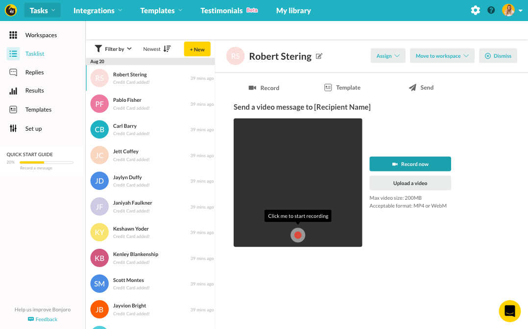
Bonjoro Video messaging
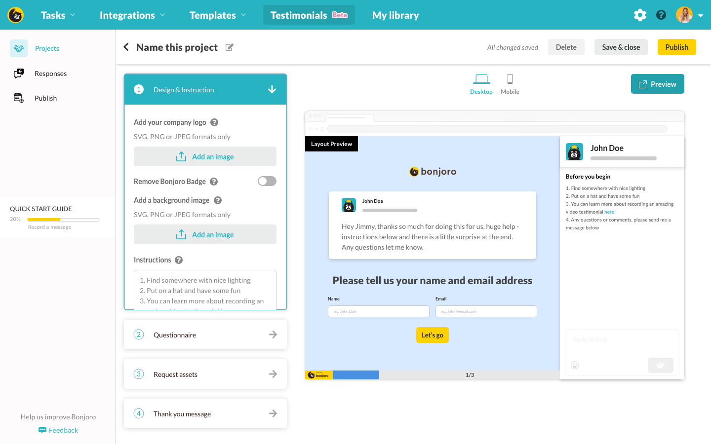
Bonjoro Testimonials

As it can be seen from above, the platform’s top navigation was heavily shifted towards Video messaging menus. So all the new users who joined the platform to use Testimonials were getting really confused and often lost. We were getting confused and lost customers asking how to use templates or integration to gather testimonials and drop off rate was becoming too huge. This confusion starts from the website to the platform as there was no clear distinction between Video messaging and Testimonials visually. So I made a conscious decision to brand Video messaging and Testimonials as different and clear as possible. I needed new colours apart from Bonjoro’s two primary colour scheme - yellow and turquoise. This used to work ok when Bonjoro had only one primary product - Video messaging, but with two main products and to have clear distinction, these colours were not enough. Also all the button rules were not properly aligned, some places were using yellow as primary and some where greenish-turquoise. Some secondary buttons are using grey with turquoise text, and some where using grey with black text. There were inconsistencies across the whole platform.

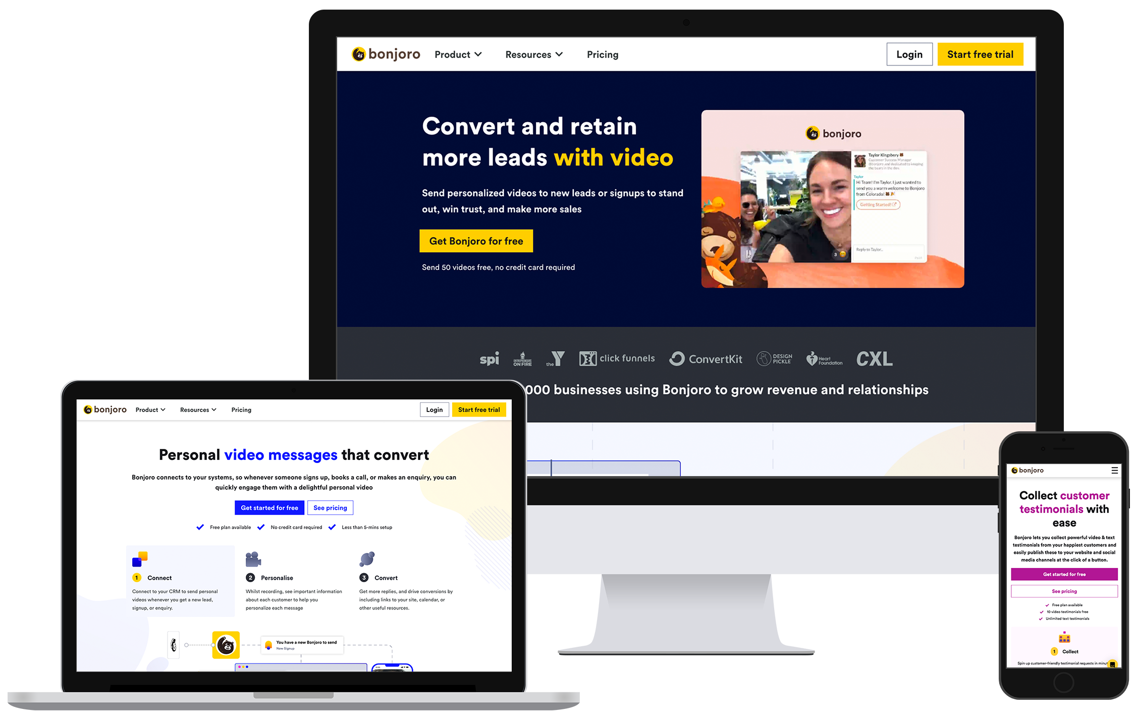
Former Bonjoro homepage
Typography were not following any particular rules either, H1 and H2 were different on different pages. Random fonts that were not listed on Bonjoro brand guidelines were being used across the site. It felt necessary to clean all these out.
The goals
- Rebrand Bonjoro
- Clean up all the inconsistencies according to new brand
- Create branding identity to both of Bonjoro’s products - Video messaging and Testimonials
- Create new icons and imagery rules to the new brand
- Plan out how this will carry across to the platform
The process
Branding colours
My first starting point is always colour. It’s the easiest and yet the hardest part to solve, however, once colour and font are figured out, the rest comes naturally. I basically needed 3 additional colour schemes for Bonjoro products - Video messaging, Testimonials and Screen recorder. Screen recorder is a Chrome extension that was developed as a part of Video messaging product. It’s not considered as an entirely different product from Video messaging but to distinguish primary product with assistance app, I decided to use different colour scheme for Screen recorder.

Since Bonjoro logo is still in yellow, and it was not my goal to update the logo itself, I started with Bonjoro yellow as the primary colour. I ran Bonjoro yellow on colour wheel in tetradic, I got 3 additional colours.

While blue was dark enough for both typography and background, green and magenta were too bright. So using colour scaler, I adjusted colour balance until colours passed screen legibility test as below. I wanted to use blue for Video messaging and magenta for Testimonials to clearly distinguish two different products better.

Then I moved onto the rest of the colour scheme including neutral colour palette, occasionally testing for screen legibility to make sure colours selected for typography were screen safe.

Typography
Next part was to work out typography. Bonjoro used ‘Lato’ as the typeface, however, Bonjoro logo itself was using ‘Circular’. Compared to Lato which felt a bit plain, Circular had much more fun curves and modern features so I switched our typeface to Circular. This not only matched our logo very well, Circular gave Bonjoro a new personality.

UI components
Once the colour palette and typography were set, it was time for UI component library to get a face lift. This was a fun process where I was reinventing all the small components of Bonjoro, giving it a new look and feel. Below are basic UI component sheet that was handed over to the dev team for reskin.


With basic component library completed, I then worked on additional components that were going to be specific for each product. So for Video messaging, blue themed components and for Testimonials, magenta themed components.

Icons and branding products
Bonjoro had a paid subscription to Font Awesome icons. While this covered most of common flat icons such as save, send etc. it lacked branding distinction to use for our own product representation. So I decided to create our own branded colour icons and product logos. Since we were going to create our own icons, I wanted the icons to take a unique form and silhouette, and also not look too flat. So I started putting together gradient colour palette from the new colour palette I worked on. Using new gradient scheme, I generated 3 product icons for Bonjoro. Using yellow as base, I gave each product its own secondary colour theme.

Then I expanded icon library with product theme so it’s convenient for my future designs.

Redesign of the website
With new branding almost completed, I began redesigning the website applying the new branding. Once again, yellow is Bonjoro’s primary colour so all the CTAs and banners are mostly using yellow except for specific product pages. Even on specific product pages, I tried to make yellow a part of the design to never lose the whole ‘Bonjoroness’. However, on generic pages such as the blog, I used yellow predominantly to maximise branding features, effectively removing old turquoise colour schemes and providing visual aid to follow through to intended product when users have landed on the platform.

Navigation was also updated to a much simpler look. I have moved all the menus that were clustering top nav, and narrowed it down to 3 top most clicked according to our Crazy Egg data, but then choose to use mega navs to provide access to all contents as before.

I especially paid extra attention to detail on assets that goes to each product pages, using blue and magenta theme for each product, including explainer videos for each product (Watch explainer videos here).

Video messaging page asset

Testimonials page asset

Video messaging explainer video screenshot

Testimonials explainer video screenshot
This meant I had to create all the assets multiple times to correctly theme each image. It was time consuming however, was really fun to be able to explore different colours and how they impact product images overall. Also I could quickly feel how well the branding was sticking to the products from this project as I instantly got reminded of blue theme when we discuss Video messaging and magenta theme when we discuss Testimonials. I was very pleased with the outcome.
Outcome
New website designs went live mid August 2022. Since the launch, we had 57% increase in new user sign ups and were hitting 71.9% onboarding completion rate. User confusion on product pages and menus have significantly reduced as well. (Read more here about Platform reskin)

Amplitude data for new sign ups (spike in late July were caused by scammers 🥲)

Onboarding completion rate data from Amplitude (Dip in July was caused by scammers 😅)
Overall, feedback from teammates and customers were very positive and increase in numbers proved this rebranding was a welcome change.