Bonjoro Platform Reskin 2023
Programs used

Overview
Project date/duration - 6 months, Nov 2022-May 2023
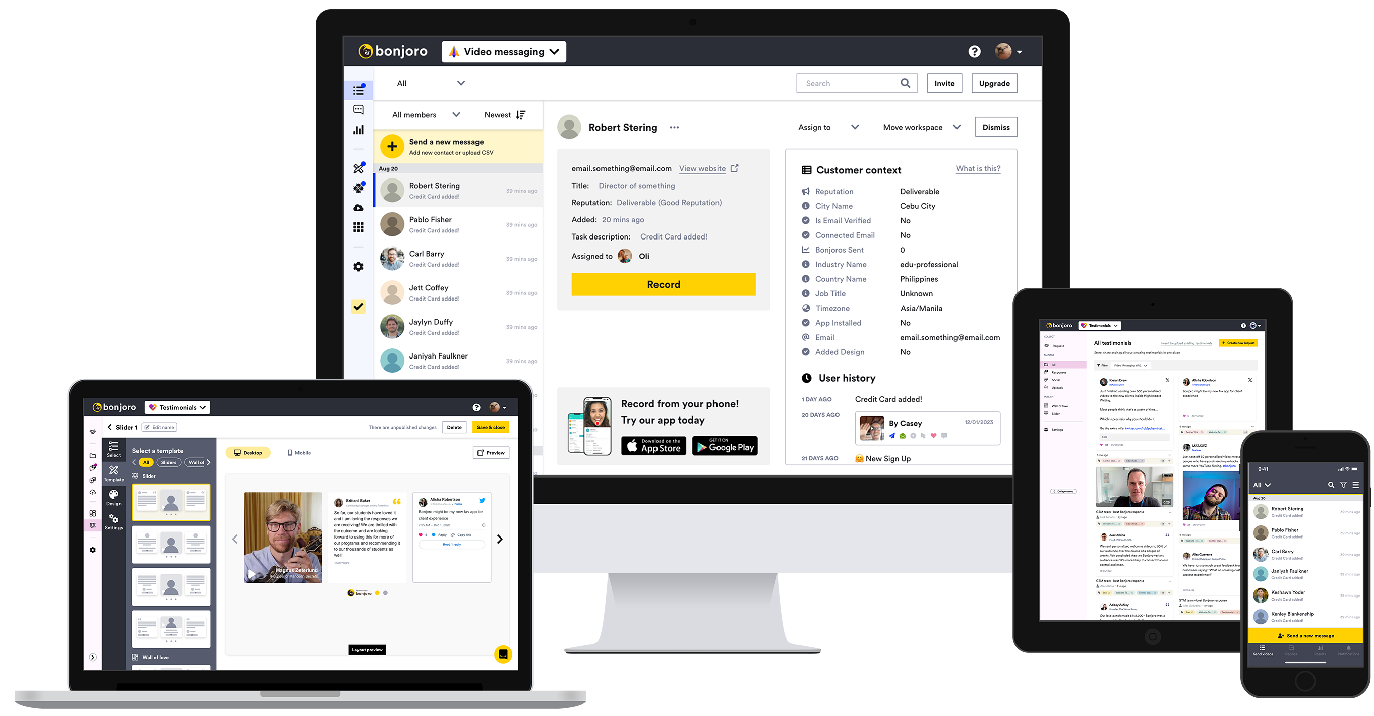
Bonjoro is a customer loyalty building platform using videos. Bonjoro’s two main products - Bonjoro Video messaging (since 2017) and Bonjoro Testimonials (since 2022) both use video to effectively create delightful and personalised experiences for every customers, then harvest that customer loyalty through testimonials to complete user journey. After completing rebranding and renewal of the marketing site, I moved onto reskinning Bonjoro platform. However, this was not just a simple reskin project as Bonjoro has decided to sell separate subscriptions for Video messaging and Testimonials, which meant that the platform that was sharing features across Video messaging and Testimonials needed to be separated including billing and upgrading. This case study covers my design process and problem solving journey to reskin and split out Video messaging and Testimonials on Bonjoro platform.
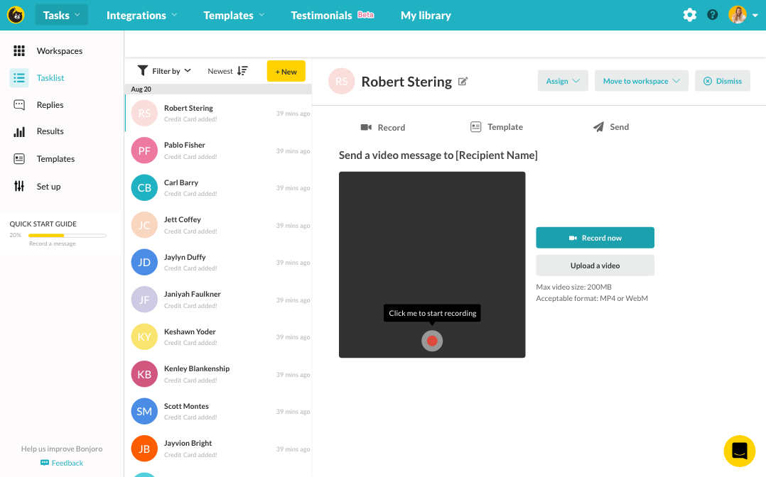
Bonjoro Video messaging
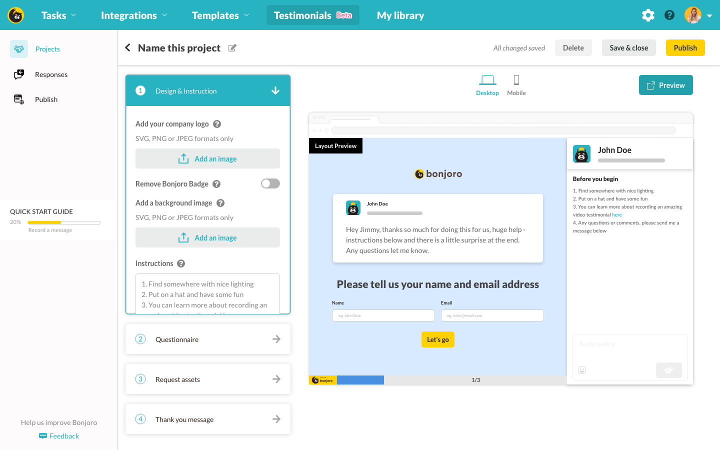
Bonjoro Testimonials
My role
As the Head of design, I was a part of the product team and responsible for the experience, strategy and design of all across Bonjoro. I was to lead the UX and produce UI elements. I worked alongside CTO, Tech lead, CMO, CEO(the product owner) and the Product manager.
The challenge
Other than just reskinning the platform, one of the main goal was to split out Video messaging and Testimonials. Bonjoro has decided to sell different subscriptions for each product and to position both products as separate that can be used as standalone products. However, because the main head navigation focuses heavily on Video messaging and Testimonial only shares a small portion of the menu, it was hard to sell separately. So while we are reskinning the platform to the new brand, we have also decided to update pricing and split two products out so that users of any product could use the platform without getting lost or confused.
The goals
- Reskin Bonjoro platform to the new brand
- Create new empty states and graphics to match new branding
- Split out Video messaging and Testimonials so either products can be used as a single product and be sold separately
- Clean up all the inconsistencies
- Clean up top navigation and side navigation menus
- Develop more brand icons and UI components as needed
The process
Navigation
The top navigation and side navigation was the first problem I tackled as C-team were negotiating final details of the new plans and inclusions with the board, and I could not begin working on the subscription tiers or billing pages without inclusions table. Navigation however just needed a good makeover and better information architecture.

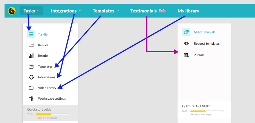
As it can be seen from above, the platform’s top navigation was heavily shifted towards Video messaging. This was because Testimonials was a new product that launched just a few months ago and were rather forcefully inserted in. Not only that, most of Video messaging menus on top nav was also on the side nav as duplicates, where the side nav only changed to new menu when users visit Testimonials from the top nav. It was not very surprising that many new users who signed up to Bonjoro just to use Testimonials, unaware of Video messaging, were getting lost and confused, and we often received questions such as how integrations or templates are supposed to work for Testimonials.
To address this, I have previously themed each product with different colours and created different product logos for Video messaging and Testimonials, providing visual aid to distinguish products by representing colours. Then, reorganised top nav as below.
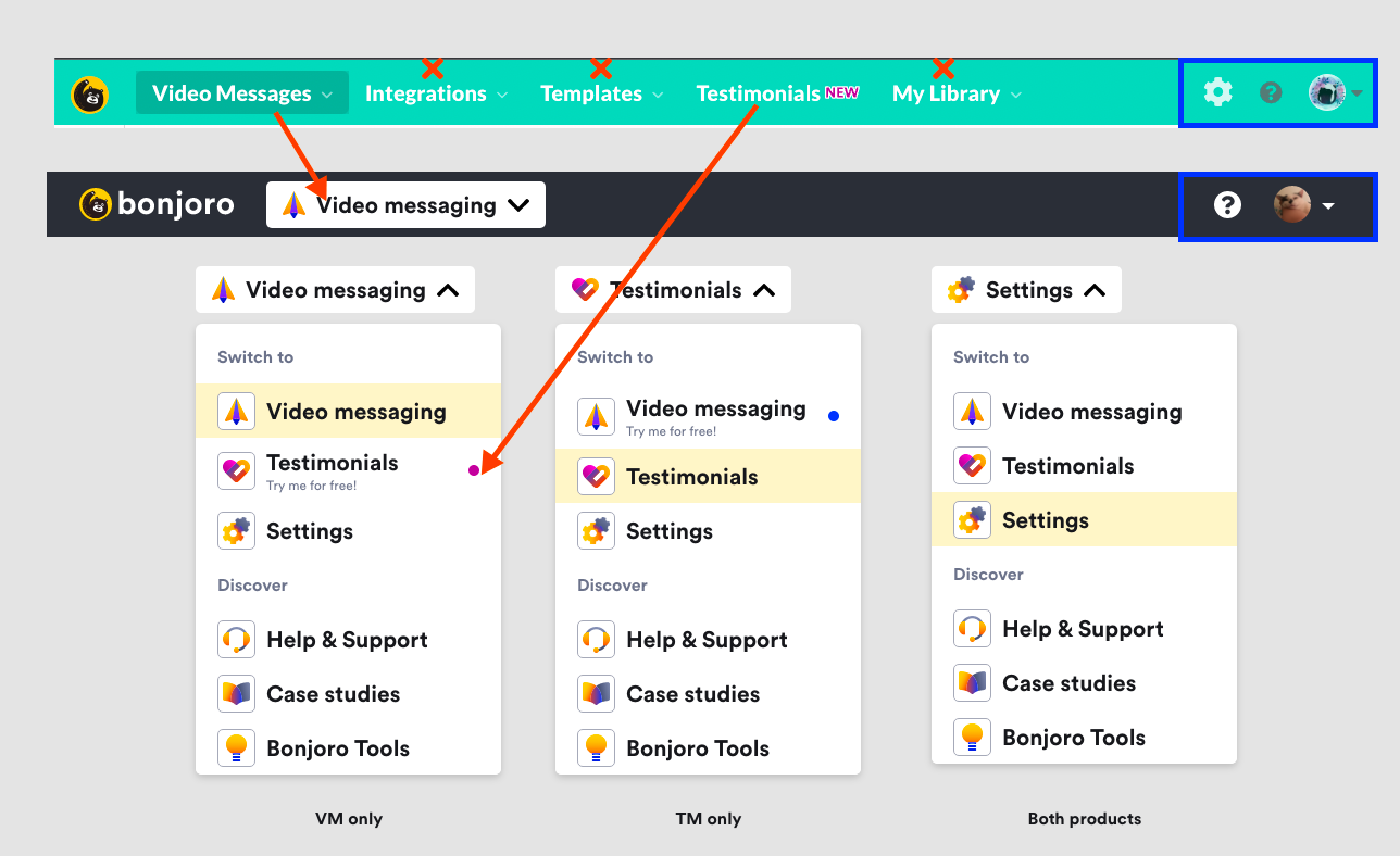
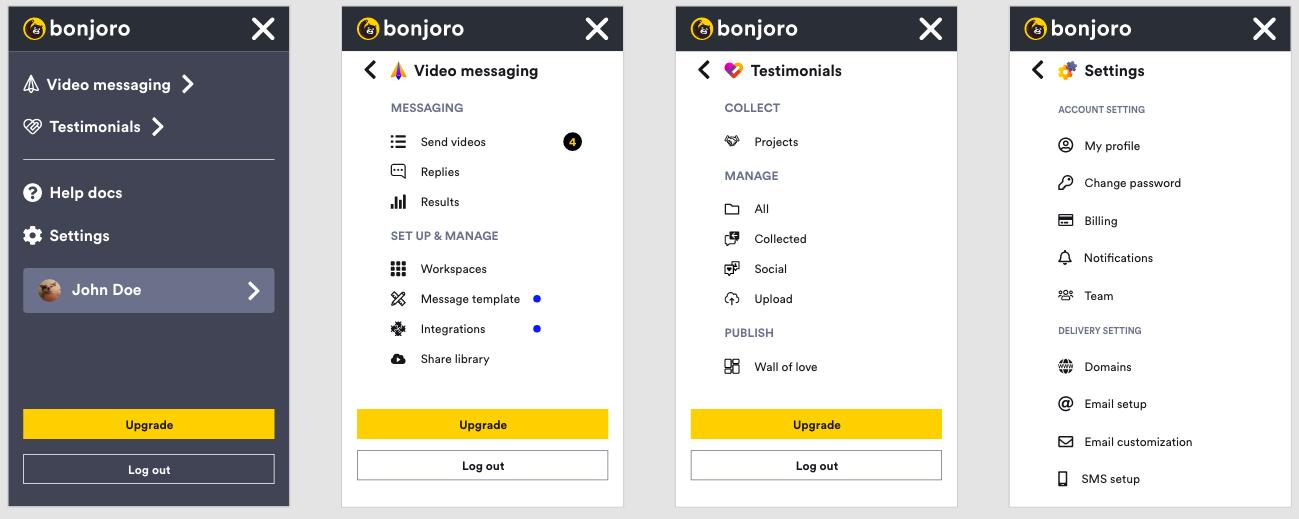
I moved out all other menus except for product selector + settings. This way I could always make sure users know which product they are viewing and also have side navigation consistent within the specific product. If the users wanted to cross over to the other product, now it had to be a conscious choice and any side nav menus would be within the chosen product so this way users will be less likely to get lost. All the removed menu items from the top nav were then moved to the side nav as below.
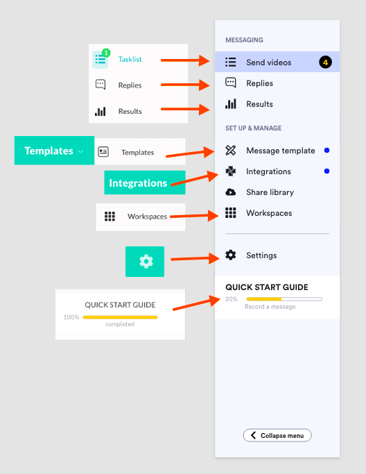
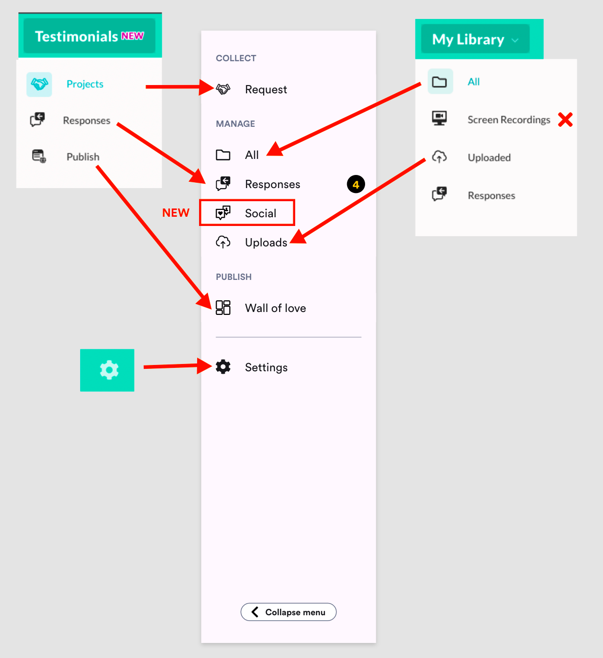
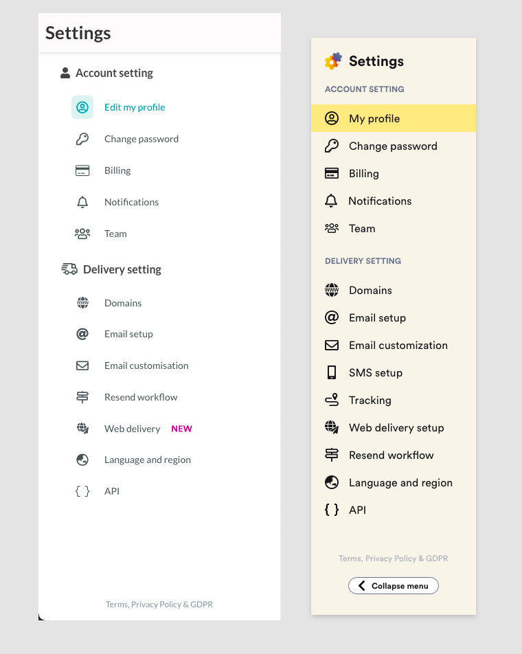
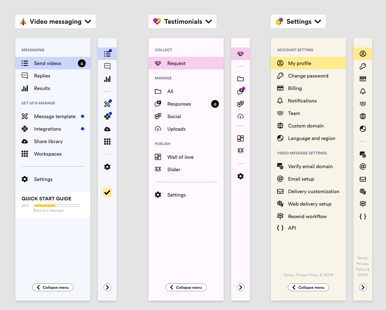
As can be seen above, I followed the colour theme once again here to give the product visual follow through. Settings side nav uses yellow (primary) as it’s a generic page that any users of any products can use. All the menu icons were updated also to new icons I have designed to give the platform unique look.
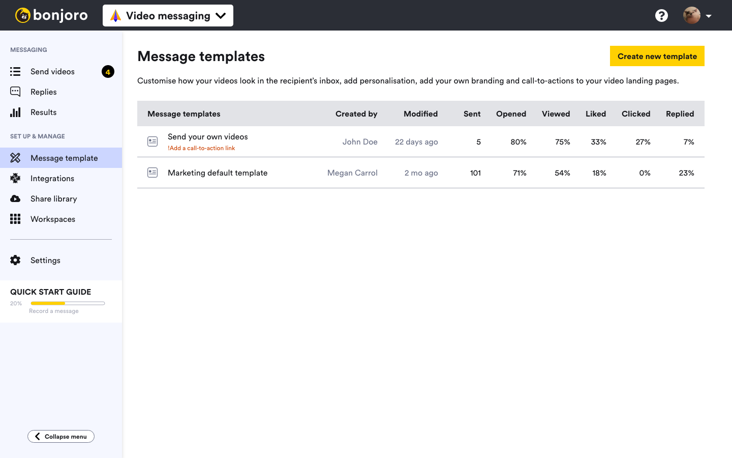
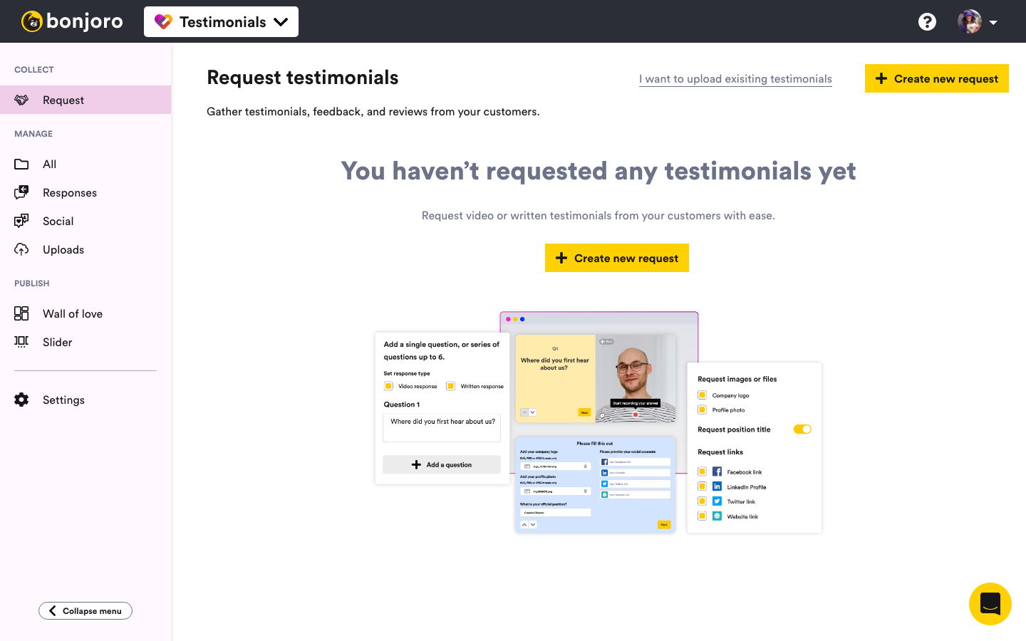
Therefore, ending up with a different look and feel for each product + settings page.
Mobile navigation
Collect (projects and builder)
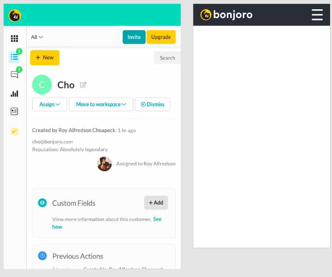
Old mobile view and new mobile nav design
Pricing and billing
The next thing I had to consider was our new pricing model and tiers. If we are aiming to sell two products separately, then naturally we will need different pricing tables for each product. I also had to consider users using both products. Without knowing the actual inclusions or tiers and potential discounts when purchasing one or both products, I could not start designing anything. Once final pricing table has been agreed upon by C-team and the board, I was able to begin this project.
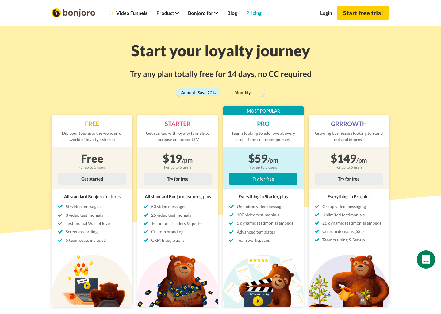
Old Bonjoro pricing page
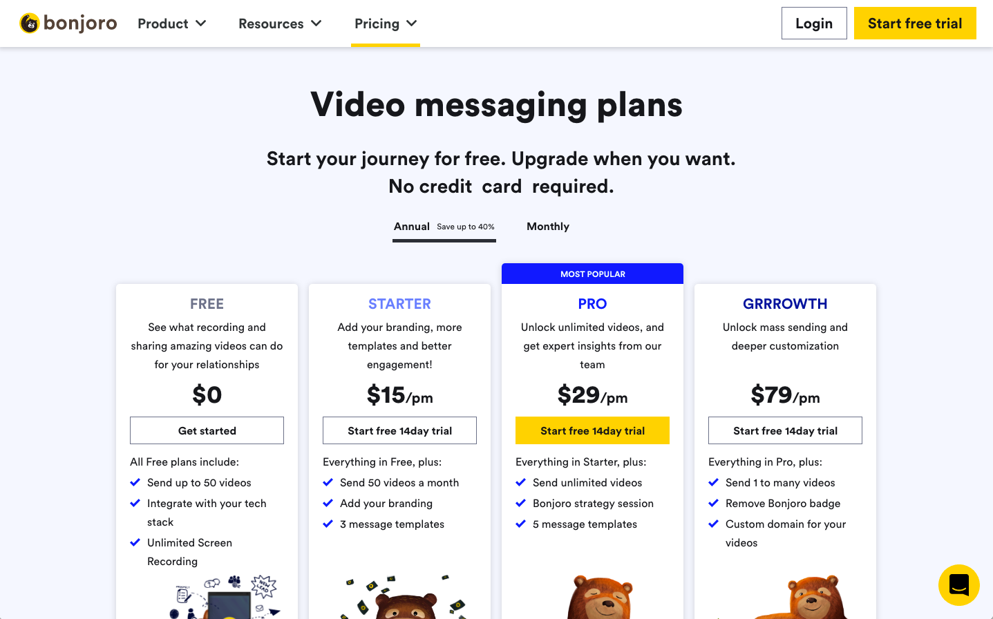
Video messaging pricing tiers
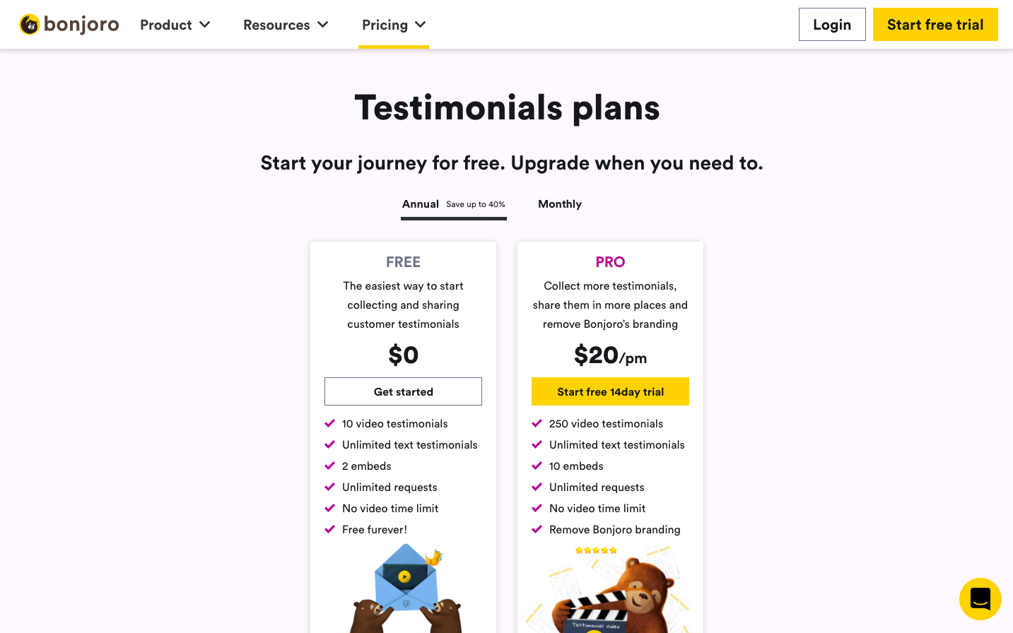
Testimonials pricing tiers
Pricing table was easy enough to complete but now I had to solve the issue of ‘Start free trial’ button on our marketing site’s top navigation. This button has one of the highest click rate as majority of our signups come through. This was never a problem before as anyone signing up through this button was automatically put on the Pro plan. But now that we have two products, I had to create a landing page for users to select which product they would like to trial first.
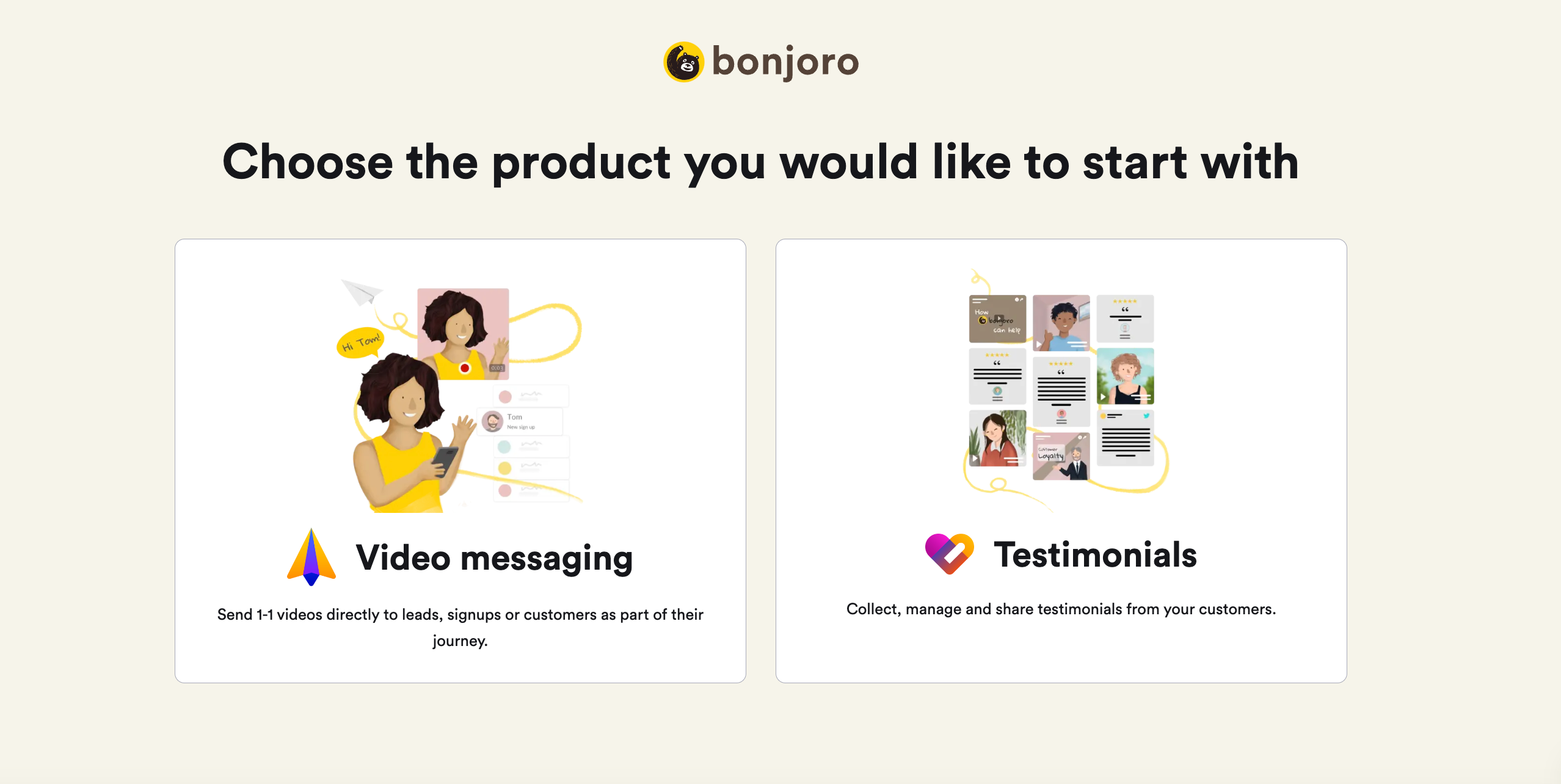
Choose product page
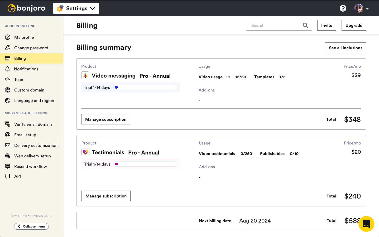
Next step was to design the billing page. The old billing page was simple enough to be just a single page design but now that users could potentially have two different products, and each product had different add-on features, I had to insert a middle page. This was to allow users to upgrade or downgrade (even cancelling), therefore managing, as easy and clear as possible. However, I did not want users to had to click through to another page to see any information (their cost of each product, final billing amount and the costs of add-ons etc.) they had access to on billing page previously. So both Billing summary page and manage subscription pages repeat some of the information but risk of confusion was much lower with this flow.
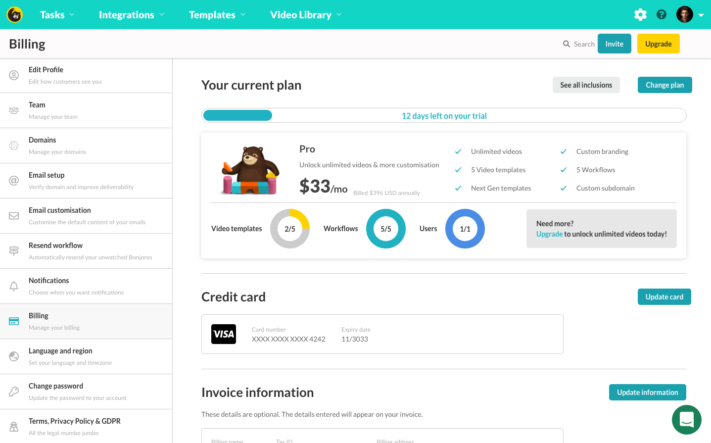
Old Bonjoro billing page for Pro user

New billing page - ‘Manage subscription’ button goes to each product management page as below
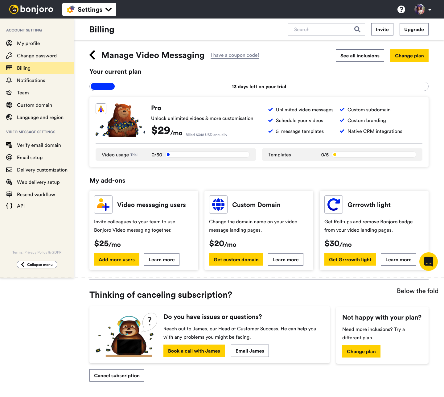
Manage subscription page for Video messaging Pro user
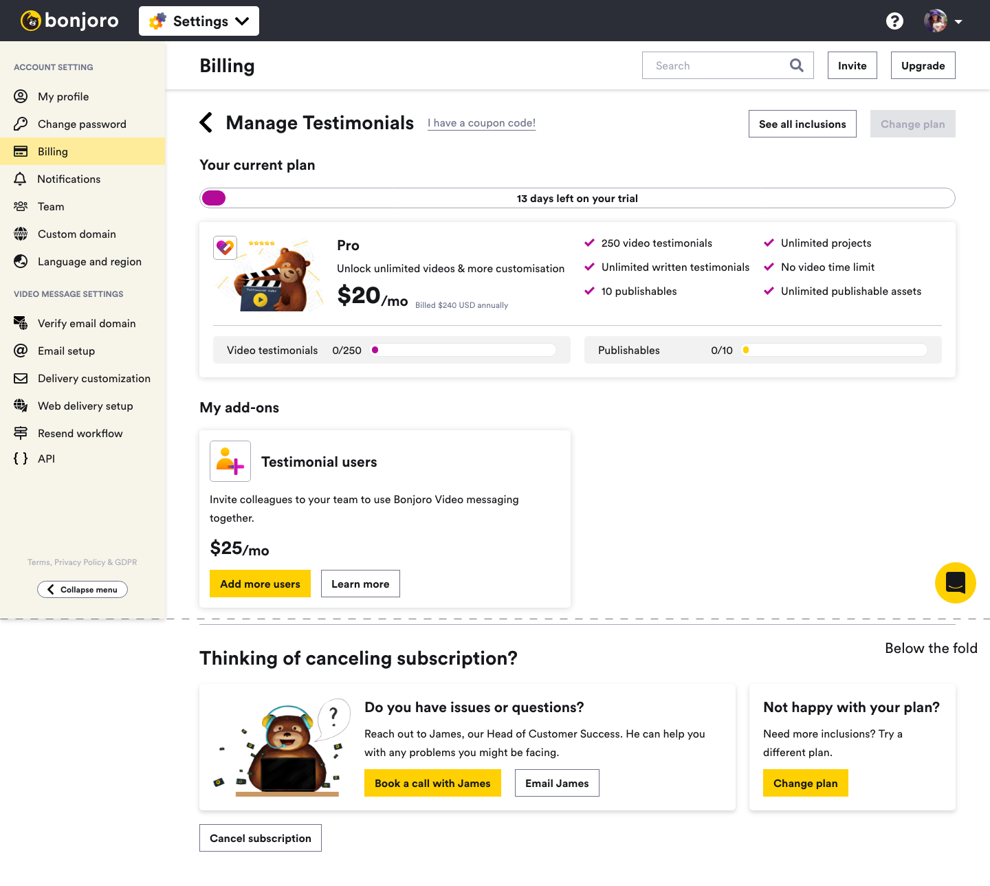
Manage subscription page for Testimonials Pro user
Share library and Asset library
‘My library’ from top nav was a video asset library that was used by both Video messaging and Testimonials. This is where Bonjoro Screen recorder files and uploaded video message files would save to and also where Testimonial user uploaded assets lived.
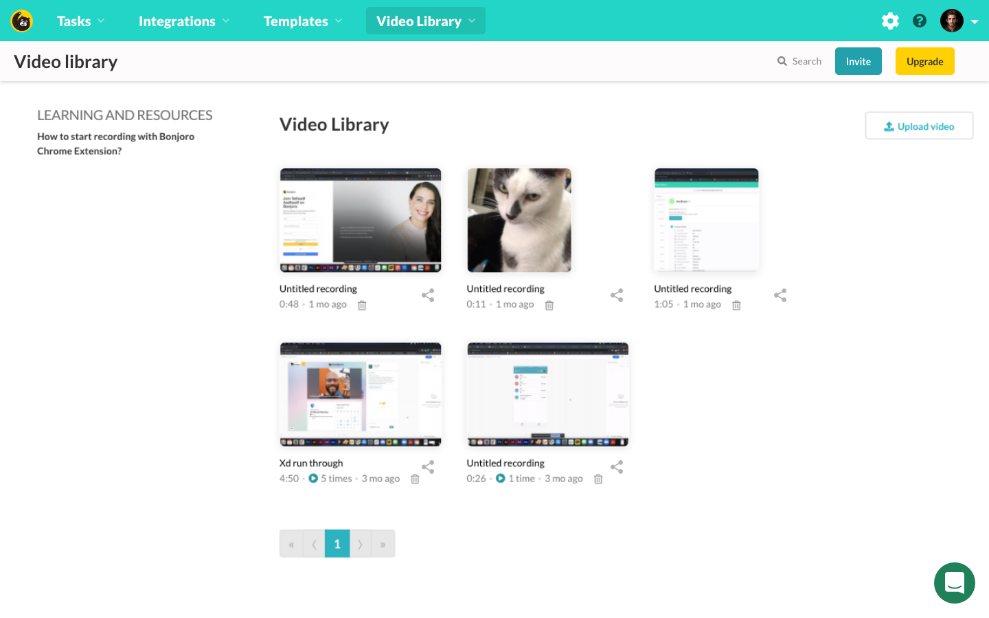
Old Video library page before Testimonials
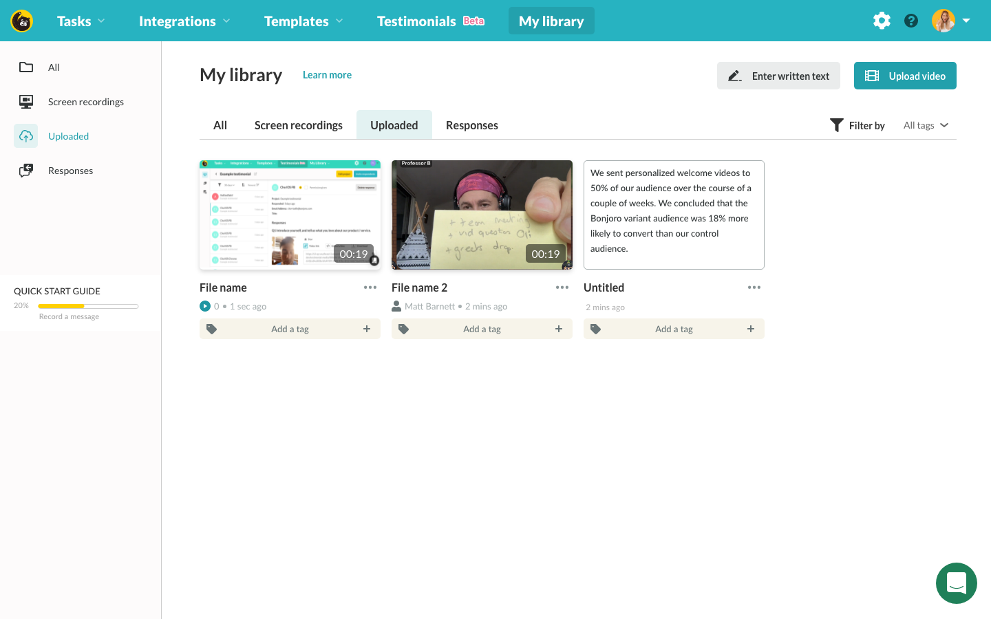
My library page after Testimonials launch with tag bars
When we were first planning Testimonials as a product, I did not know that Bonjoro would sell a separate subscription for Testimonials so I just used the existing Video library for any uploaded testimonial assets from users. But now that we are splitting the product and users will not be able to access either of the product without a correct subscription, this library had to be divided into Video messaging library and Testimonials library. Other than this complex design issue, another problem was deciding which video files go to which library for all existing users who used both Video messaging and Testimonials. With users reaching almost 1,000, it was difficult to go around and consult every user to correctly migrate relevant video files. So after a small discussion, we decided to migrate all uploaded video files since the launch of Testimonials to new Testimonials Asset library for any users who had a Testimonial embeds or created Testimonials request and the rest would remain in Video messaging Share library. Then once this goes live, if any users contact us regarding their missing video files, we will just migrate those as requested. The main purpose of Video messaging users to upload videos was to share, embed the video itself or to send the video using Bonjoro. This included their recorded personal message videos and any screen recordings they made using Bonjoro Screen recorder. For Testimonials, users uploaded testimonial videos they collected before they joined Bonjoro Testimonials. Two use cases may look similar, however, the usage and functional requirements were quite different. Video messaging users had no use for tags as those assets would not be used for creating testimonial embeds (like Wall of love etc.), and Testimonials users did not need to attach the video to a message template as their assets are video testimonials to their business not a personal message.
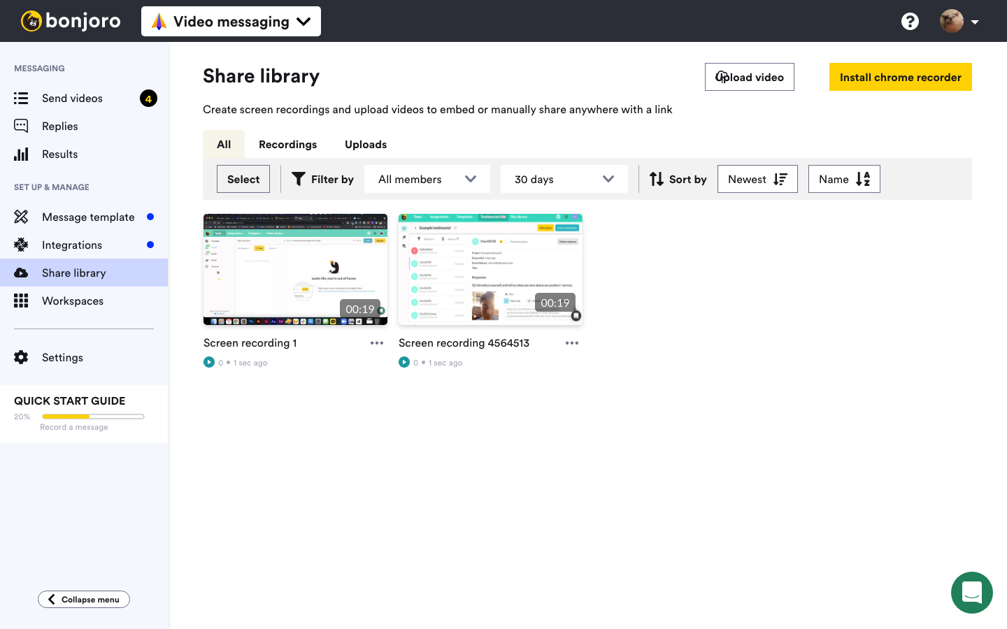
Video messaging ‘Share library’
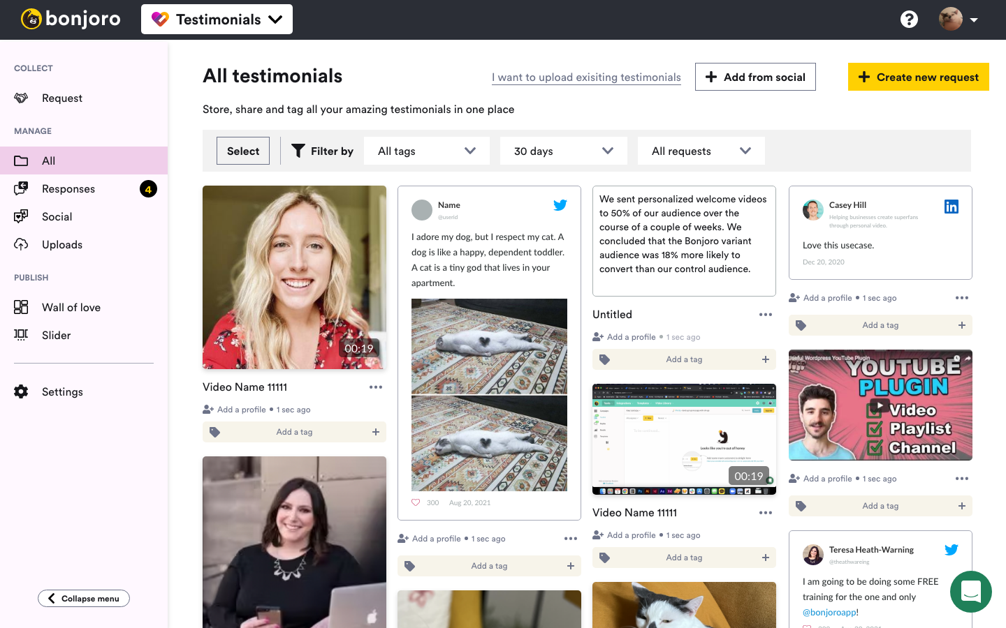
Testimonials ‘Asset library’
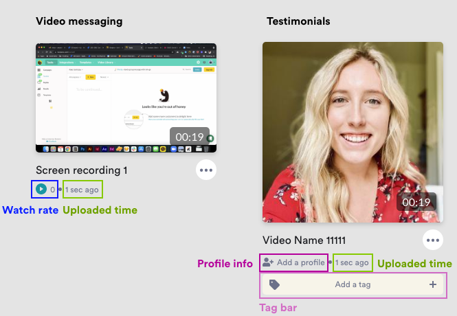
While the overall design system remained similar, I had to make adjustments to functions attached to each assets in each library. At overview, Video messaging has watch rate counter info with uploaded time indicator underneath the video name. This watch counter is used to count unique number of plays regardless of where this video was sent, embedded or shared. Uploaded time was also relevant as most use-case we could identify for Screen recorder was product walkthroughs and date would be very relevant in deciding whether or not this video is outdated. Testimonials asset does not have watch rate counter but has a profile info section where users can manually enter the respondent’s information such as their name, company, role title and profile image. This information is important for most Testimonials as it adds credibility and is an important piece for testimonial embeds. Additionally, a tag bar sits directly underneath for easy tagging and removing of tags. As these tags are used to create published embeds and those embeds update according to the contents within tags, fast access to adding or removing tags was very important for Testimonials asset library.
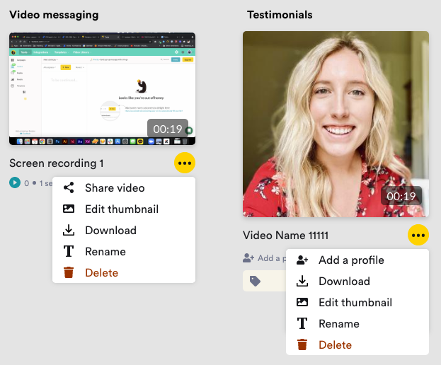
Menu options in meatball menus are also slightly different. Basic functions such as download, rename and editing thumbnail were commonly available across both libraries, but main function that sits on top of the menu varies. Although these function and design decisions came from monitoring user behaviours and through user interviews, I ran a series of user testing with XD prototype, meeting Video messaging users, Testimonials users and both product users all separately. Through these tests, no interviewees questioned any components or options which was very positive and assured these design decisions were correct. With more confidence I moved onto the next set of problems.
Teams
The final piece in this redesign and split was the teams page.
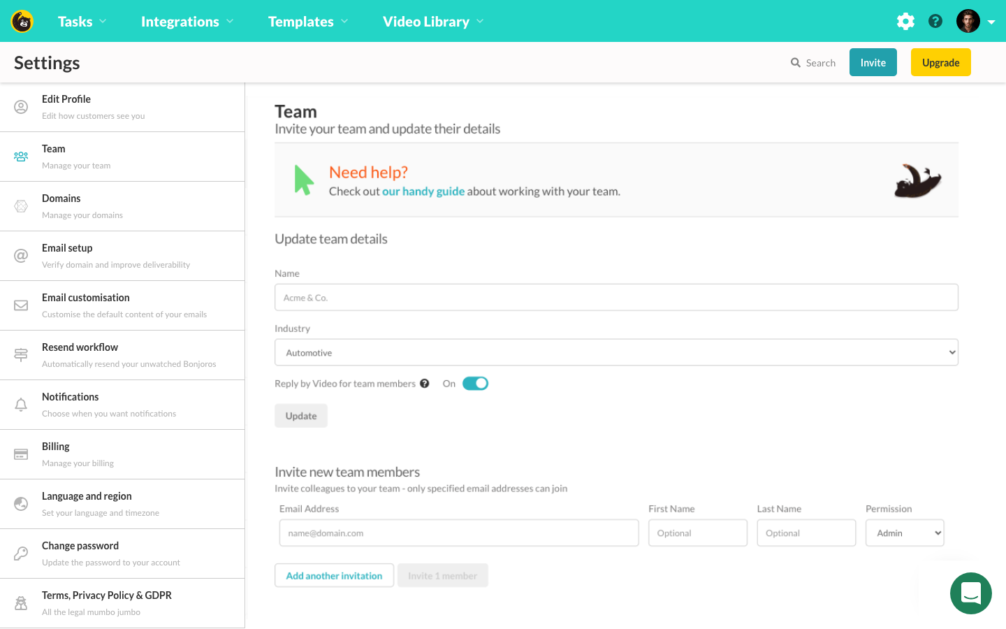
Old team settings page
As expected the UI on these pages were quite outdated and very unfriendly. So while I am working on the actual functionalities, I decided to completely redesign this page. The requirements on teams was much harder than video library part. This is because the settings page had to be shared across both products. Not only that, because additional team member seats will be sold separately, the account owner may choose to invite teams with different access rights - Video messaging only, Testimonials only or access to both products. And moreover, Video messaging had two different team member access permissions to choose from - filmer and admin. This feature was not yet developed on Testimonials side so UI had to be as clear as possible to not cause any confusion when inviting or editing user rights if the invited member was to be invited to use both products.
To remove all the clusters, I moved all the form fields into modals and left information display fields instead. This way users could see relevant information and their team member list without scrolling down.
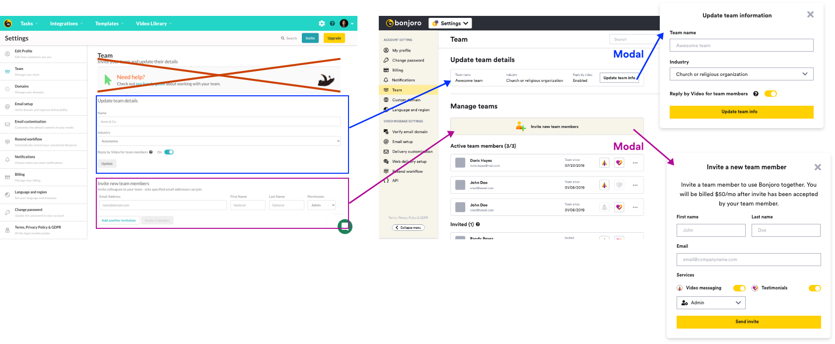
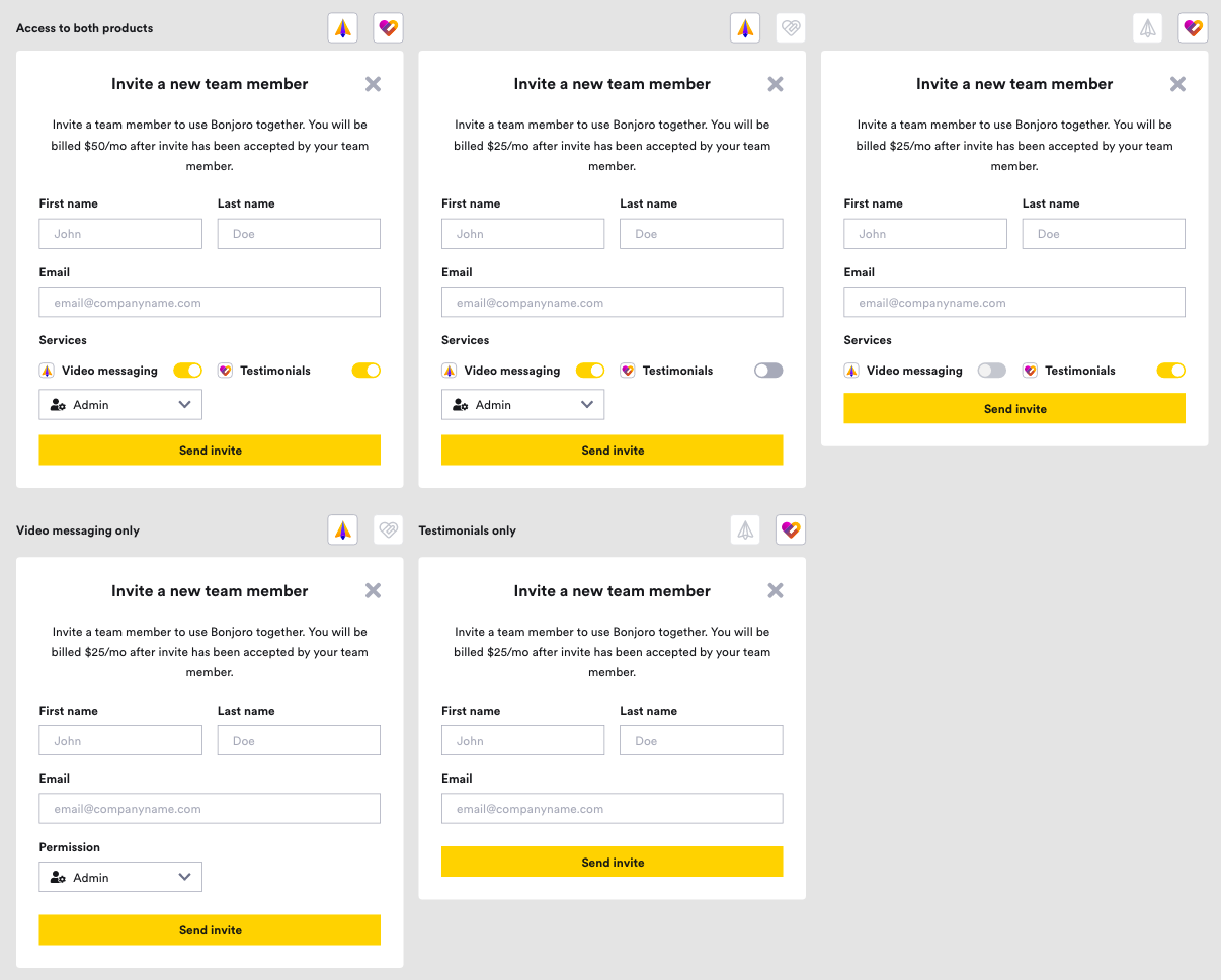
As for invite modal, design had to vary depending on the account owner’s subscription. If the original account owner held both Video messaging and Testimonials subscription, then they will get a toggle choice to include/exclude invitee. User access rights dropdown gets displayed or hidden according to Video messaging toggle. If the original account owner only has access to a single product, then they will not see the toggle option for the other product until they purchase the subscription themselves first.
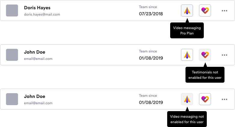
For the team members list, I added product indicator icons to indicate which products they have access to. At first I had no intentions to make these product indicators to be interactive but after internal feedback from our team, I decided to add help text to inform users why these icons have been greyed out.

Outcome
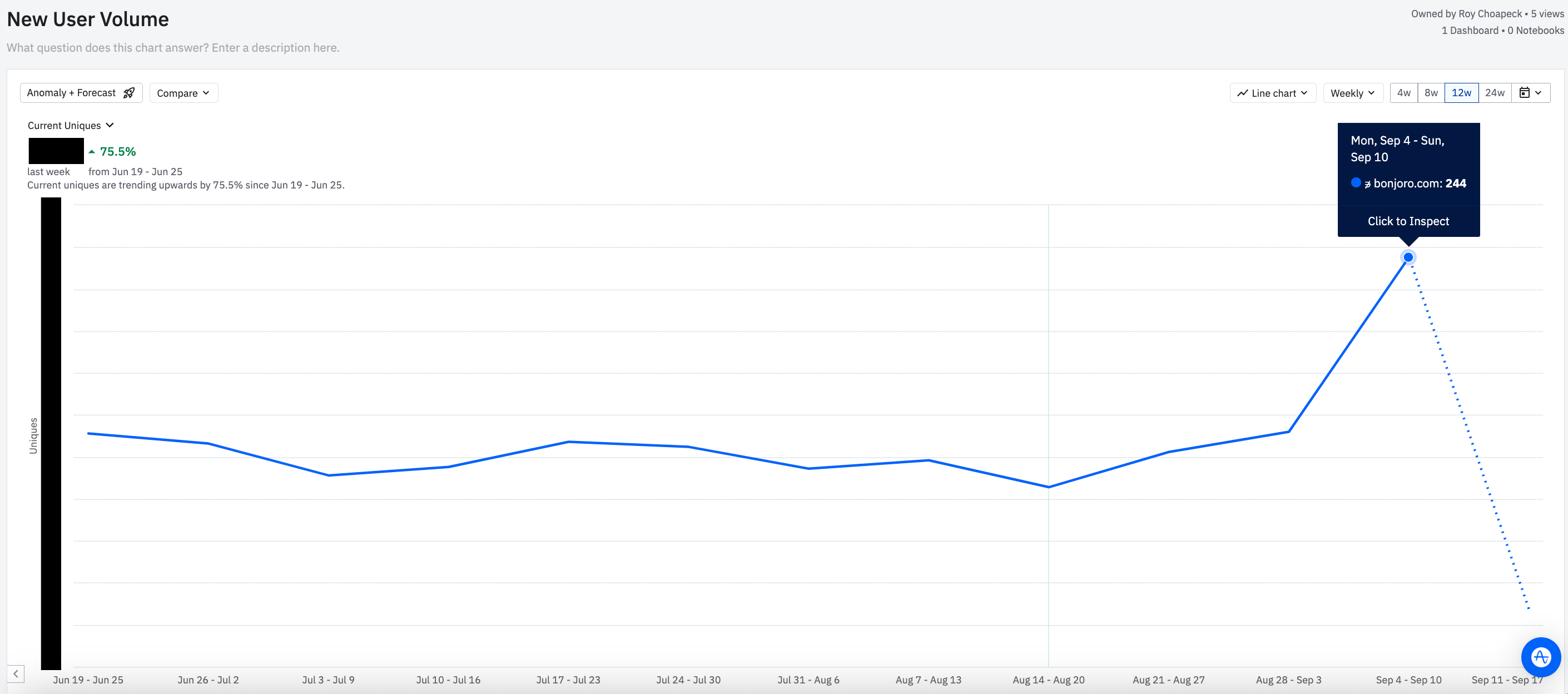
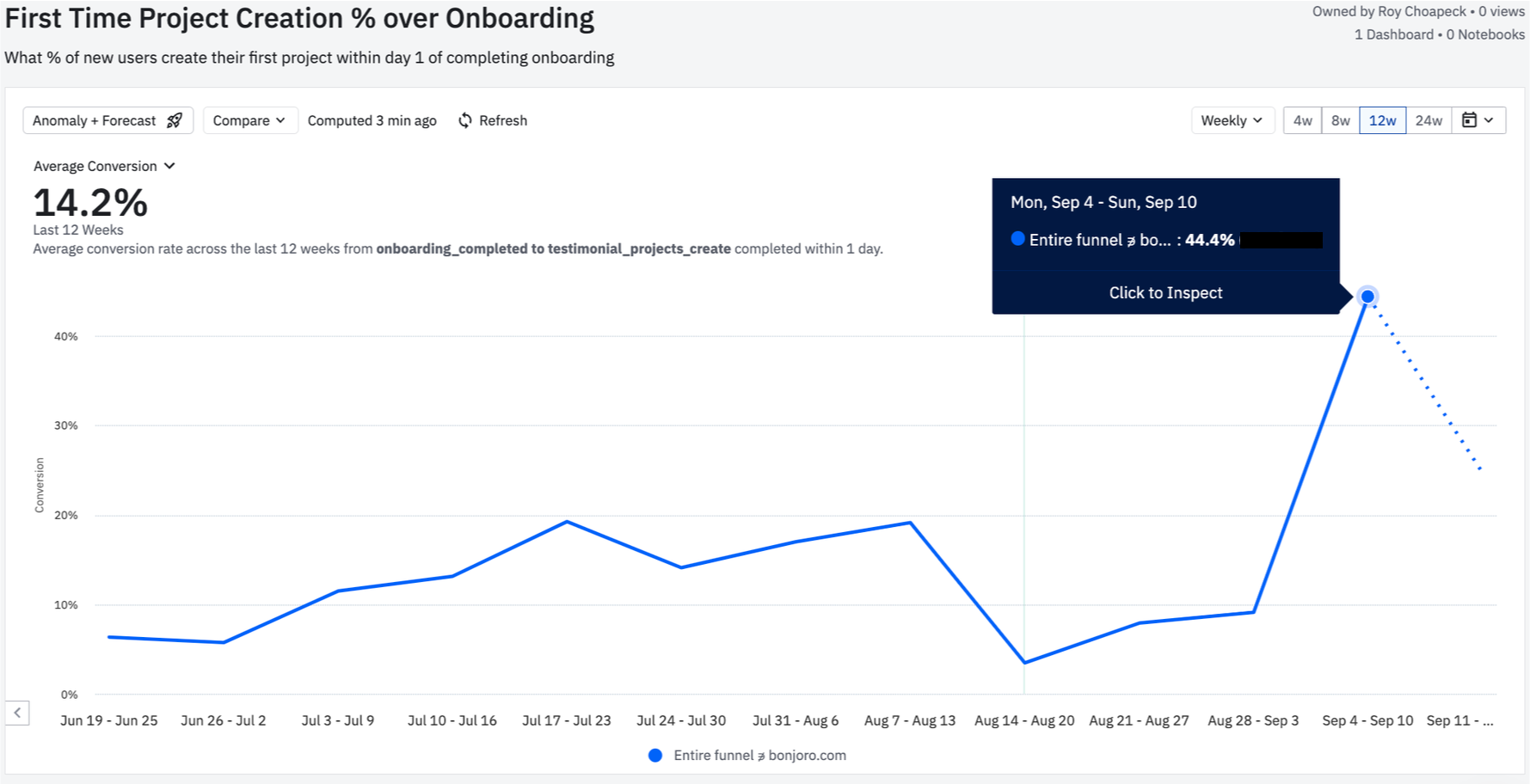
We went live late August 2023. Along with the launch, we sent out marketing emails to our past users and inactive users to trigger reactivation. We then also ran a campaign on AppSumo to gather larger base of users for Testimonials. This was a great success because our acquisition shot up 74% from previous week. Onboarding completion and conversion rate matched this graph and even though this was a very early stage to be fully counting all the success, it seemed very positive.
