Lawpath Rebranding & Reskin 2019
Programs used


Overview
Project date/duration - 3 months, Mar 2019-Jun 2019
Lawpath is Australia’s largest online legal platform for businesses and individuals. When I first joined, Lawpath did not have a dedicated designer or a strong brand guideline. This has caused several issues in both platform and website designs. This case study highlights my design process for rebuilding Lawpath branding and reskinning the website.
My Role
I was a part of the product team and responsible for the experience, strategy and design of both Lawpath platform and website. I was to lead the UX and produce UI elements. I worked alongside CTO, Tech lead, CMO and CEO(the product owner).
The Challenge
Unclear navigation

Lawpath site navigation was challenging to understand. The navigation used vague headings such as ‘Service’ and ‘Directory’. I had to spend some time to read a few pages to understand what they were offering. If I were a user trying to get quotes from lawyers (one of the services Lawpath provides), I would not know that I had to click ‘Directory’ to access such service.
Unclear navigation
Although Lawpath was a start-up, over three years of successful growth, Lawpath’s website already had a good SEO set up with Google. Since this SEO came directly from existing navigation, Lawpath’s CMO asked to maintain the current navigational structure as much as possible for SEO purposes. I considered the navigation menu as another area of improvement; this presented some challenges.
Unclear navigation
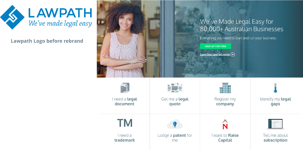
Balance of primary colours or brand voice varied from pages, and it was easy to see inconsistency across the entire website. Images and graphics had low resolution and colours were dull and grey even though Lawpath’s primary colour was blue. There was little to none interactivity, and it was not very interesting to browse the site. Overall, Lawpath site looked outdated and old.
Text hierarchy
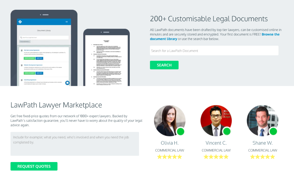
Although Lawpath was using a sensible Sans Serif font, it was still without proper text hierarchy. Sometimes headers used title case and occasionally headers would use all caps. Body paragraph had bold text here and there making the site look messy with inconsistent text styling.
The missing link back to the platform
The biggest problem I had noticed was that even though Lawpath was a SAAS platform-based business, it was not mentioned or referenced enough and it was a struggle to find the pricing page.
The Goals
- Restructure Lawpath branding
- Update Lawpath’s website with the new branding
- Modernise the UI assets to meet the trends
- Improve the UX of the overall site to boost more sign-ups
- Display and inform Lawpath platform better
The Process
A new brand guideline

After listing out all the issues, I started working on a brand guideline. I focused on developing a strong brand guideline that can assist over 50% of the problems listed above and help future brand growth. The new brand guideline includes clear-space rules for a new logo, primary and secondary colour scheme with colour hierarchy rules, typography rules, web button and hyperlink rules and a new set of illustrations including icons.
A new illustration & icon library

Brand illustrations

Coloured icons

Line icons
Based on the new brand guideline, I developed a new set of icons and brand illustrations. Brand illustrations are a stylish way of expressing brand messages as well as the product itself. These help users understand how to use the product and shape a character to the branding, making the brand unique. I started two types of icon library, coloured icons and line icons. Line icons are an essential communication tool for any website or platforms. While coloured icons are also a communication tool, they also add vibrance and fun to often tedious informational pages, adding another character level to the brand.
Typography rules
With the rebranding, Lawpath moved away from their old font face and introduced a new typeface. A new text hierarchy needs to be developed for every typeface because every typeface has different kerning, weight, and line-height scale. I used the Golden Ratio Typography (GRT) rule to establish text hierarchy for both web and print.
New site structure
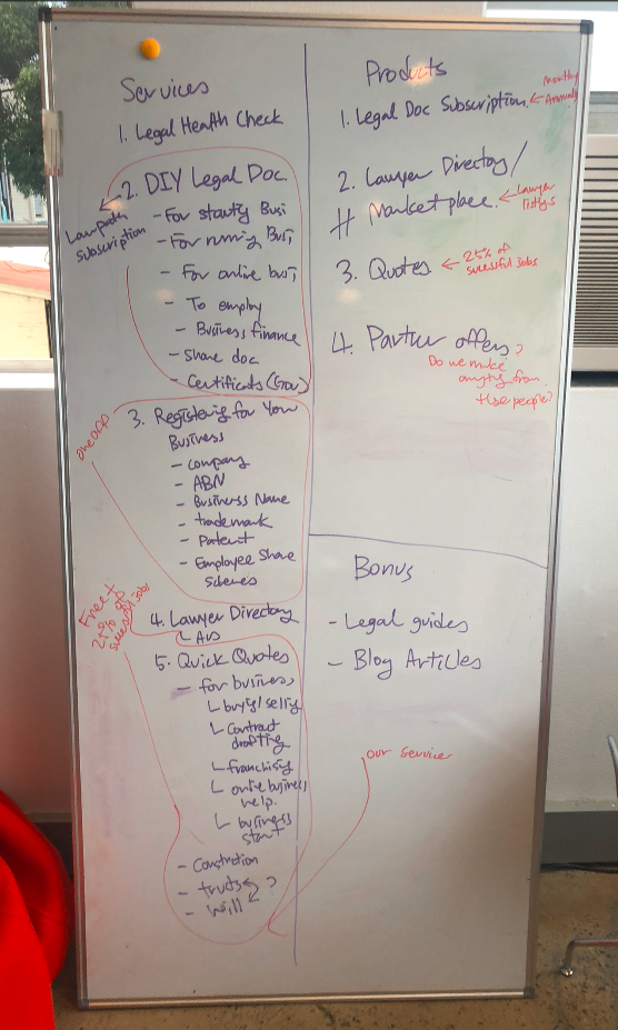
With both the design system (brand palette and typography rules) now structured, I had to solve navigation’s information structure. The navigation is the most critical element of any website as this is how users will navigate the site. The navigation also informs users about services or products offered by the business at a glance. Good navigation can make any user journey easy and smooth, where bad navigation does the exact opposite. The navigation should exist to help users find what they need or help obtain information, not confuse or mislead them. Firstly, I listed out every service Lawpath provided then regrouped according to service types using a whiteboard. With similar services listed out, heading for each category came naturally. Then, I visited the user sign-up data and SEO data to re-evaluate user journies to scale each page’s importance. The initial list was re-written based on this data and allowed me to judge the navigation items’ order. This list then became the skeleton to hand over to the internal content team for review in wording and brand voice. Once the internal content team was happy with the navigation list and wordings, I submitted the new proposed navigation to our stakeholders for review, providing relevant data and reasoning behind why I am proposing these navigational items. After a couple of stakeholders’ adjustments, the new navigation approved and became the reskinned site’s foundation.
Outcome
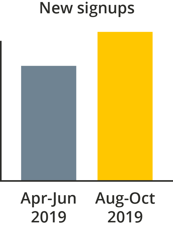
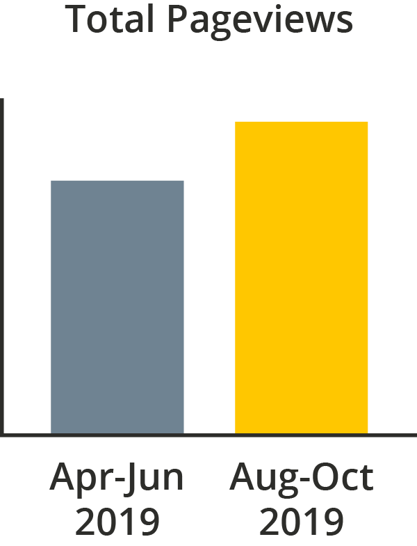
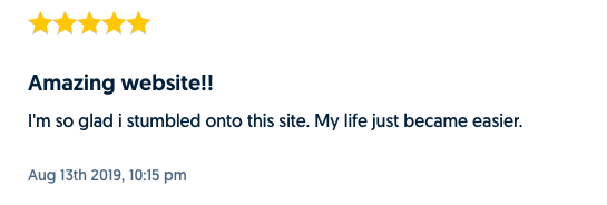
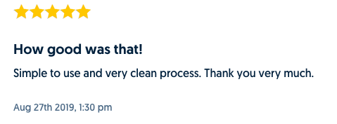
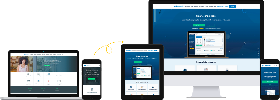
The new site went live in July 2019. After the launch, the number of total visitors increased by 30%, and the total number of user sign-ups also increased by 30% in the first month. User feedback from both intercom and call has risen significantly. Because both numbers and customer feedback were positive, I believe this project has successfully resolved issues intended to resolve.
