ZiftONE 2019

Programs used



Overview
Project date/duration - 4months, July 2018-Jan 2019
Zift Solution is B2B and B2C channel marketing solution platform where users (businesses or companies) build marketing co-brand-able campaigns of their products and services on Zift. A campaign can include emails, landing pages, web banner sets and workflows that allow users’ business partners to add their branding to campaigns and distribute at ease.
My Role
I was a design lead at Zift Solutions in Creative Services team. I was initially a designer at Elastic Grid, a channel marketing agency providing marketing strategies and complete campaign packages. In 2017 December, an American channel marketing company called Zift Solution acquired Elastic Grid along with CS team and project management teams. Because Zift Solution did not have a design team before, we became a part of newly developed service and explained our services to Zift’s existing customers. For this project, I led the UX UI design for client projects and internal marketing projects. Working with our product owner, I was the design lead in this project.
The Challenge
Zift announced in mid-2018 that they would combine their core platform services(Zift123 and ZiftMarcom) and newly acquired services to ‘ZiftONE’ to centralise all platform services.
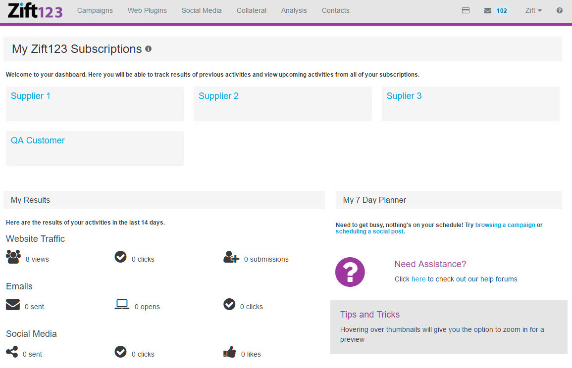
Zift123 is designed for clients to come and run their channel programs
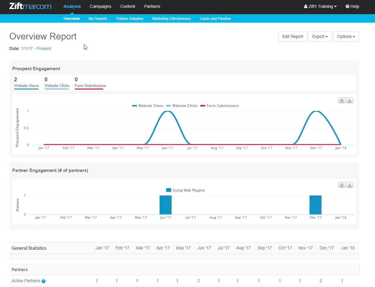
Zift Marcom is where vendors create new marketing campaigns – landing pages, email campaigns, web-banners and workflows
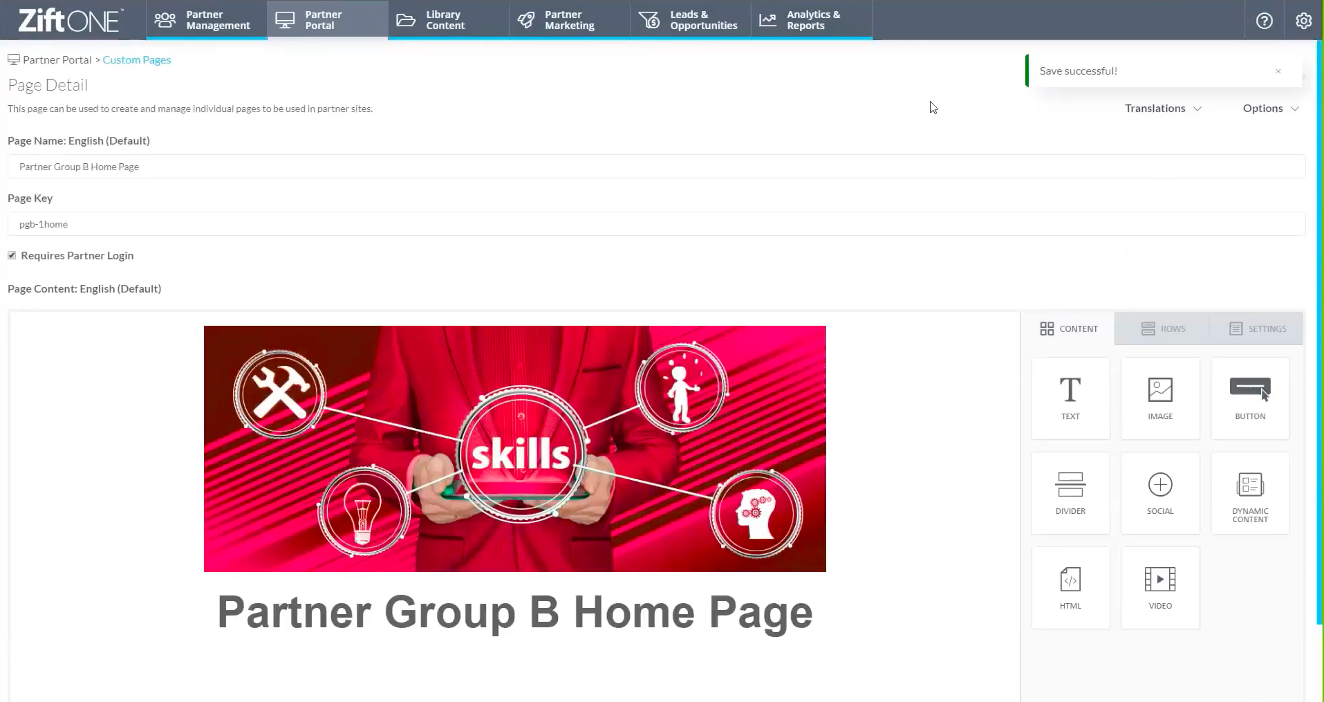
Due to B2B’s nature, these platforms required multiple admin boards with different access levels, communication functions, and various tracking levels. This project also aimed to combine Zift’s newly acquired services such as Relayware’s Partner Relationship Management System and Elastic Grid’s Blueprint Editor.
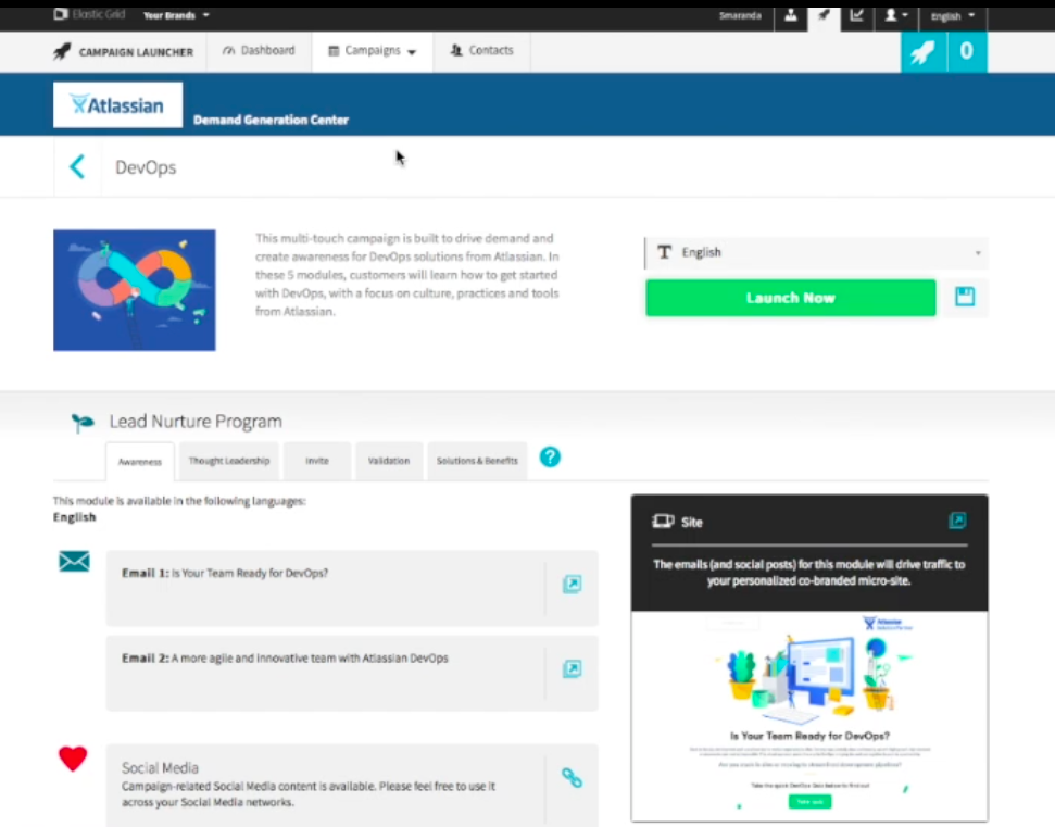
Elastic Grid’s dashboard
Elastic Grid is a channel marketing agency providing marketing strategies and complete campaign packages. Elastic Grid’s software, Blueprint Editor is a simple site builder software that allows users to build a landing page without any coding, was available for internal usage. Relayware is a Partner Relationship Management (PRM) software provider designed for channel marketing customers. Relayware allows both vendors and their customers to review, manage and communicate with their partners, taking control of channel programs using their desktop and mobile-friendly platform.
The Goals
- Develop a new system design for ZiftONE
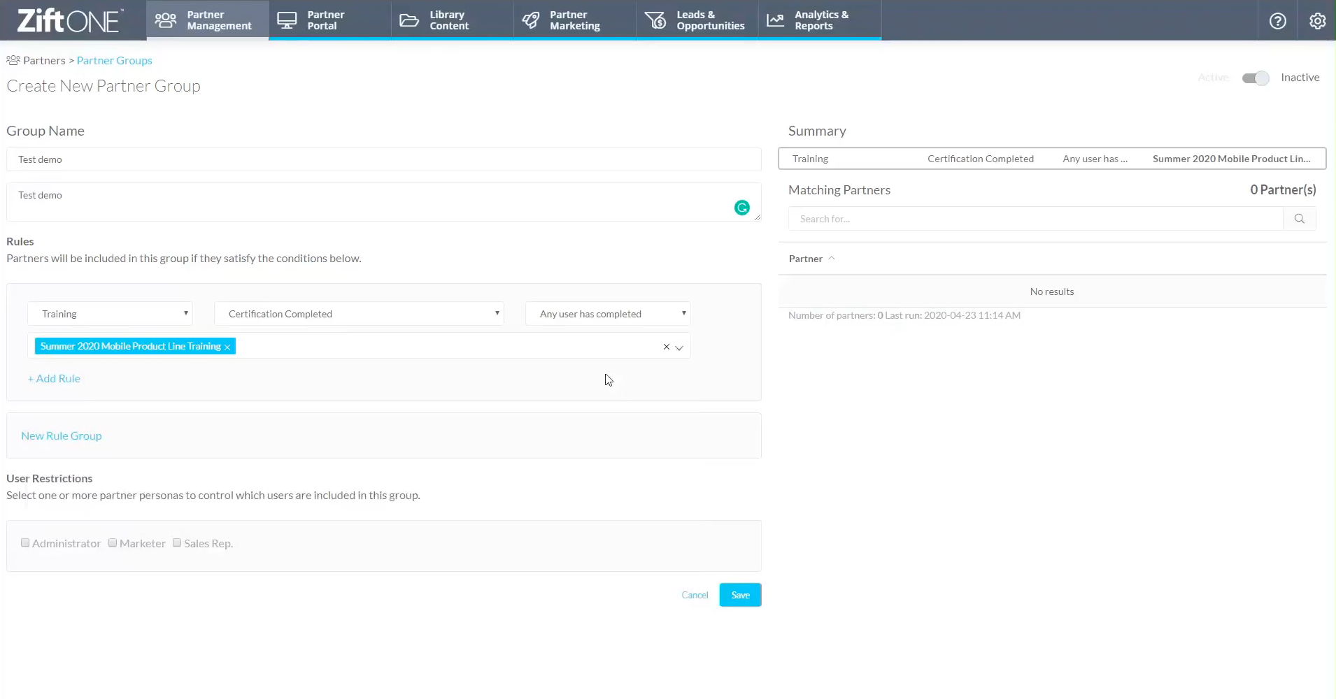
- Allow Zift’s users to create, manage and onboard their partners through Zift’s internal system
- Integrate newly acquired services to new ZiftONE platform system by creating matching UI sets
The Process
Research
To combine three different platforms, I needed a better understanding of past user interaction from all the platforms involved. So firstly I interviewed Customer Service teams from both Zift and PRMS. Elastic Grid’s Blueprint Editor was a familiar platform, so I already knew its problems and needs. I asked the following questions;
- What are the most frequently asked questions during client calls?
- What is the onboarding process for a new client, and what do you go through?
- Has there been a steady feature request from clients within the last three months?
Zift
Customers were facing a substantial learning curve with the UI. Many customers often had issues setting up their campaigns and could not use the site builder if they did not have much coding skills. Most frequently asked question was “Where do I go to create campaigns?” Zift had extensive documentation on ‘how-tos’; however, this meant the platform did not have any automation in onboarding its users.
Relayware
For PRMS customers, they had integration issue. While they had an extensive partner management system, vendors(users) often had channel marketing platforms that did not integrate well, resulting in a lot of manual work. Most frequently asked question was “How do I integrate this with my current channel software?” and “How do I migrate my partner list from this platform?”
The solution
After the interview, the solution was simple. What Zift lacked was cleaner UI and better UX for its platform. In terms of its functionalities, it was quite extensive. After clients have overcome the learning curve, they had no issues running their campaigns. And if Zift’s code based site builder integrated with Elastic Grid’s Blueprint Editor, users could gain an accessible landing page builder that does not require any coding skills. Furthermore, because Zift Marcom already had an extensive client migration system which resolved one of Relayware’s most significant issues. Therefore, I concluded that this project was almost like a reskin project on a bigger scale. All three of the platforms (Zift, Blueprint Editor, PRMS) were already live and running; it was just a matter of combining them seamlessly.
Navigation and dashboard
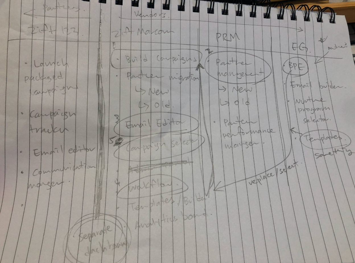
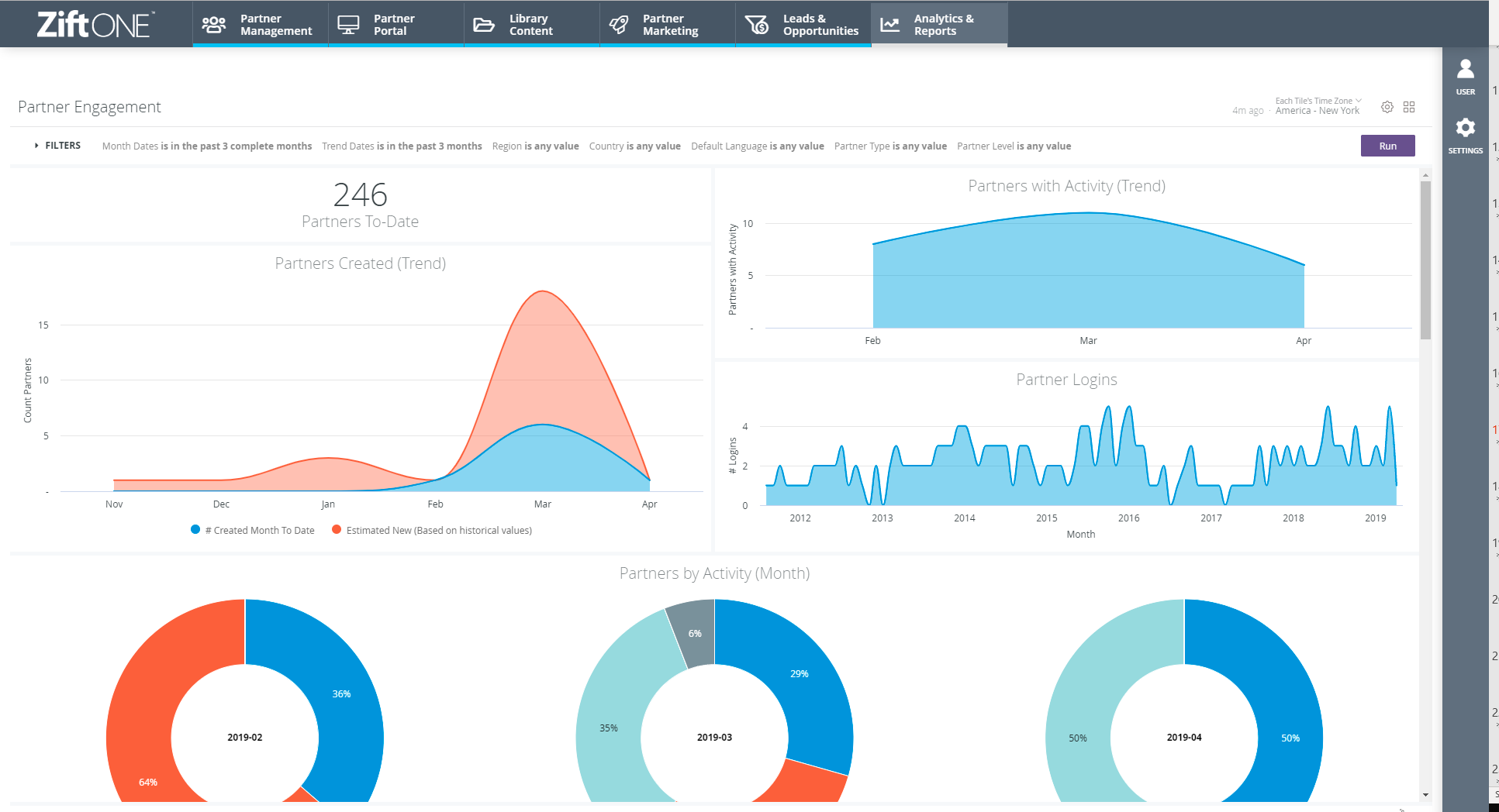
My design principle is always function first. If the product is not functional, the design is unsuccessful. To get all the functions in order, I listed every possible feature offered by ‘ZiftONE’. Referencing heatmaps and feedback from CS team, I worked out top 5 functions users are looking to do on Zift’s platform;
- Build campaigns
- Partner management
- Build emails
- Build workflows
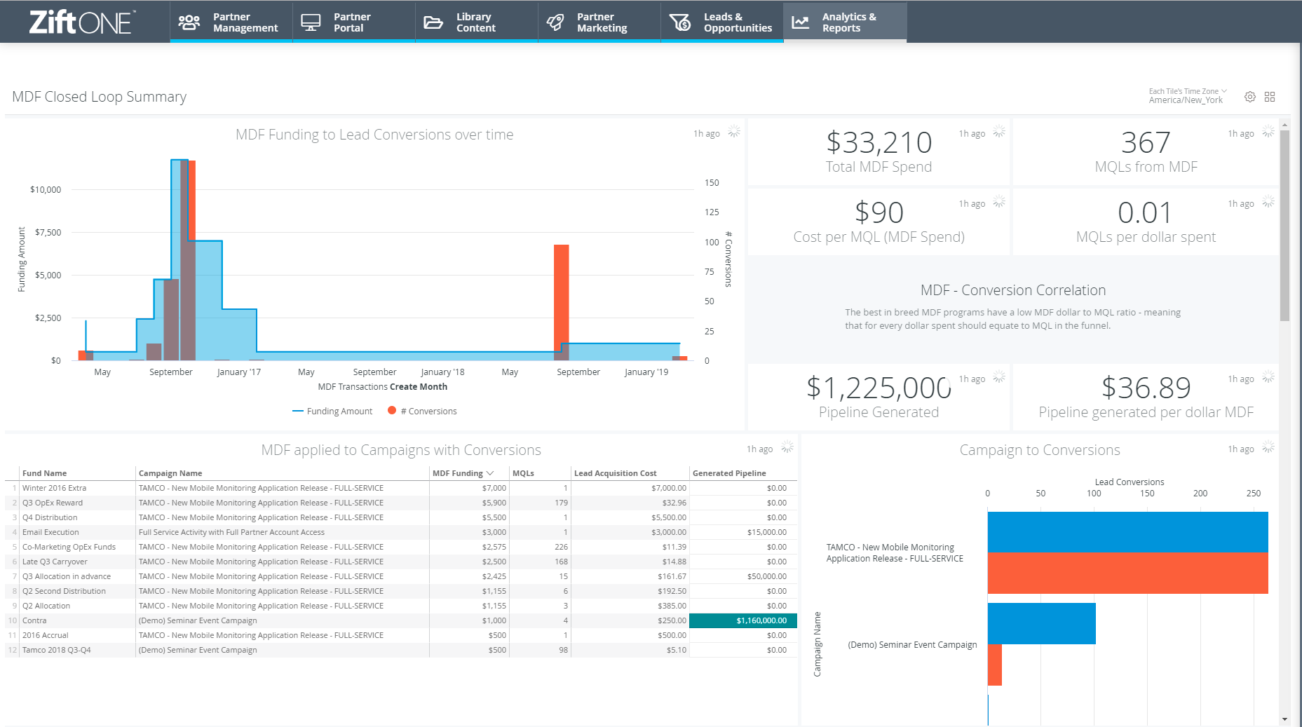
- View campaign analytics
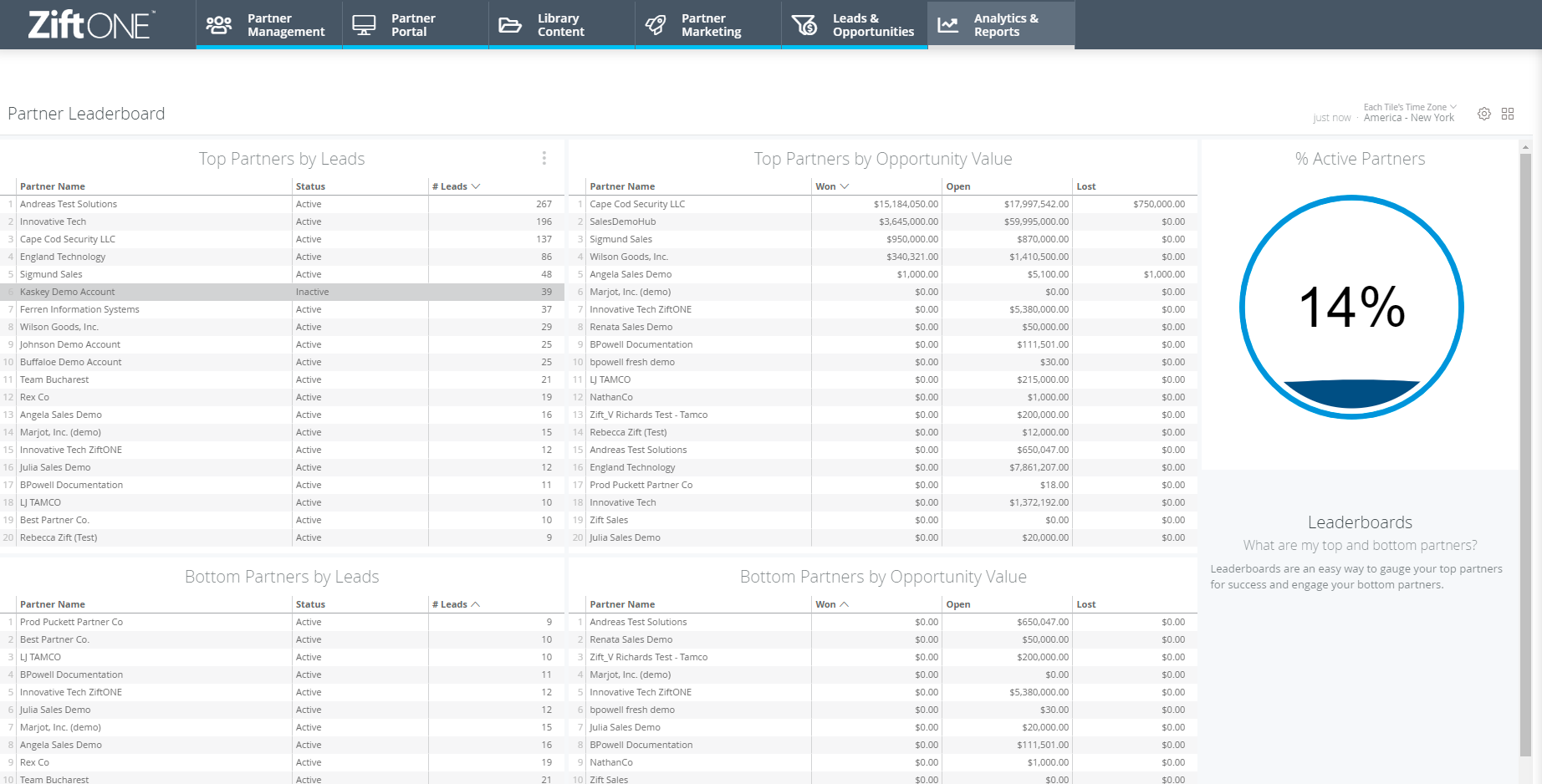
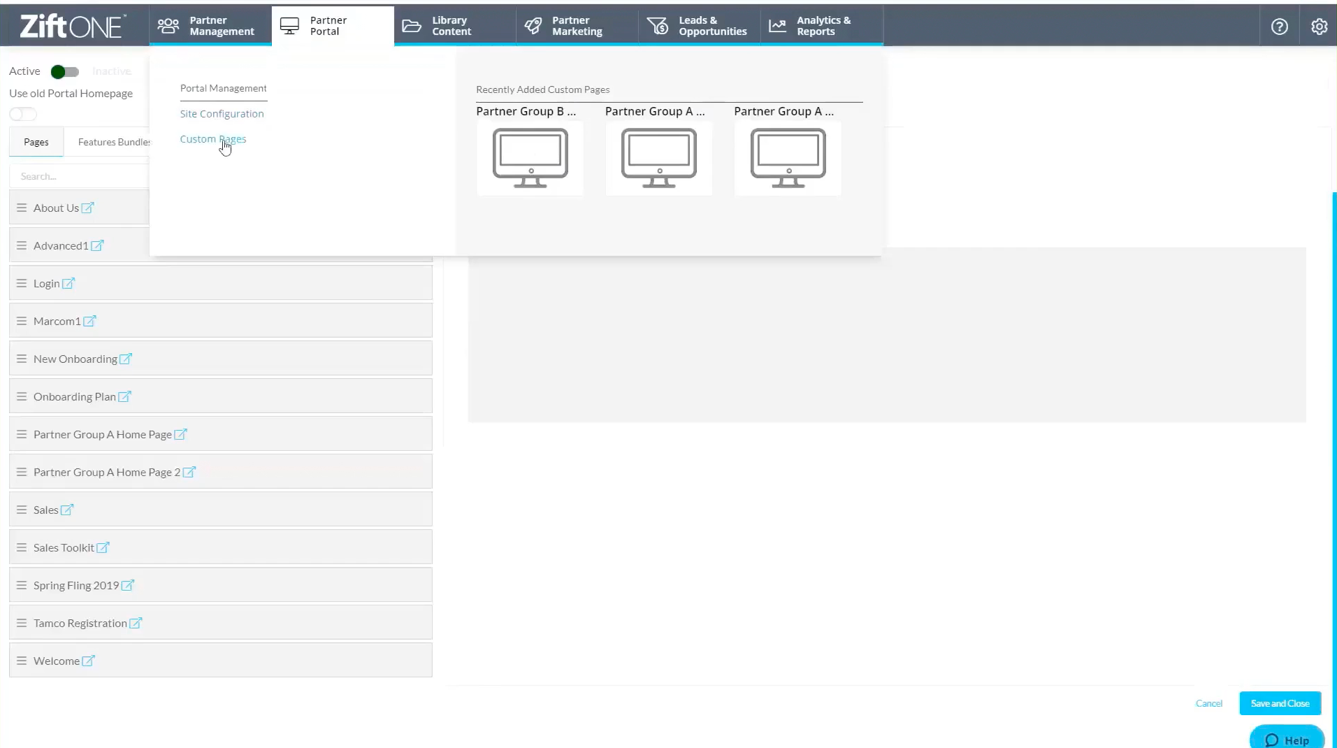
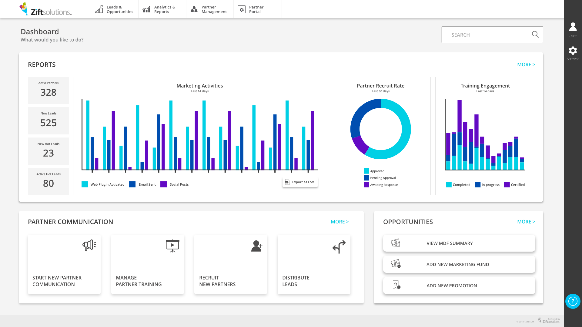
Out of those five items, three fit under campaign management. Starting with Campaign management, Analytics and Partner management as top three items for navigation, I proposed Digital asset library to be a navigational item. After a stakeholder meeting with relevant teams gathered, four navigation items increased to 6, including Lead management and Partner portal link to improve accessibility. With these principal functions, I drafted a dashboard and navigation highlighting top 3 functions – build campaigns, partner management and quick access to analytics.
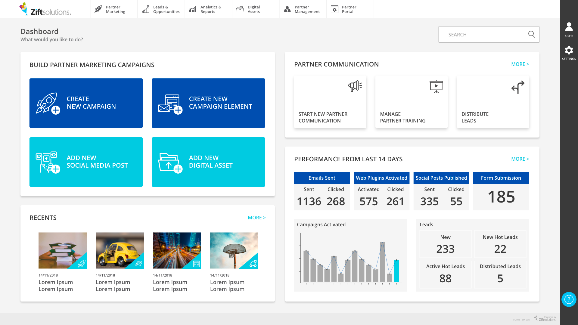

UI components
After creating the dashboard (the most challenging part in any product design), the rest of the pages and the UI came quickly. I developed a UI system consisting of buttons, colour schemes, card layout rules and typography rules.
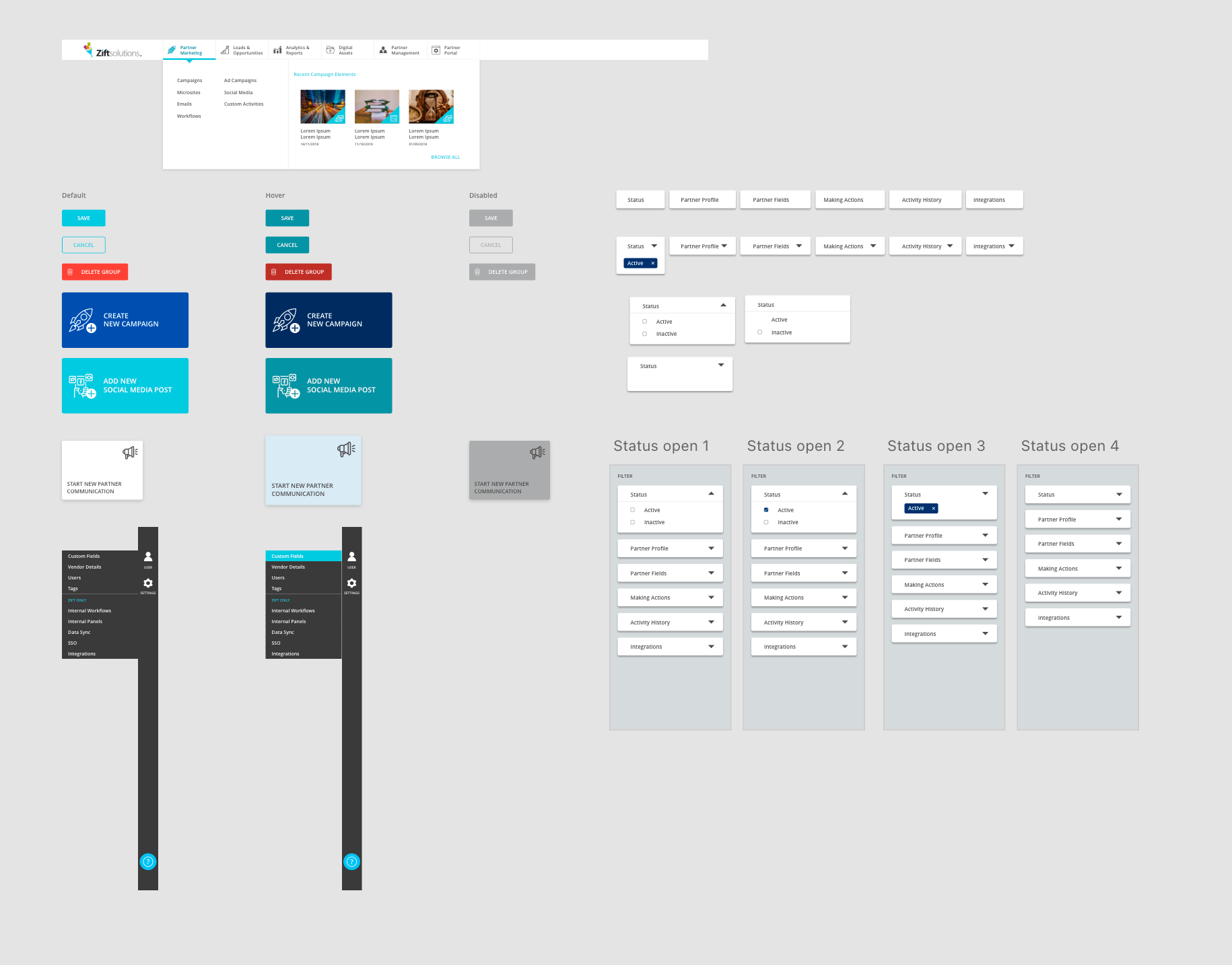
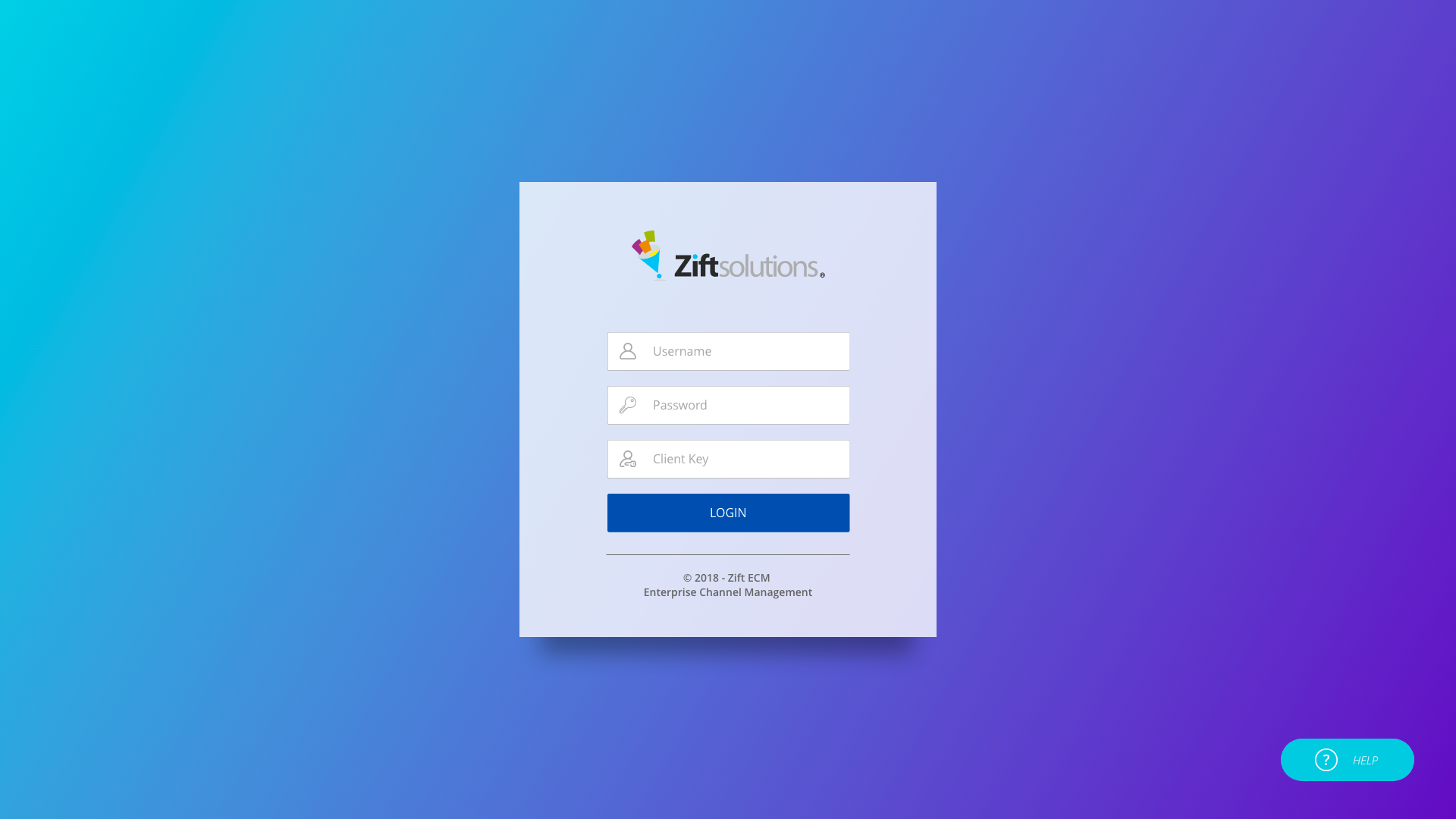
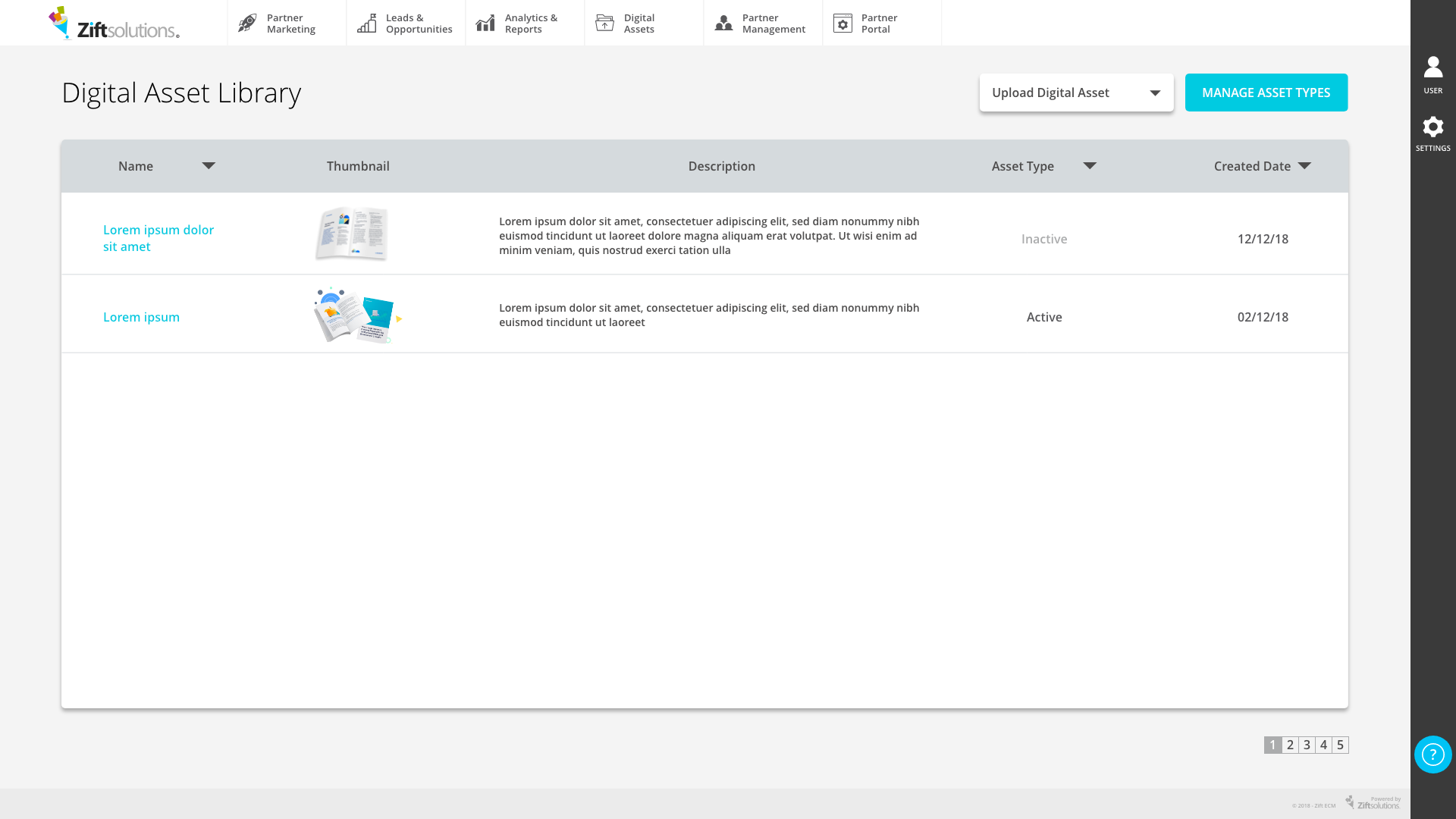
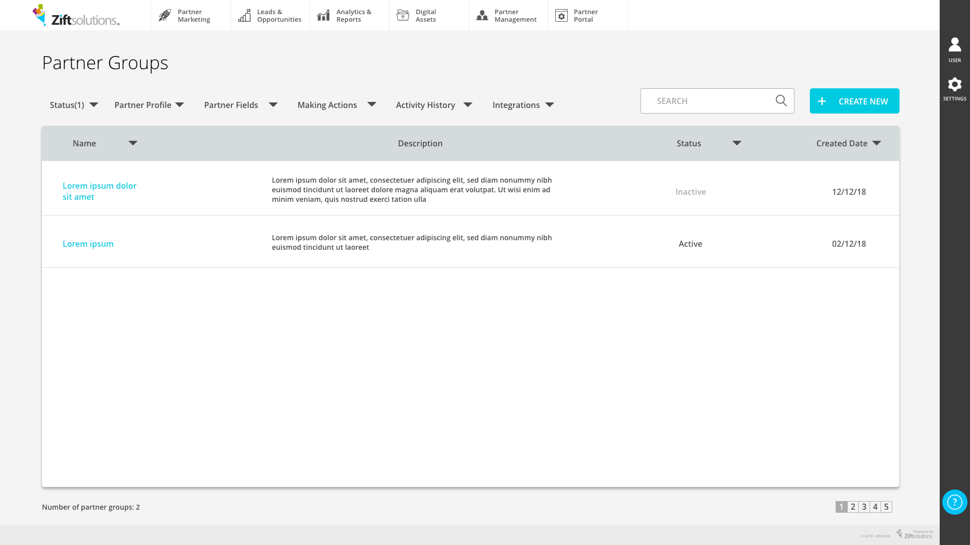
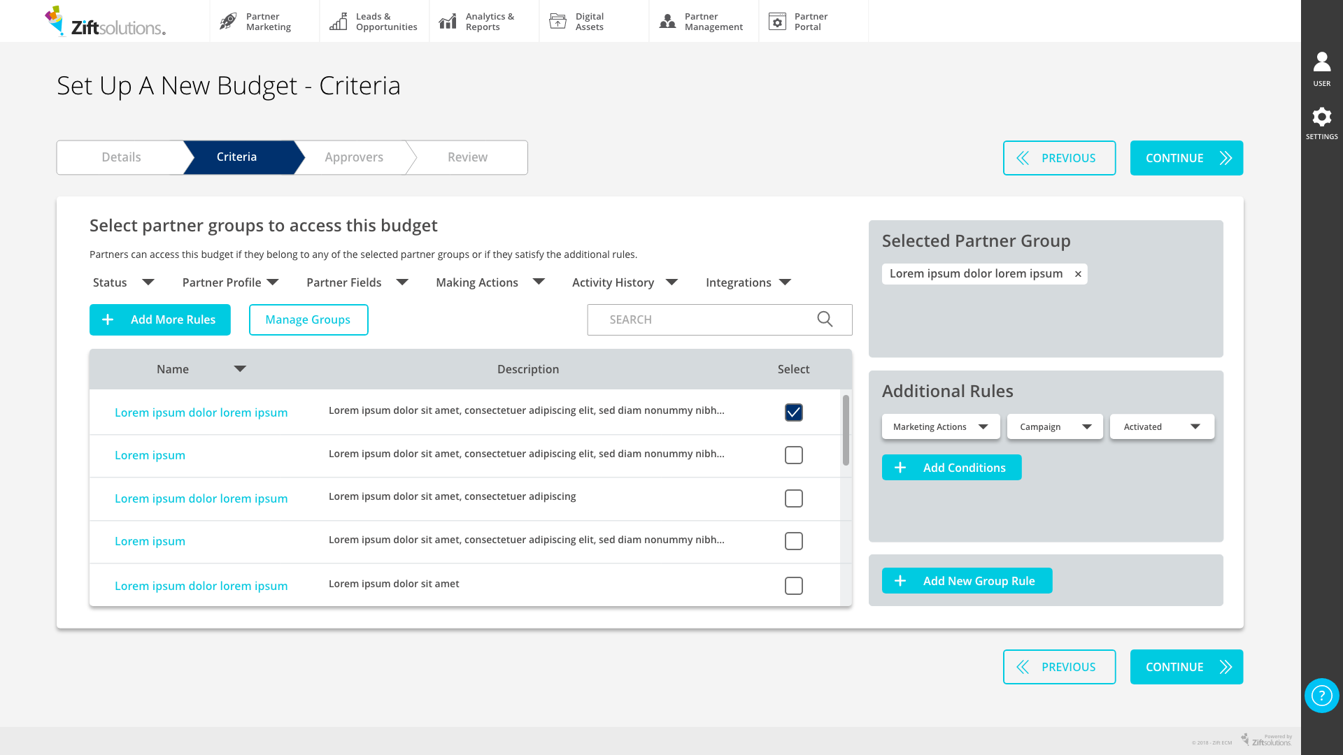
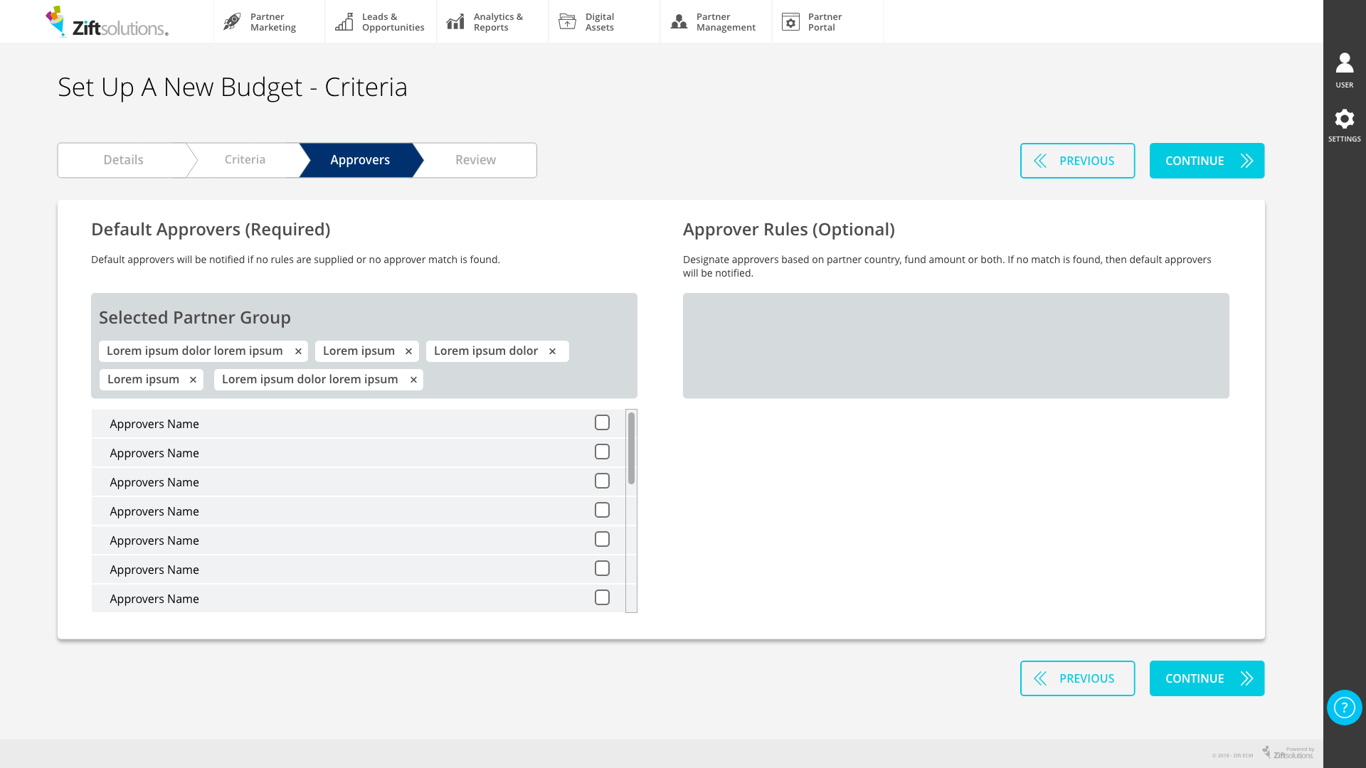
I sent through a mid-session handover to our product development team for the design system build with all components developed. This was to reduce project timeframe and also to avoid design becoming the bottleneck. As many pages were just a matter of reskinning the existing, the dev team could finalise 30% of the build with minimal design involvement over seven business days.
Outcome
After the soft launch, feedback from internal team and a small group of clients who signed up for beta release were very positive. Both the internal teams and test clients were able to use the platform straight away without an onboarding session which was a must for previous Zift systems. Previous employees of Relayware were also able to recognise and use the Partner Management side of the platform without any difficulties. They were even able to use the campaign launcher from Zift’s side because UI could show them how and where to click. ZiftONE project’s duration took just over 12 weeks; 8 weeks for design and 4 weeks for the build. The biggest challenge was the communication between the development team and me as they were in North Carolina in the US, and I was in Sydney, Australia. The time difference made it very difficult to answer their questions, and the dev team missed asset package (icons and other images) I sent through email. I often had to answer calls and attend meetings at 1-2 AM, and even then, stakeholders made decisions through discussions without communicating to Sydney office. Lack of communication and time difference made was a big obstacle for this project. Although it was challenging, ZiftONE successfully made a soft launch in February 2019. I learned the importance of communication and sharing correct work processes when working remotely from this project.
