Lawpath eSignature on Mobile 2020
Programs used



Overview
Project date/duration - 6 weeks, Jul 2020-Aug 2020
Lawpath is Australia’s largest online legal platform for businesses and individuals. Legal documents are one of Lawpath’s core services that acquires 70% new users. However, as 90% of legal documents require signatures, Lawpath did not provide a complete cycle for completing legal documents. To address this concern and to increase product value, Lawpath launched Lawpath eSignature in late 2019.
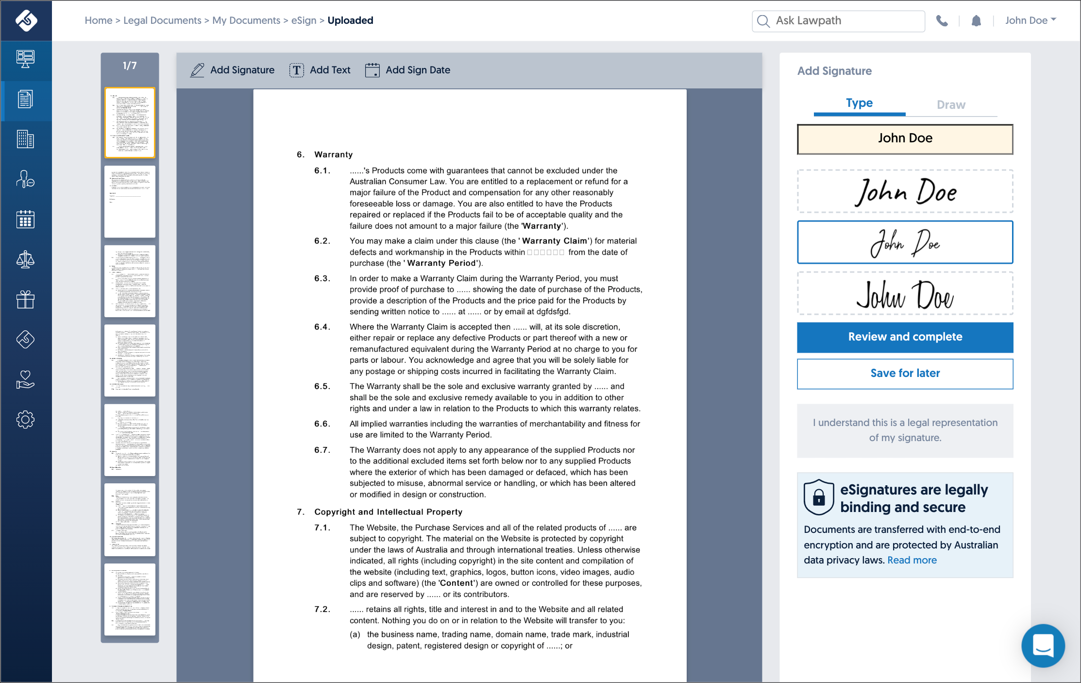
This launch increased platform usage of existing users by 10% and when ‘Request eSignature’ feature, where users can send a document via email to another user(s) to request signature(s), launched two months later, there was a 20% increase in new user sign-up. eSignature was not responsive at this point. Six months after launching Lawpath eSignature, our team noticed the growing demands for eSignature to be available on mobile devices. One of the reason is that more users are moving to mobile devices to receive and open emails. According to eMailmonday’s article ‘The ultimate mobile email statistics overview’, “47% of people use a mobile device to check an email campaign on average, while 26,9% uses desktop and 26,1% uses webmail” and “81% uses a smartphone for regularly checking emails. 21% uses a tablet.”. This was also evident in Lawpath statistics. Compared to 2018, both mobile and tablet usage increased by 5%, making a total of 21% of all users.
Lawpath’s ‘Request eSignature’ feature works via email communication where the recipient received a secure link to Lawpath platform. Without this link, the recipient cannot access the document; however, because Lawpath eSignature tool was not available on mobile, signature completion rate fell from 95% to 87%.
My Role
I was a part of the product team and responsible for the experience, strategy and design of both Lawpath platform and website. I was to lead the UX and produce UI elements. I worked alongside CTO, Tech lead, CMO and CEO(the product owner).
The Challenge
When this project started, Lawpath eSignature has already been running for over eight months. Although we had to make small UI and UX adjustments during eight months; our users had no significant issues overall. While the tool has proven to be usable, eSignature request completion rate recorded at 95% earlier in the year dropped down to 87%. To replicate the same experience for mobile as the desktop version, there were several technical issues we had to overcome. Firstly, the signature is placed on documents based on a geometric calculation of fixed viewport size of the document. To make this mobile responsive, this calculation will have to be redone and become flexible. Secondly, there are two other panels; page thumbnail panel and Add Signature panel; however, as mobile screens are much smaller, we needed a different method to display both without getting in the way of actually placing signatures. Lastly, this project was scheduled without any design time. This was because the stakeholders believed making an existing tool responsive should not be too difficult, and hence, it did not need any further design work involved. So I was assigned another project while the dev team began to work on making eSignature mobile responsive. However, even though I was not given any time to go through this project’s design process, the dev team frequently asked for quick UX and UI advice. I could not answer most of their questions, which caused a significant disruption in my work and work.
The Goals
- Make eSignature mobile responsive
- Provide the same sending and receiving experience as desktop
- Ensure signature, text box, and date box placements are accurate
The Process
Dev lead design
Unlike our standard process where design comes before the build, this project was lead by developers. As mentioned above, the stakeholders believed making an existing tool responsive should not be too difficult, and hence, it did not need any further design work involved. So I was assigned another project while the dev team began to work on making eSignature mobile responsive.
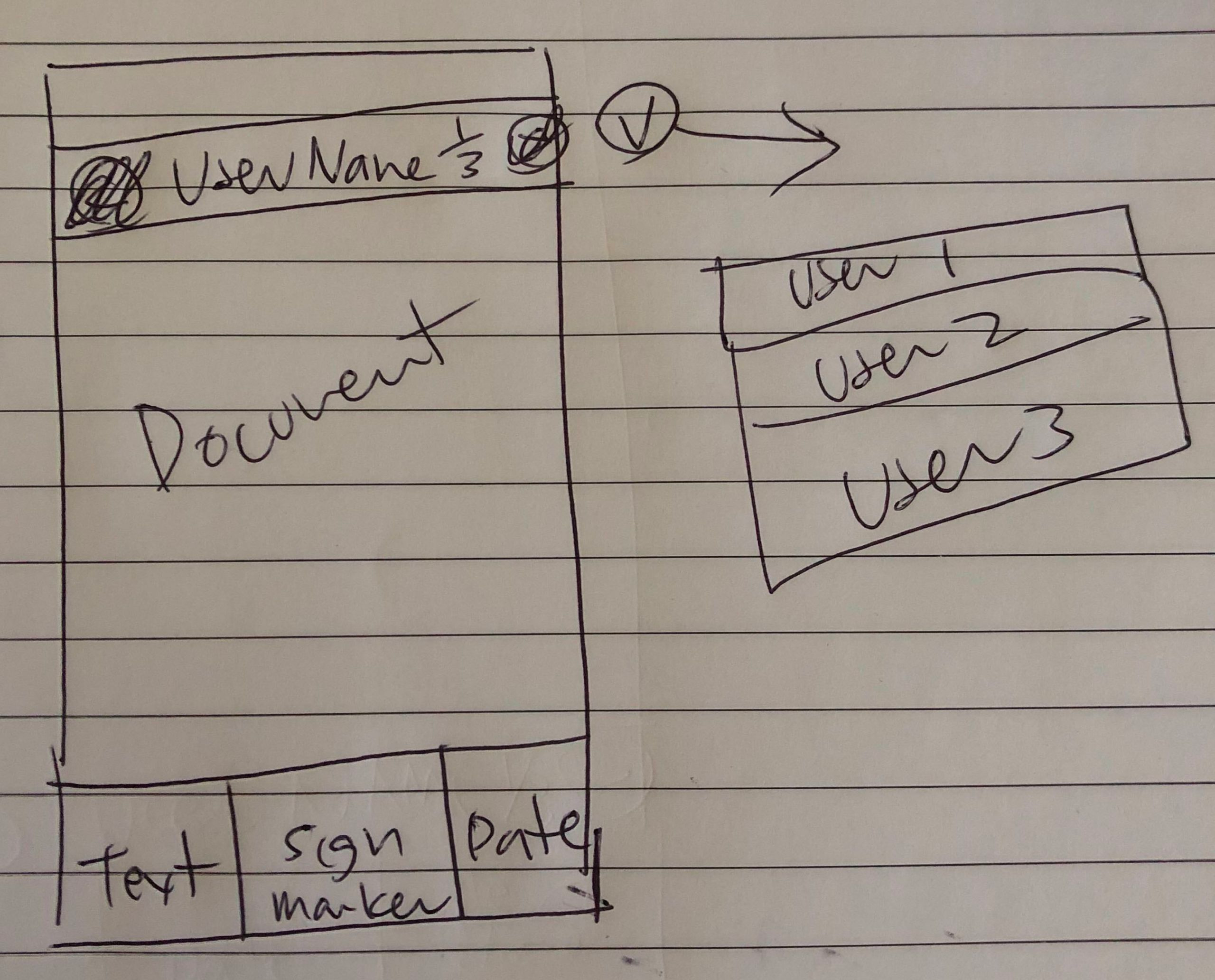
Quick UI sketch I’ve done for the dev team
After four weeks of dev work, the tool could function; however, it was not usable. This was due to the lack of proper consideration of UI and UX. I have advised on the process to help, but my solutions were band-aid solutions that did not assist with the tool’s fundamental problems. Even then, the stakeholders refused to assign proper design time for this project. With the launch date coming up in two weeks, the product was not looking launch-able at all. So I decided to work on this project after work hours.
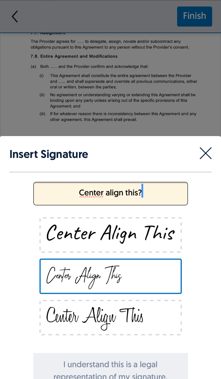
Bad alignment
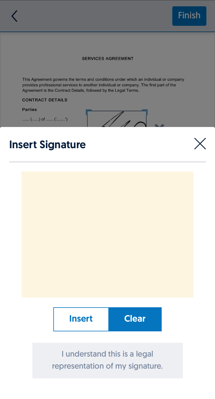
Wrong use of primary and secondary button, also buttons were too small
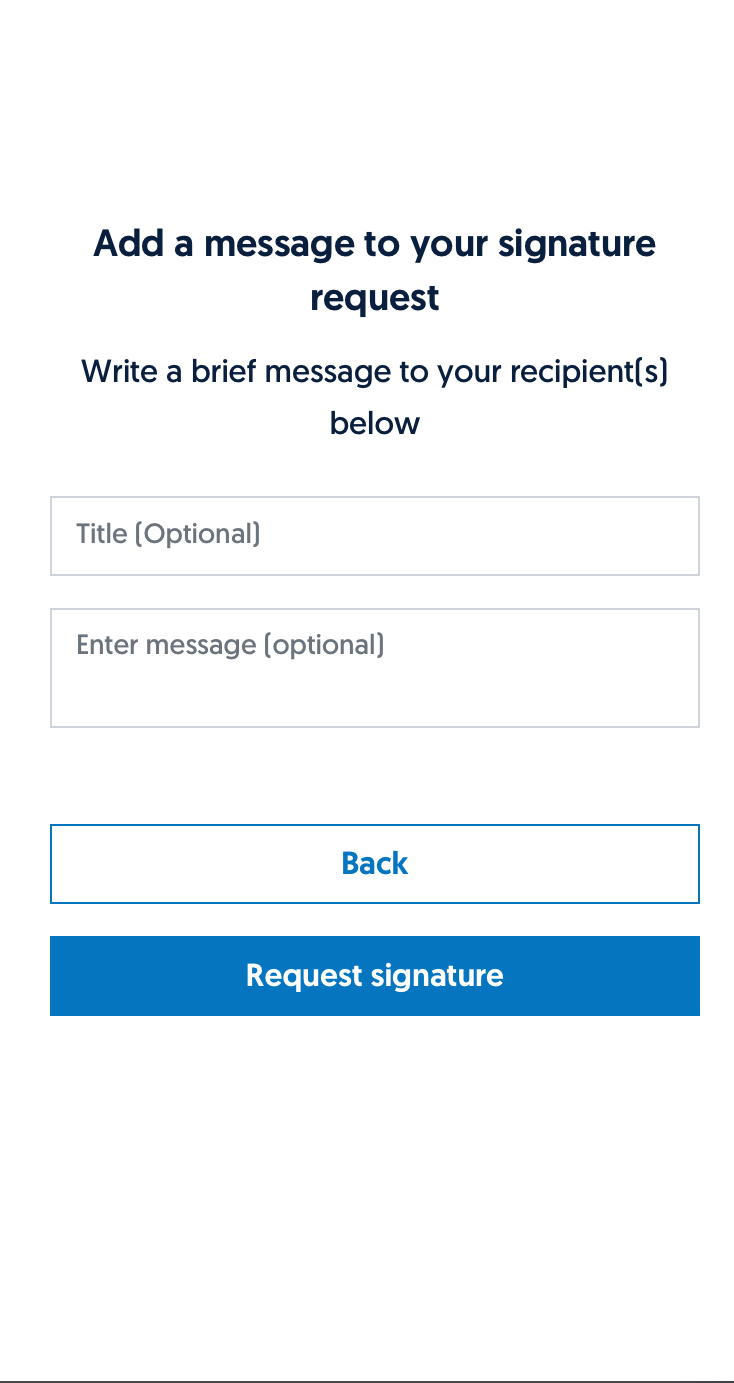
Too many buttons making it difficult to understand
Wrong placement of primary and secondary buttons
Document is cut off
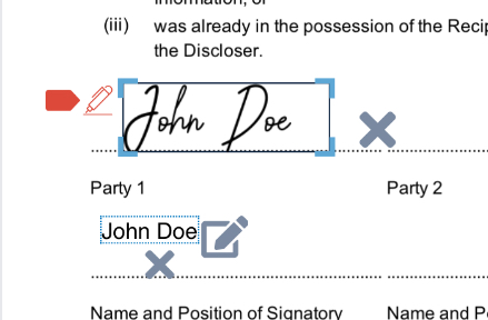
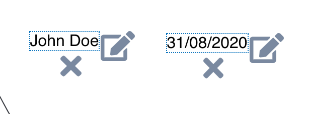
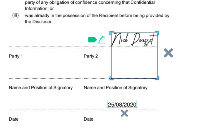
Signature, text field and date field issues
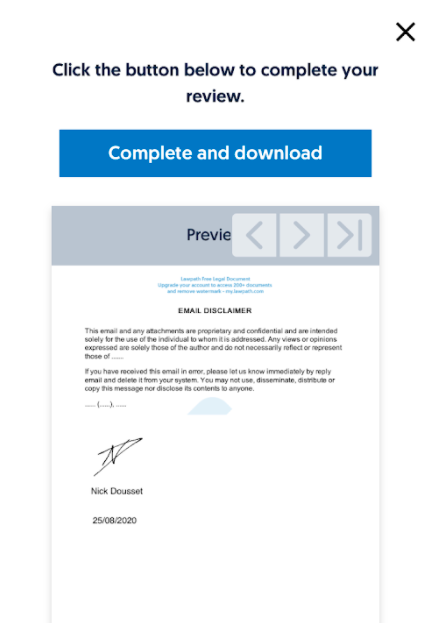
Preview text is hidden under buttons
Loading animation modal is cut off
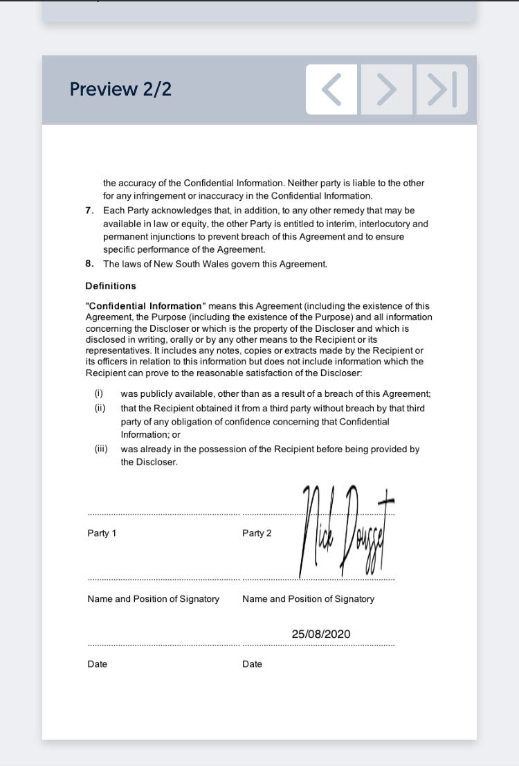
Signature stretched out after exiting eSignature tool
Redesign
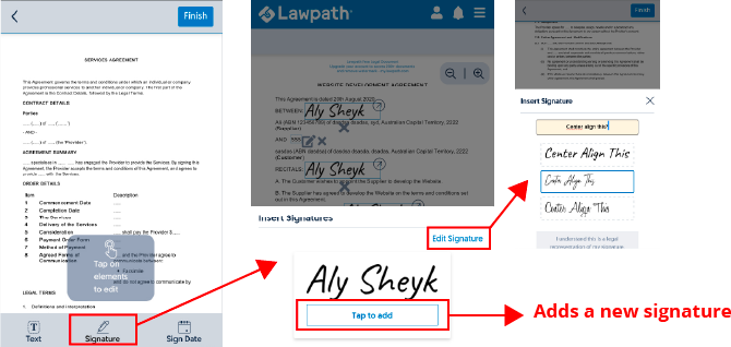
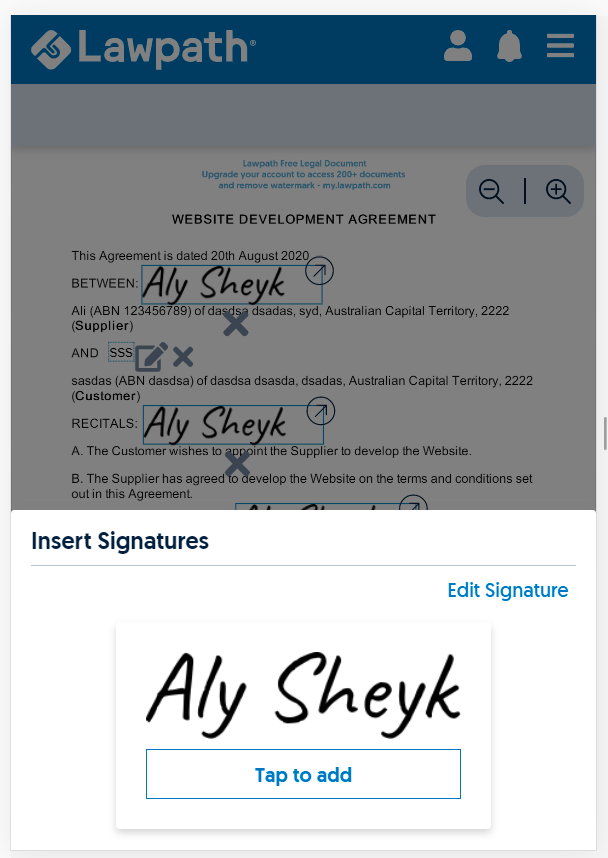
Old flow of adding or editing signatures
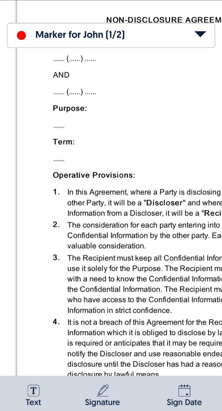
After reviewing existing dev work, I reworked the interaction first. The current process of adding signature was too complicated. The users had to go through 3 different taps to add a signature even if they already had a signature they used before. To reduce these steps to allow the users to add signatures, I changed the flow to add a new signature when a user clicks ‘Signature’ button and to click on placed signature to edit the signatures to a different look.
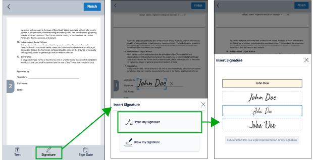
When adding a new signature
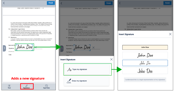
When editing existing signature/adding another signature
After design mockup was complete, I tested this mockup on both my iPhone and my iPad. From my experience, the interaction was more comfortable and more straightforward to use. With a bit more confidence, I updated adding and updating text and date field interaction to be the same. To validate this design, I sent Xd mockup link to a friend who was also a UX designer to conduct a quick user test. I asked her to do the following actions:
- Add a signature
- If typed the signature, change the signature to drawn signature or the other way around if drawn signature at first
- Finalise document after placing a signature
Outcome
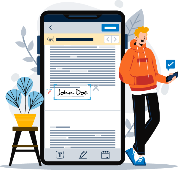
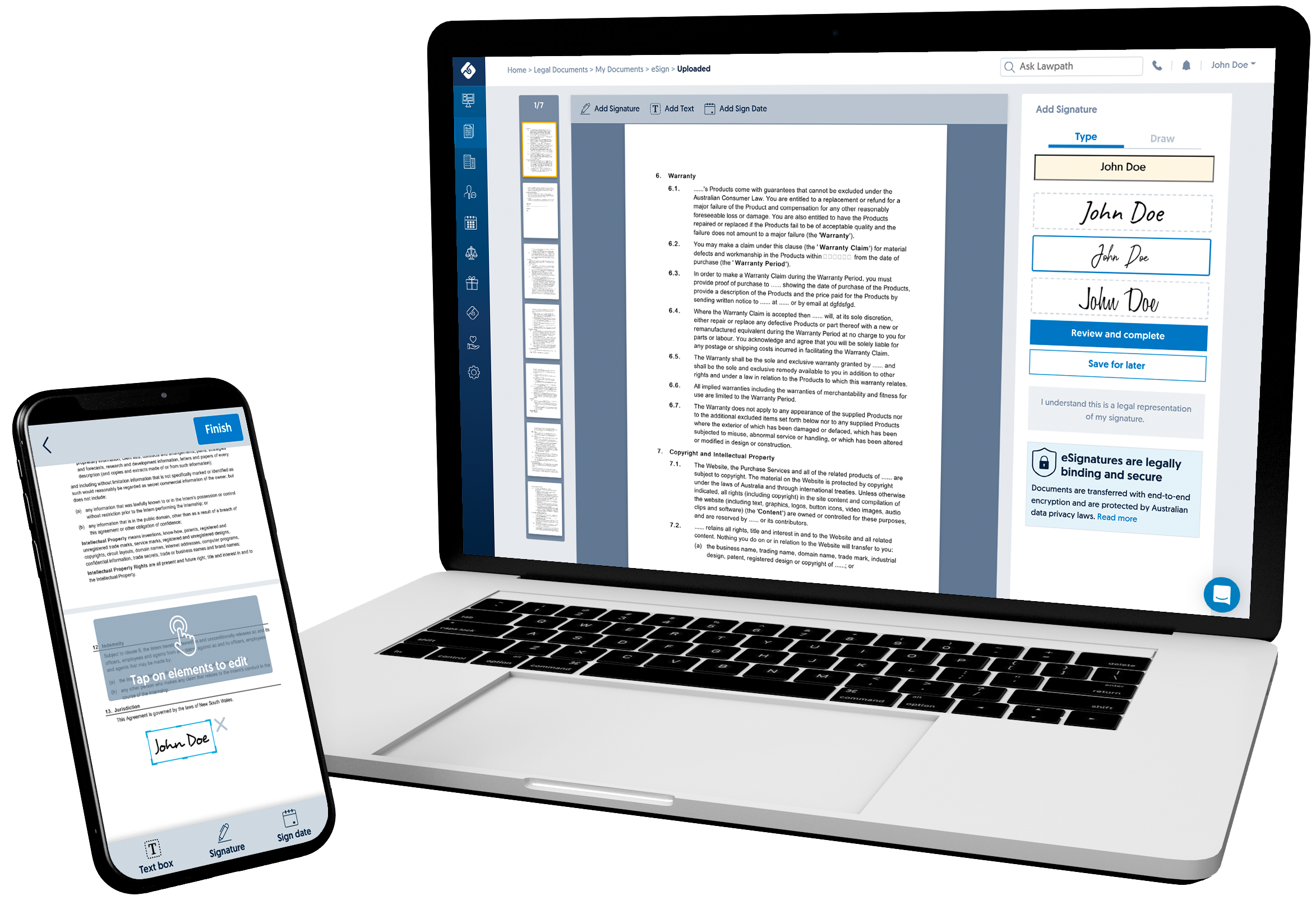
Illustration used for eSignature on mobile promotion
I submitted a finished design mockup for team review. The feedback was positive, so I leveraged my design mockup to create fix tickets. The dev team spent remaining two weeks fixing front-end for UI issues and updating eSignature flow as the design mockup. During this time, I worked with our marketing team to promote an update for our eSignature tool so the emails and social banners could be sent out on the day of eSignature on mobile launch. After three months after the release of eSignature on mobile, the total completion rate for eSignature documents has grown to 116.15%. The overall mobile users have increased by 6.76%, where 10% of those new users are from eSignature mobile. This result boosted our total new user sign-up within those three months by 10%. Although this project was not an easy project with time restraints and had conflicts with stakeholders, it was a good learning experience for me.