Lawpath document builder 2020
Programs used



Overview
Project date/duration - 6 months, Jun 2020-Nov 2020
Lawpath is Australia’s largest online legal platform for businesses and individuals. Legal documents are one of Lawpath’s core services that acquires 70% new users. Many users who signup to Lawpath is to use their free document received upon registration. Hence, legal document related services are our most frequently visited projects. Since Lawpath Reskin Project that ran between July 2019-Nov 2019 (for both website and platform), legal document service tools at Lawpath tripled with newly added Lawpath eSignature(12/2019) and Lawpath Document Editor(2/2020).
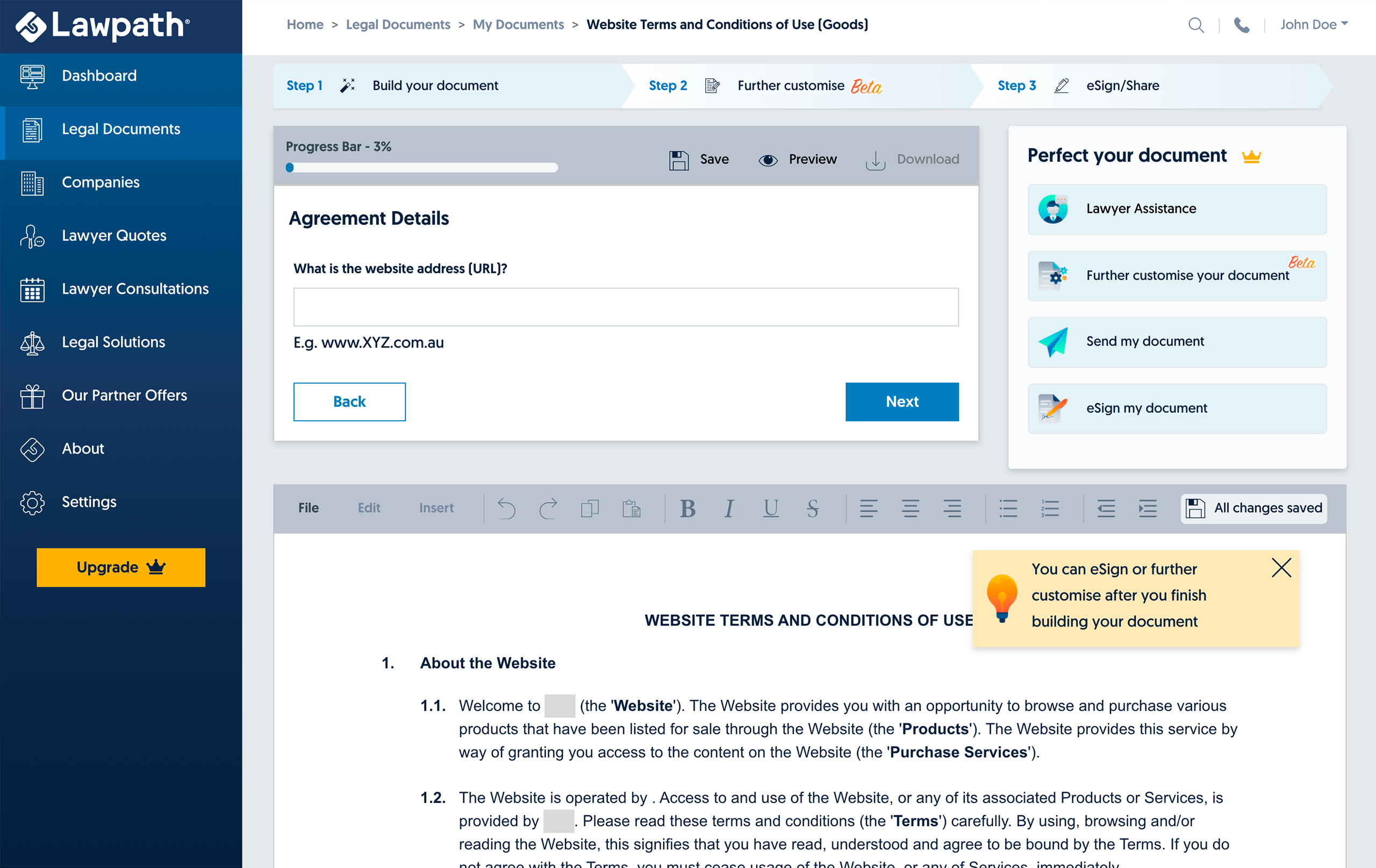
Lawpath Document Builder
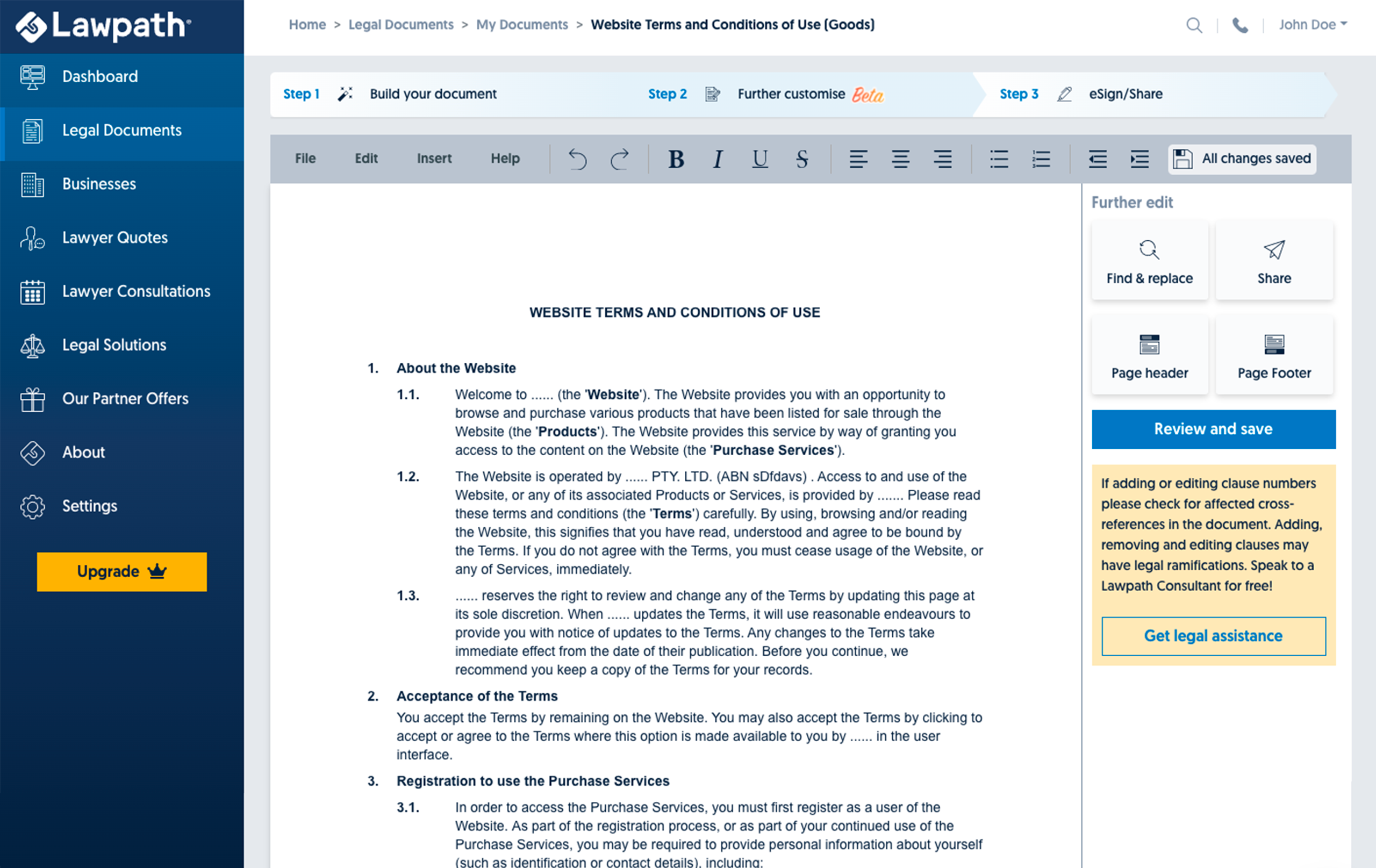
Lawpath Document Editor
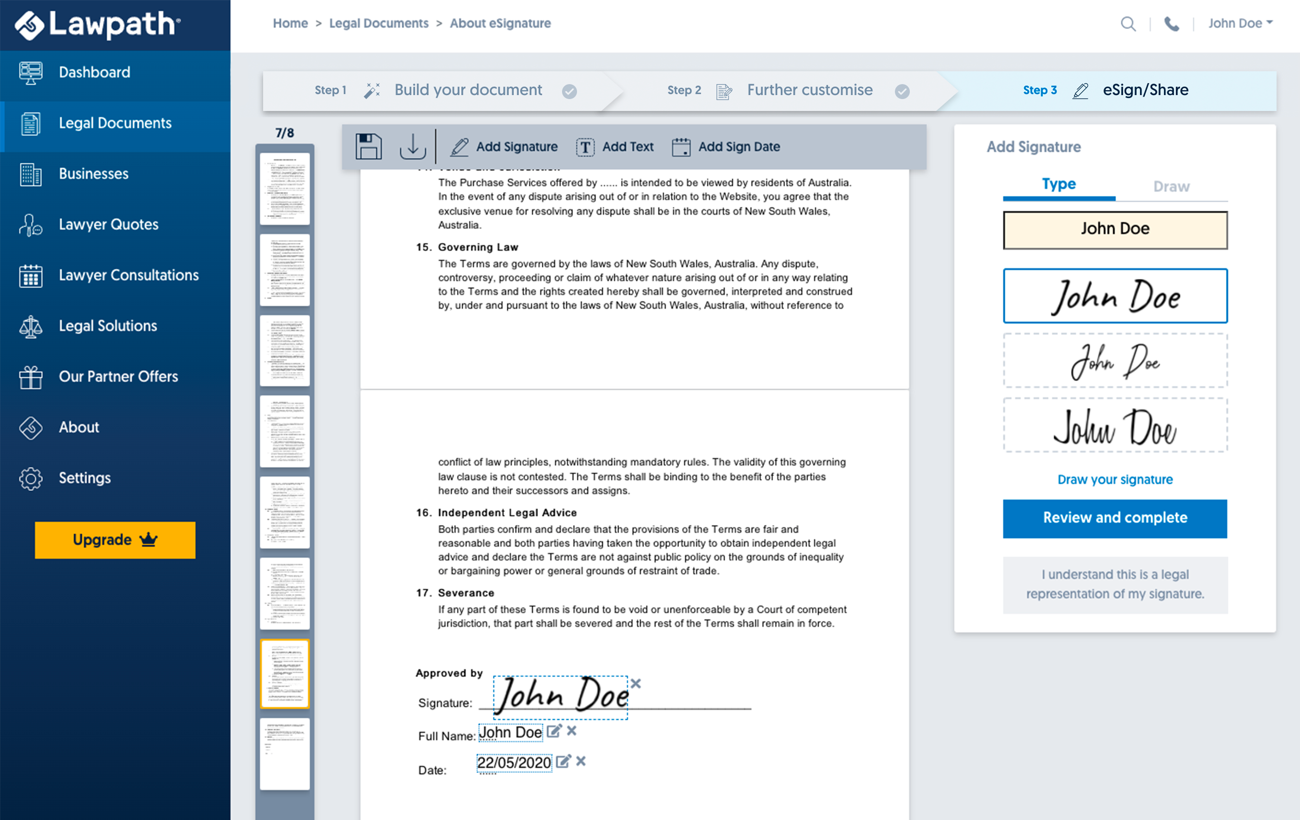
Lawpath eSignature
Lawpath Document Builder is a legal document builder where users can answer short questionnaires to build legally binding documents. Lawpath Document Editor is an HTML based text editor where users can edit their Lawpath Builder documents. Users can add headers, footers and make any other amends they required. This is a premium feature that requires a Lawpath subscription. Lawpath eSignature is an electric signature tool where users can sign or request signatures from others. Users can choose to eSign both Lawpath Builder and Editor documents or upload their own documents for eSign and eSign requests. This case study explores my design processes to update Lawpath Document Builder.
My Role
I was a part of the product team and responsible for the experience, strategy and design of both Lawpath platform and website. I was to lead the UX and produce UI elements. I worked alongside CTO, Tech lead, CMO and CEO(the product owner).
The Challenge
The document builder has already gone through a significant update during Lawpath Reskin Project in 2019(platform). However, the overall UI never changed from Lawpath V1 Builder where the questionnaire box sits at the top of the page, and document preview sits at the bottom, making the page a double scroll.
Before Lawpath reskin project 2019
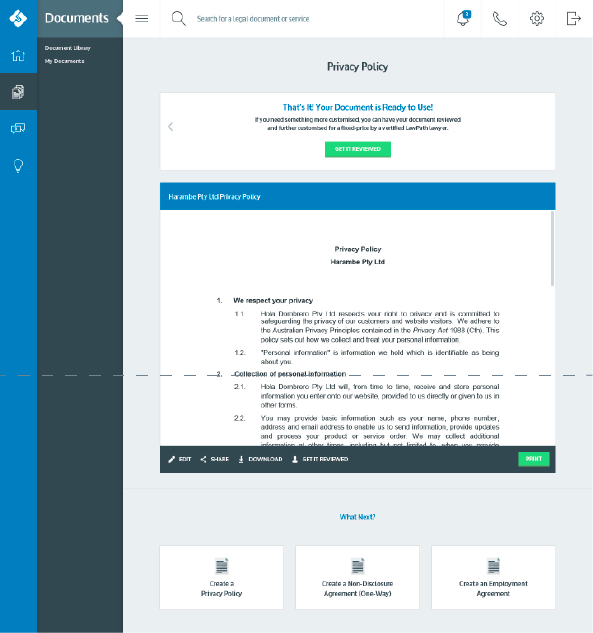
After Lawpath reskin project 2019
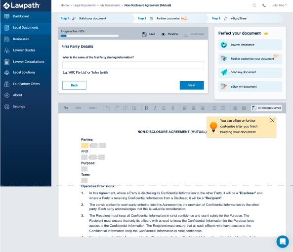
The dotted line is screen viewport cut off. To view the document, users had to scroll up and down.
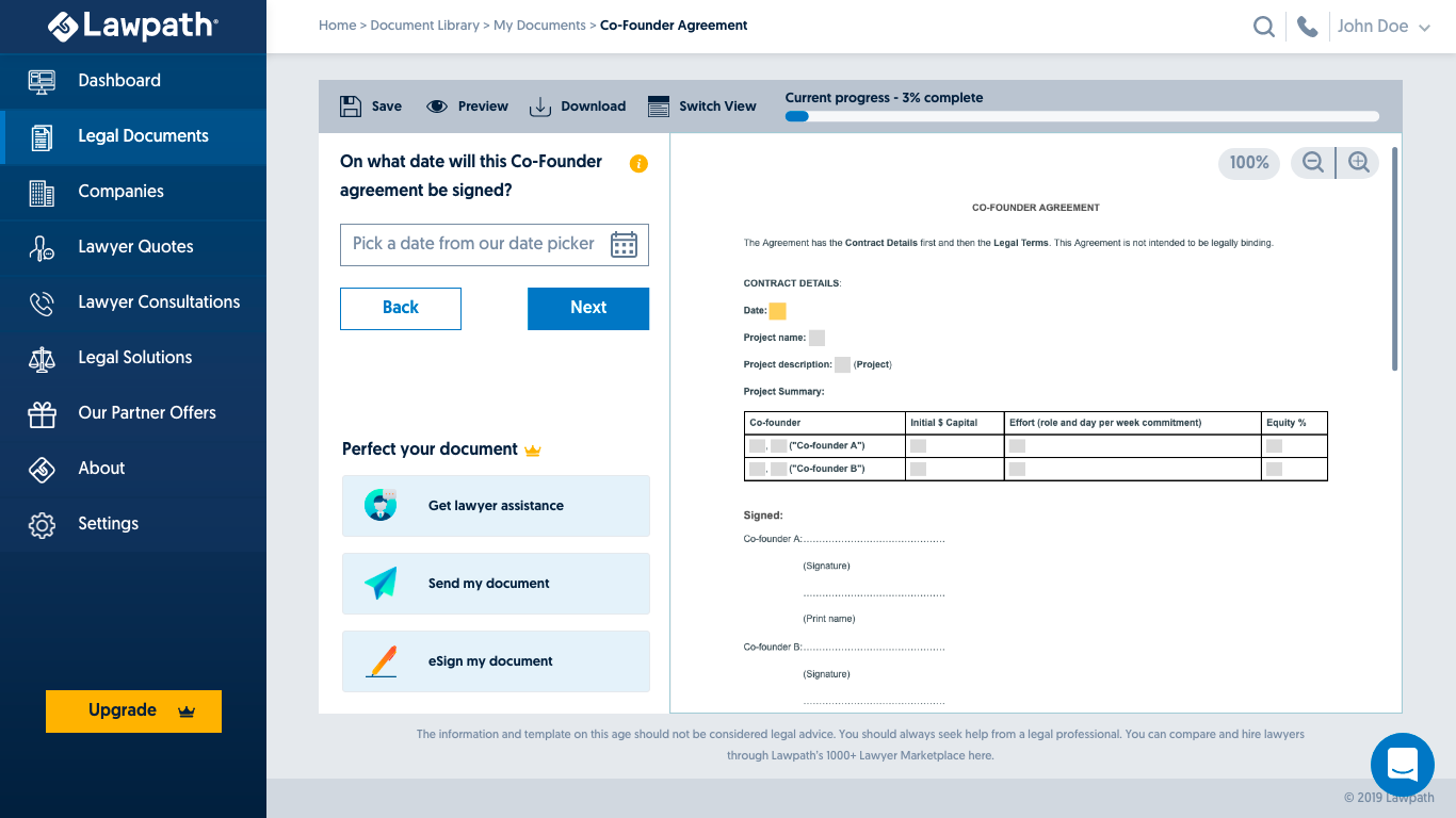
Proposed Horizontal Builder mockup during Lawpath Platform Reskin Project
I proposed a ‘Horizontal Builder’ where document and questionnaires sit side by side, removing double scroll from the reskin phase. However, our stakeholders were concerned for document preview becoming too small and might cause difficulties in older users to use the tool. There was also a resource issue. There were only four people in the product team, including myself, and the reskin project was to run for three months in total. Due to a lack of resources and other data to back up this change, my proposal was denied. However, the double scroll issue was costing us subscription of paid users. Watching user interactions from Fullstory(records and monitors user interaction on the platform), some users were struggling to fill out their answers because it was hard to see the document’s overall view and where their answers would sit. The Builder still provided a good experience but not great enough. Over 60% of new users would drop off during the document building stage, which was not good enough.
A New Proposal
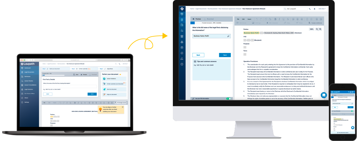
In May 2020, a new project was booked into our roadmap, ‘Pre-filled Answers and Common Answers’. This project aimed to pre-fill standard fields in Document Builder questions with information we have already collected from the user (i.e. Name and phone number) to reduce the user’s workload and help build the second document easier. Also, suggest common answers for predictable questions backed by accumulated data such as ‘How long is the provisional period?’ etc., once again to help our users build documents faster. PDCA (Pre-filled Answers and Common Answers) was an excellent opportunity to revisit the Document Builder’s UI. I first began designing PDCA mockups for our existing system; however, I also worked on a second design using Horizontal Builder design from 2019.
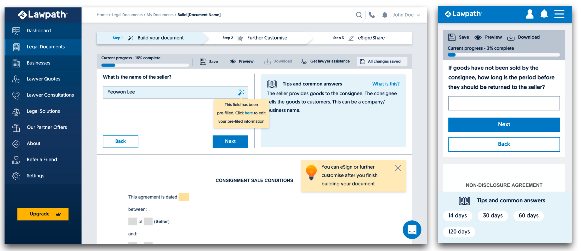
Original PDCA mockup using current settings
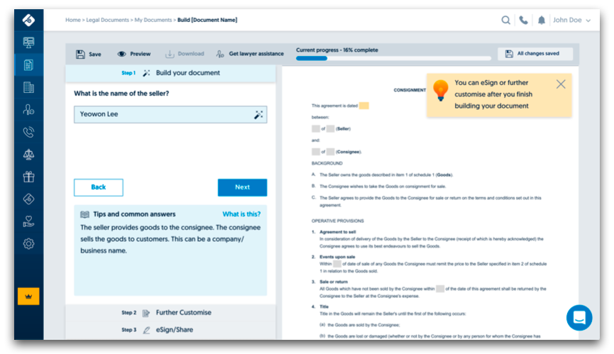
Proposed PDCA mockup
To avoid my past mistake of not having enough data in my proposal, I backed up my new Builder design with heatmap data, user tests, and competitor analysis.
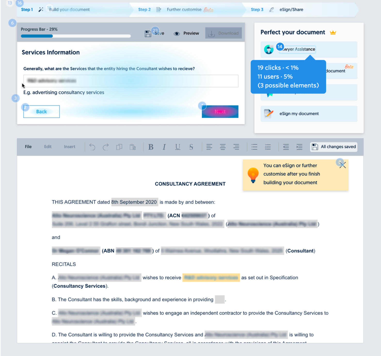
Heatmap information showing lack of engagement
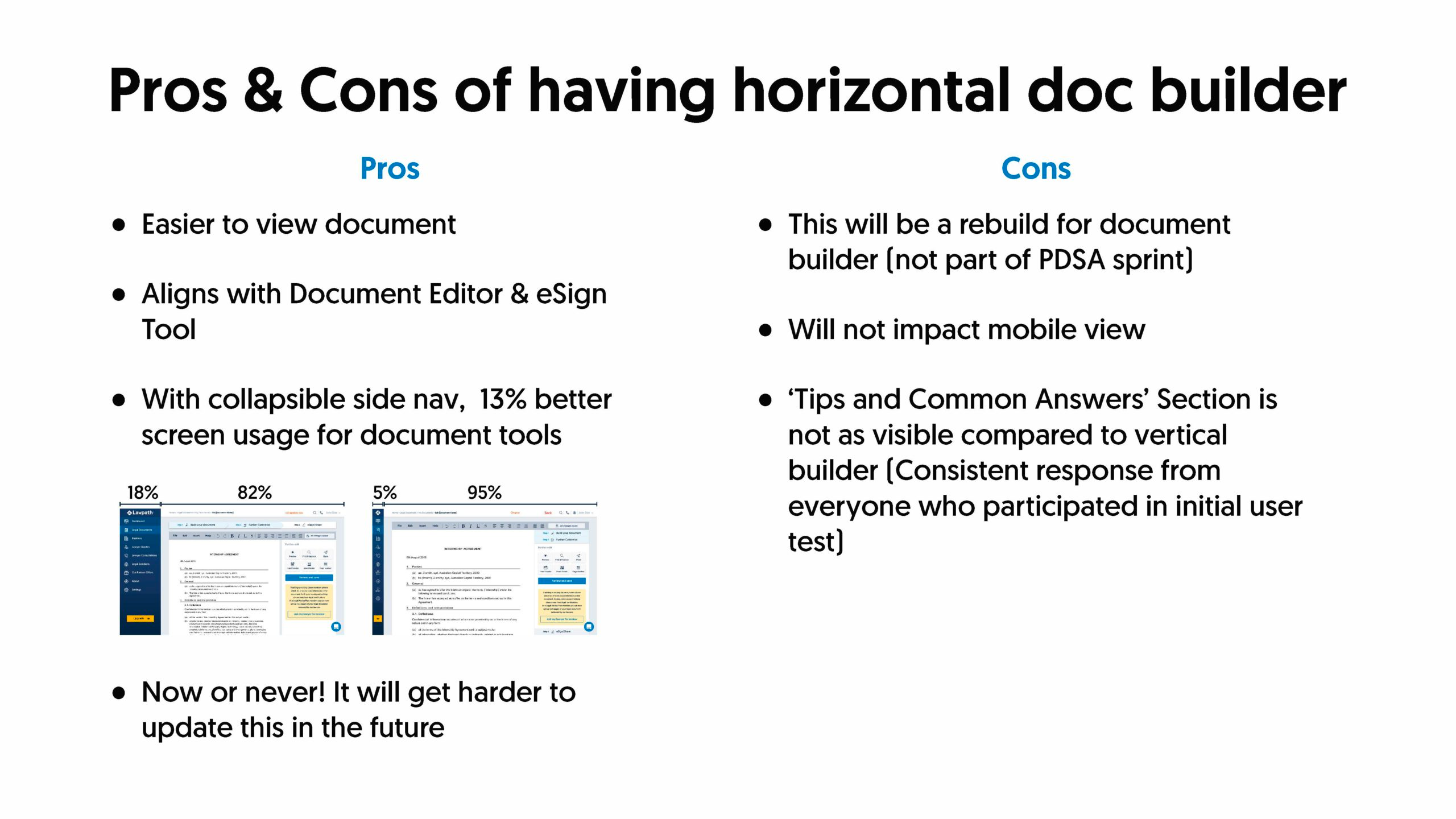
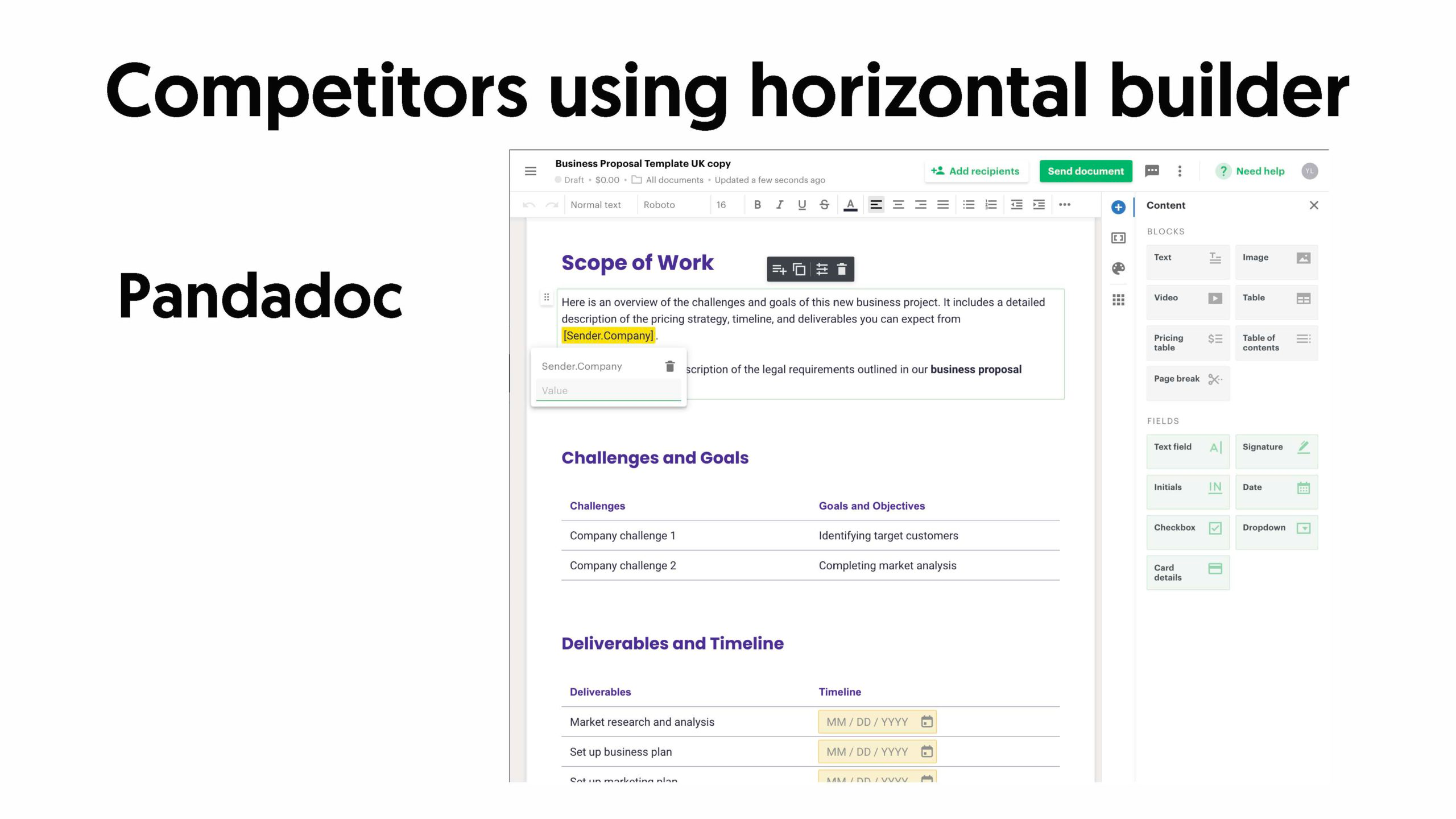
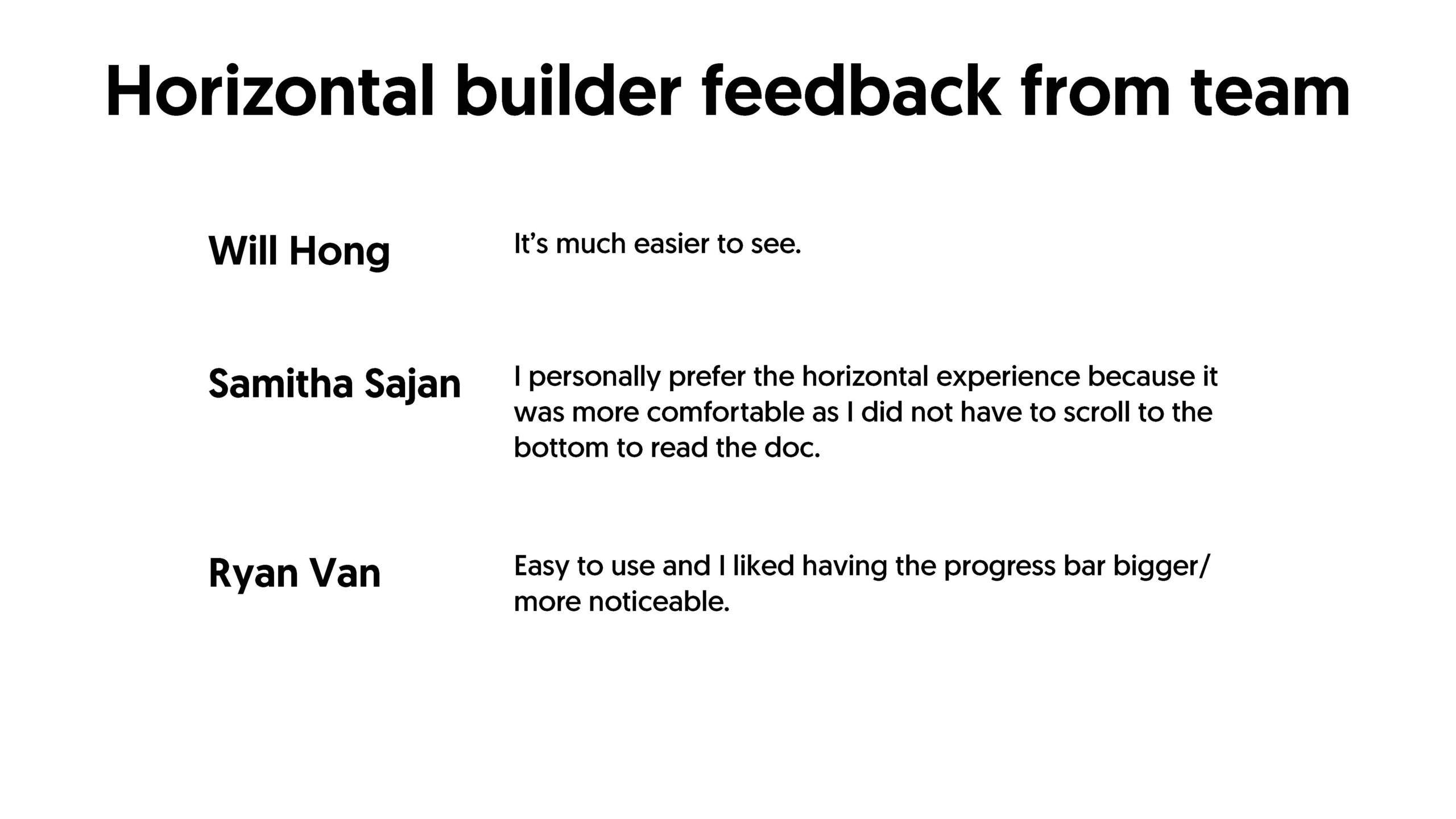

This presentation was a great success! Our stakeholders and internal team members have fully agreed that our Builder should get a fresh UI and remove double scroll. The fact that our production team has increased to 10 helped as well. Horizontal Builder was added to PDCA project’s scope.
The Goals
- Improve Document Builder UI
- Eliminate double scroll
- Pre-fill document builder fields with pre-existing data to provide a better user experience
- Suggest ‘Common Answers’ where possible Reduce repetitive task of entering the same information (i.e. Name) to reduce the user’s workload and to help to build the second document easier
The Process
Pre-fill fields
According to the document team, 80% of our documents had;
- Name
- Phone number
- Email address
- Business/Company name
- ABN
- ACN
- Address fields
Out of 7 fields, name, phone number and email address fields are information we collect at user signups. This meant that you will always have at least three fields pre-filled even if you are a new user. New users can experience how easy it is to create a document through Lawpath Document Builder and have confidence that their next document will be just as easy.
Because our documents were not built considering pre-filling, document answer tags often varied from document to document even though the answer the question requires was the same. So, I sat down with our document team and briefed them on how PDCA will work and what data and work we needed. They have been asked to go through all of our document, starting from the top 100 most popular documents, and update all answer fields to be consistent. The system can then recognise which fields are associated with pre-fill data and which fields will have common answers.
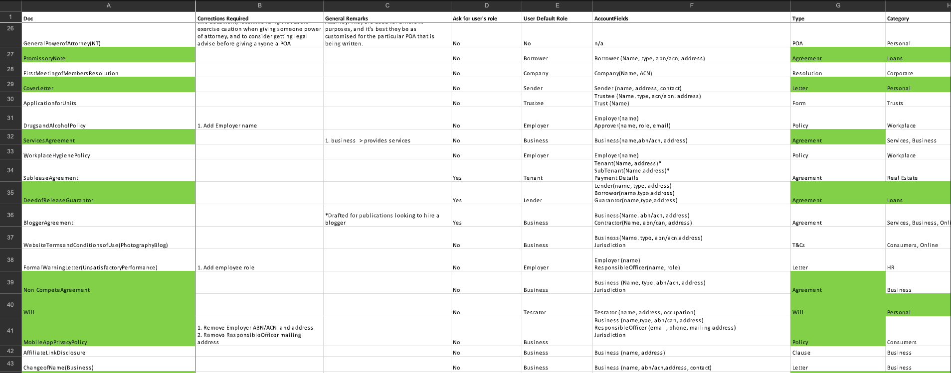
Spreadsheet listing out which fields needs updated for PDCA project
Better use of the real estate

Heatmap information showing lack of engagement
Because our documents were not built considering pre-filling, document answer tags often varied from document to document even though the answer the question requires was the same. So, I sat down with our document team and briefed them on how PDCA will work and what data and work we needed. They have been asked to go through all of our document, starting from the top 100 most popular documents, and update all answer fields to be consistent. The system can then recognise which fields are associated with pre-fill data and which fields will have common answers.

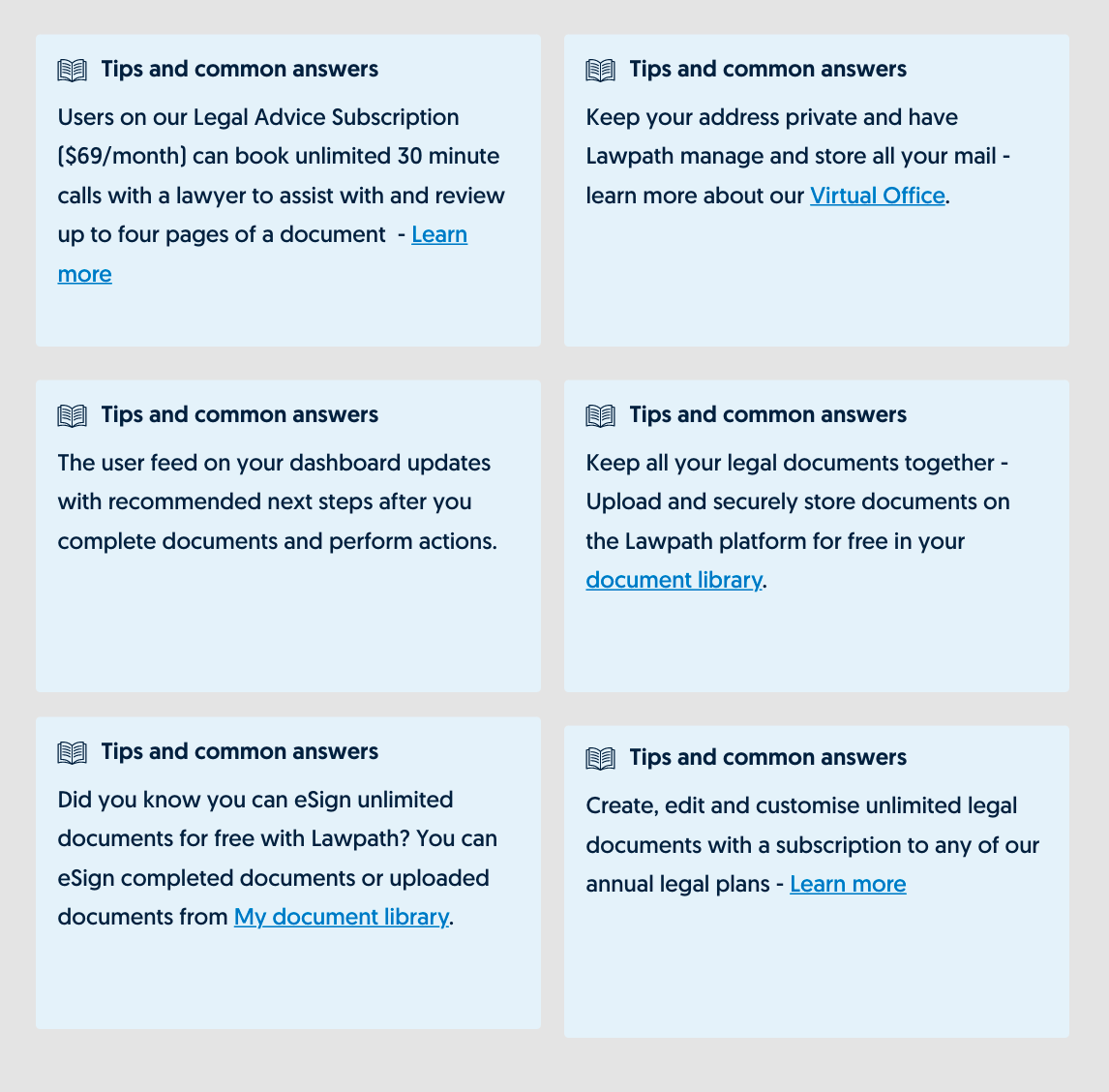
Over 85% of questionnaires had either explanation or example text; however, some questionnaires did not have any. To avoid a massive amount of blank space, I worked with the content team to convert previous ‘Perfect your document’ section into generic Lawpath promo content that can be used when neither example text and common answers were missing. Total of six generic promo content was developed to display at random without overlapping each document building session.
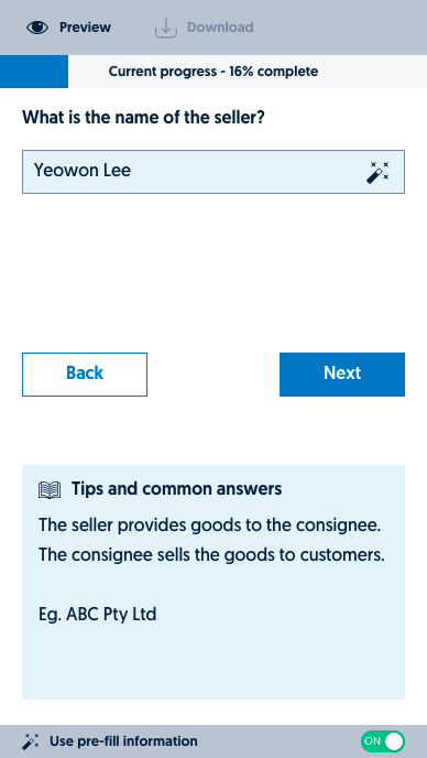
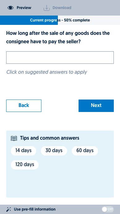
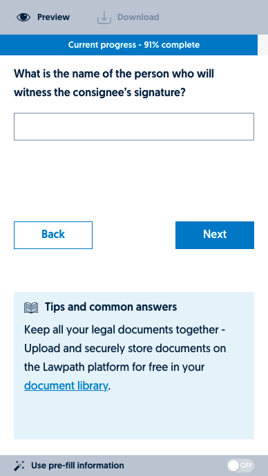
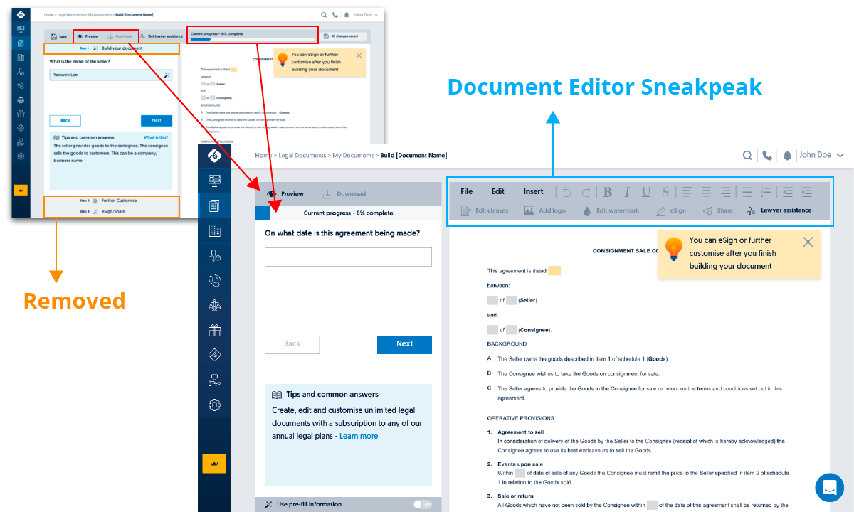
During a mid-session review, some of our stakeholders showed concerns regarding lack of push for free users to upgrade to a paid subscription. They wanted the promotional content to still exist as the Document Builder is where we acquire most new subscription users. To address this concern, we added in the greyed out toolbar that looks like our Document Editor which does not function but calls up an upgrade modal for free users. Paid users who already have access to Document Editor see a modal to inform them that they can only use the Editor after building the document.
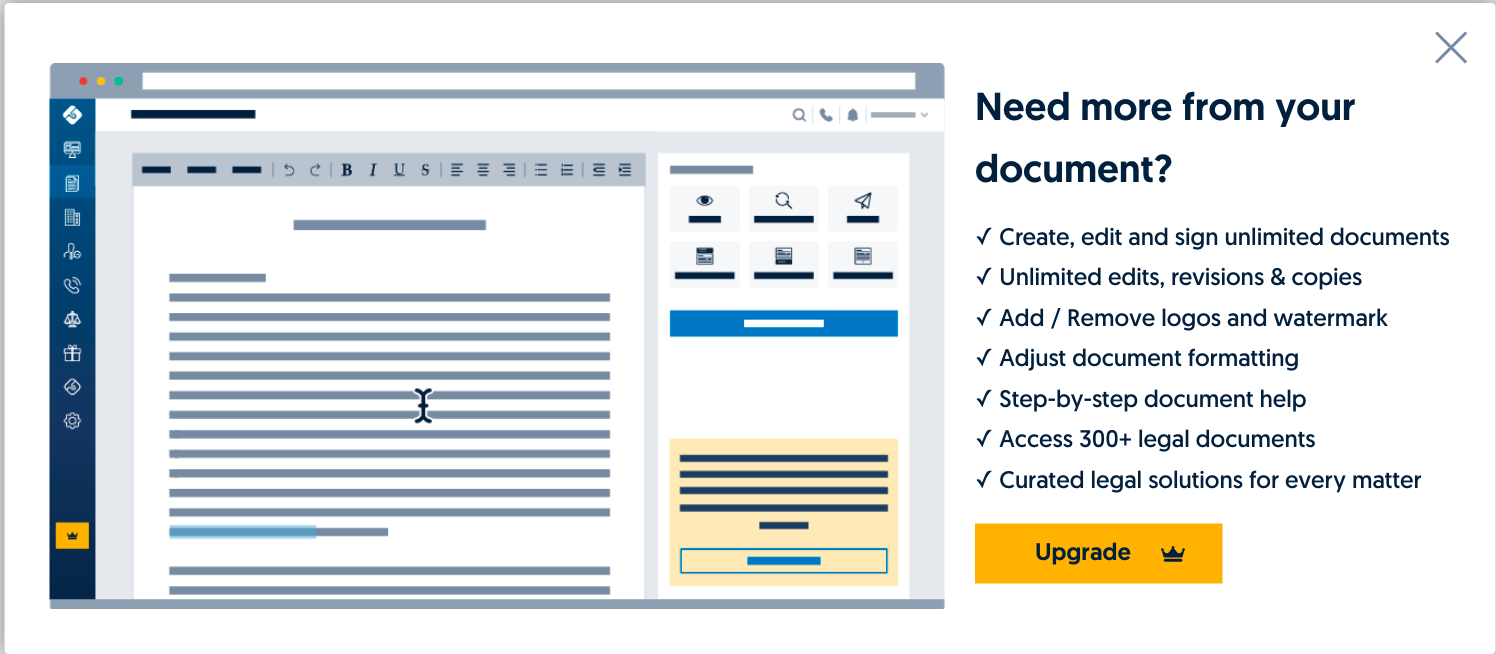
Free user upgrade modal
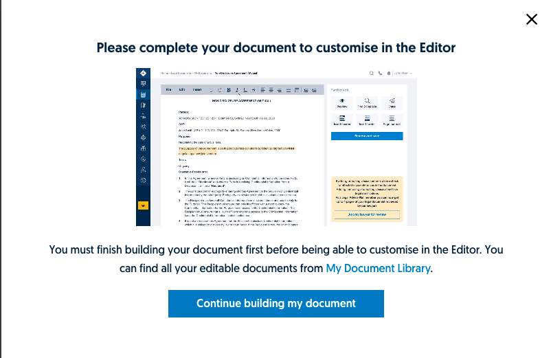
Paid user modal
Mobile
According to Google Analytics, 15% of Lawpath users build documents on mobile devices, where 87% of mobile screen size was 375px wide (iPhone 6,7,8). To cater to most of our users, we focused on mobile experience on 375px screens as a priority.
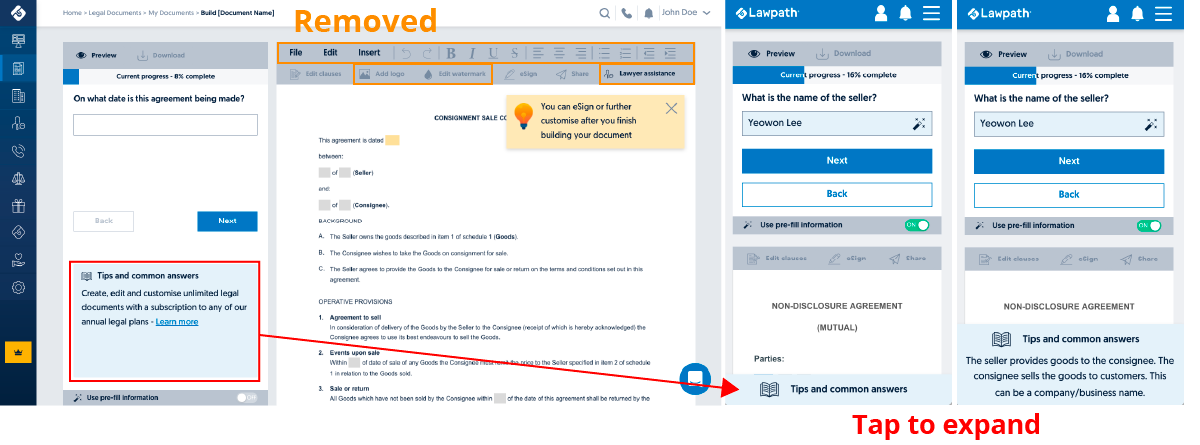
While double scroll was unavoidable on mobile screens, to minimise users’ scroll to view the document, I asked the dev team to search using a floating bar for Tips and Common Answers section that expands upon touch. This was particularly difficult for iOS as unlike Android system, iOS overlayed the keyboard over Tips and Common Answers section instead of pushing the screen up. Because this was a web environment, the users would have to use either Chrome or Safari app to access the Document Builder on iOS, making it harder to manipulate how the keyboard reacted. After some research, dev team confirmed that they could fix this; however, it will take a few days to implement; our dev team suggested that we release the product without this fix and put this down as a post-fix ticket. It was a difficult decision; however, it was a compromise I had to make. For small screens(<1200px) and tablets, the Document Editor replica menu became a problem.
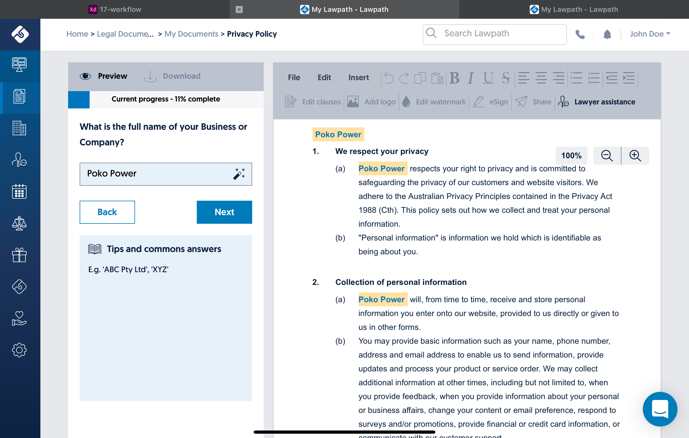
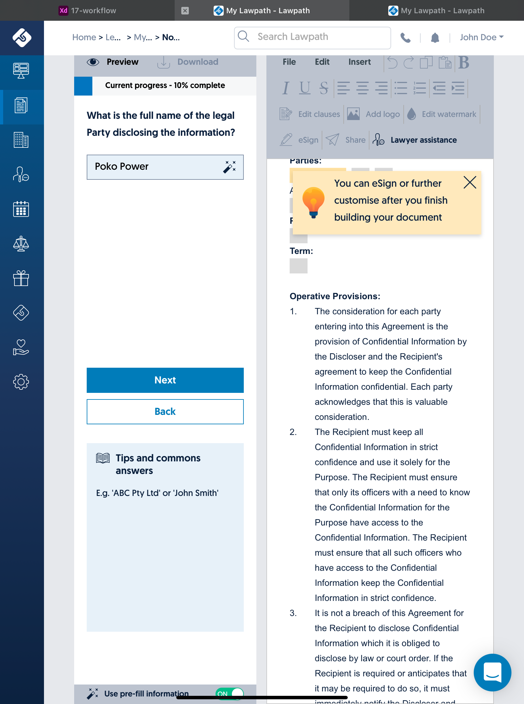
Screenshots from iPad Pro before fix
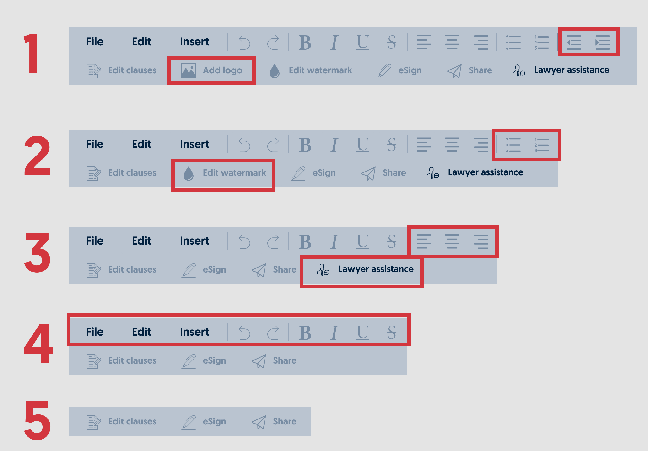
I reevaluated screen breaking point for the mobile view to fix this situation, resetting mobile view breaking point from 628px->735px and asking the dev team to gradually hide some of the grey bar buttons until screen size reaches mobile view.
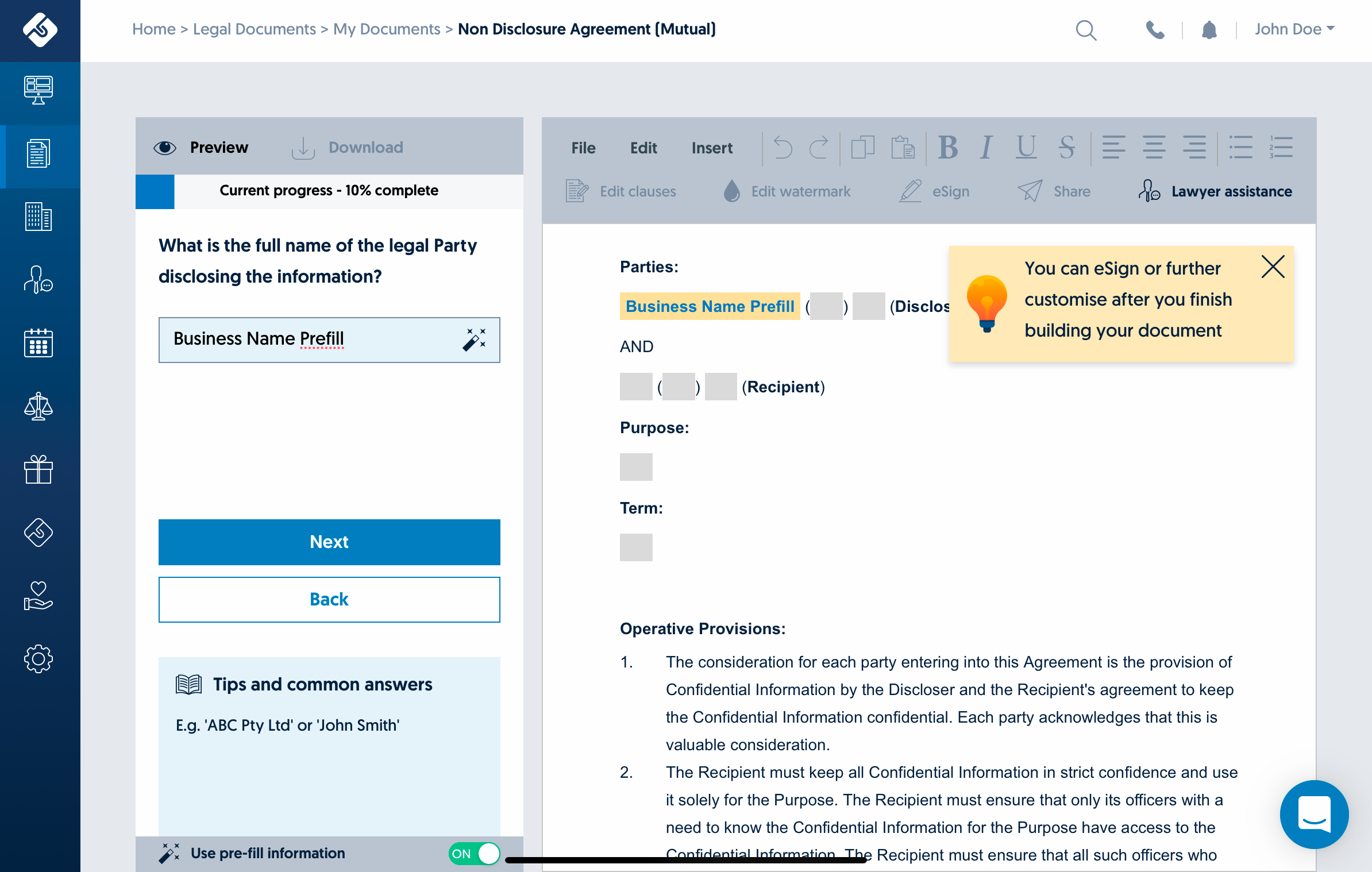
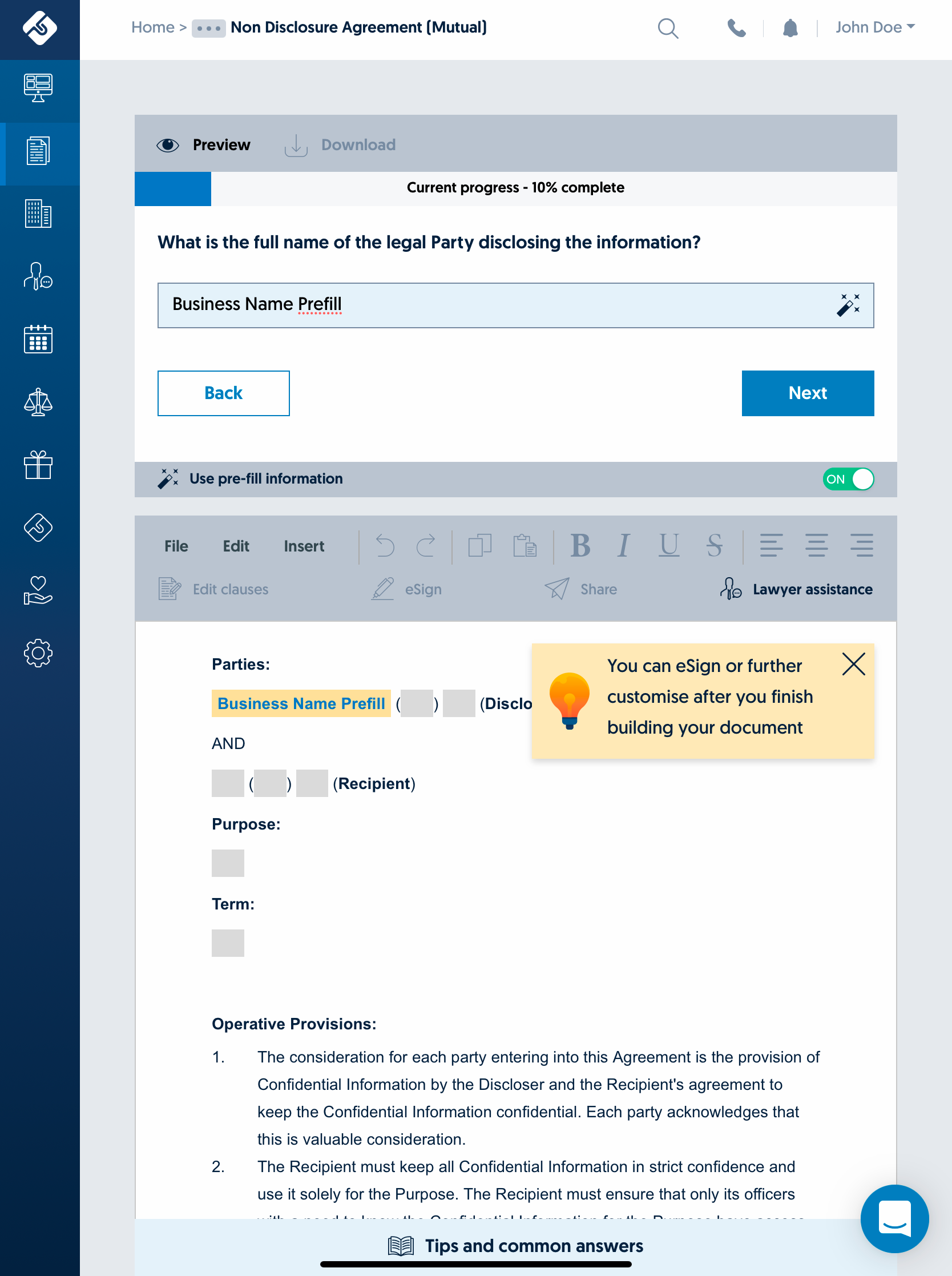
Screenshots from iPad Pro after fix
Extras
Lawpath has never had new product onboarding system other than our onboarding team on the phone. I introduced an automated onboarding system that explains how our updated products work using animation and short content in a modal.


For this project, I also decided to add a new loading animation. Until this point, we only had two generic loading animations. This was a bit of fun I wanted to add as a part of refreshed UI.
Outcome
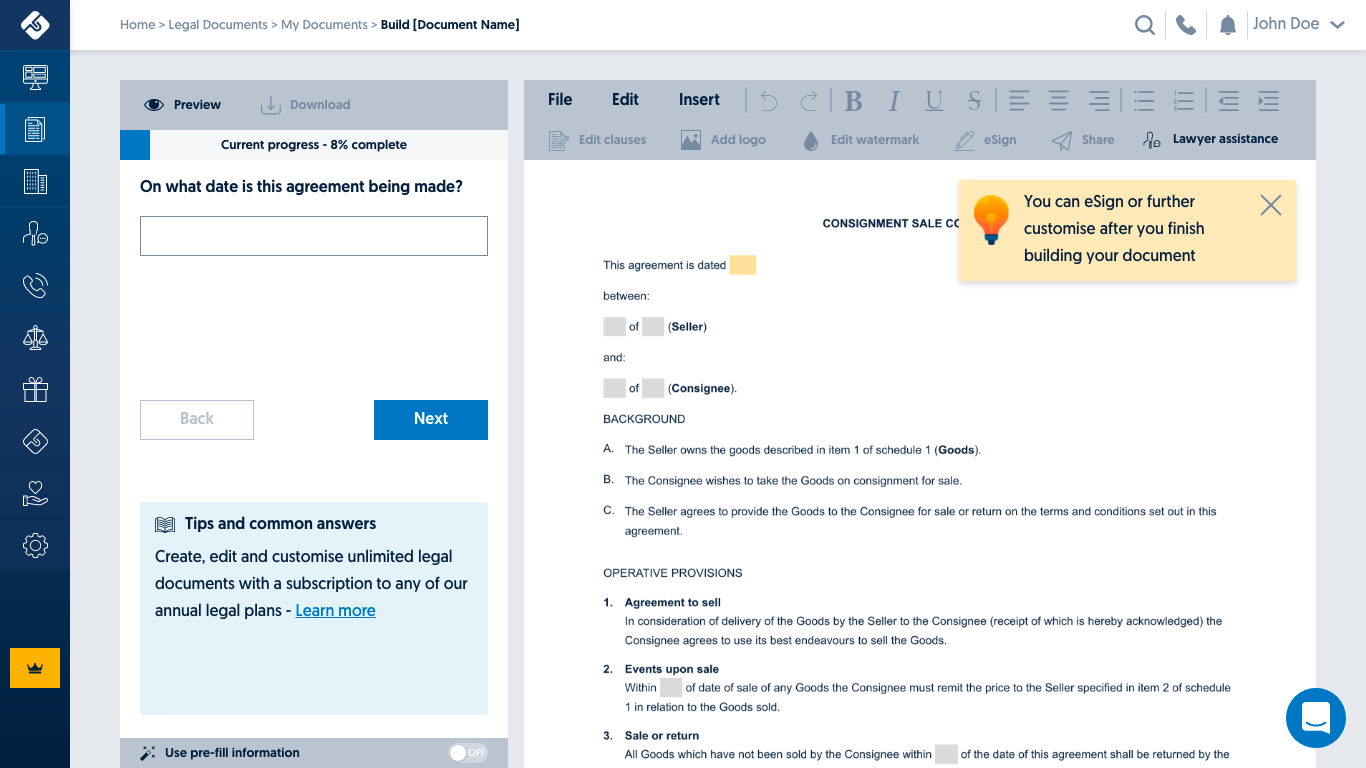
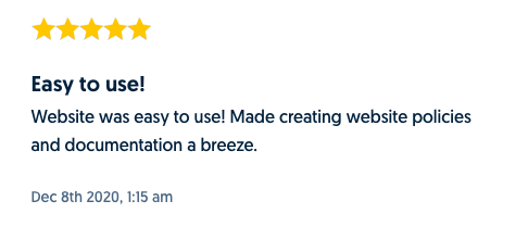
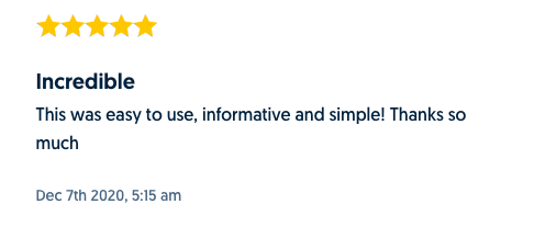
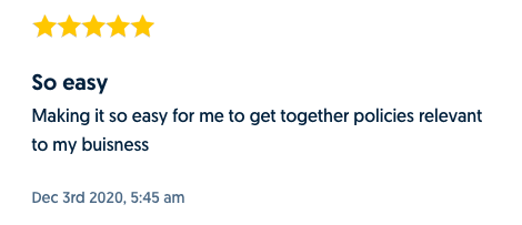
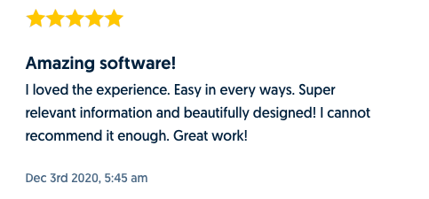
PDCA project launched on the 1st of December 2020. Since the launch, document completion rate has increased by 5% within just two weeks, and it was generally well-received by both internal team and our clients. Our onboarding and customer service teams have received very positive feedback on the phone and online review system.
