Bonjoro Testimonials 2022
Programs used


Overview
Project date/duration - 6 months, Jul 2021-Dec 2021
Bonjoro is a customer loyalty building platform using videos. Bonjoro’s two main products - Bonjoro Video messaging (since 2017) and Bonjoro Testimonials (since 2022) both use video to effectively create delightful and personalised experiences for every customers, then harvest that customer loyalty through testimonials to complete user journey.
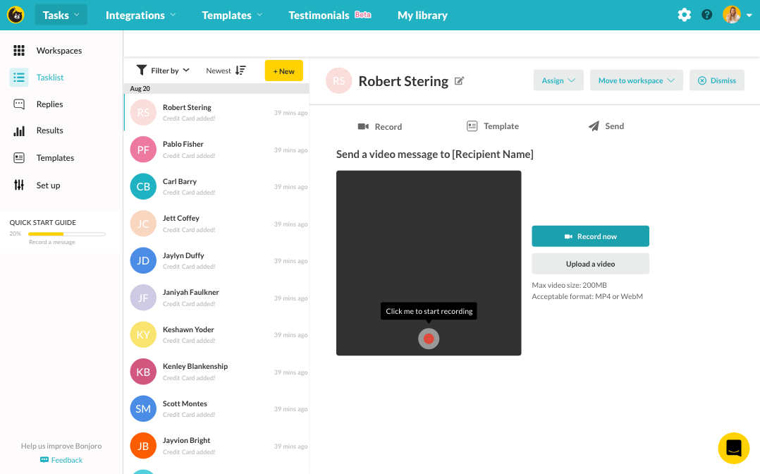
Bonjoro Video messaging
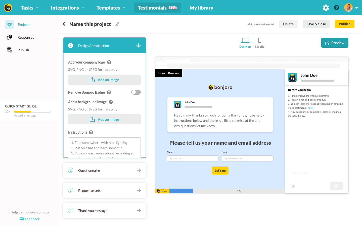
Bonjoro Testimonials
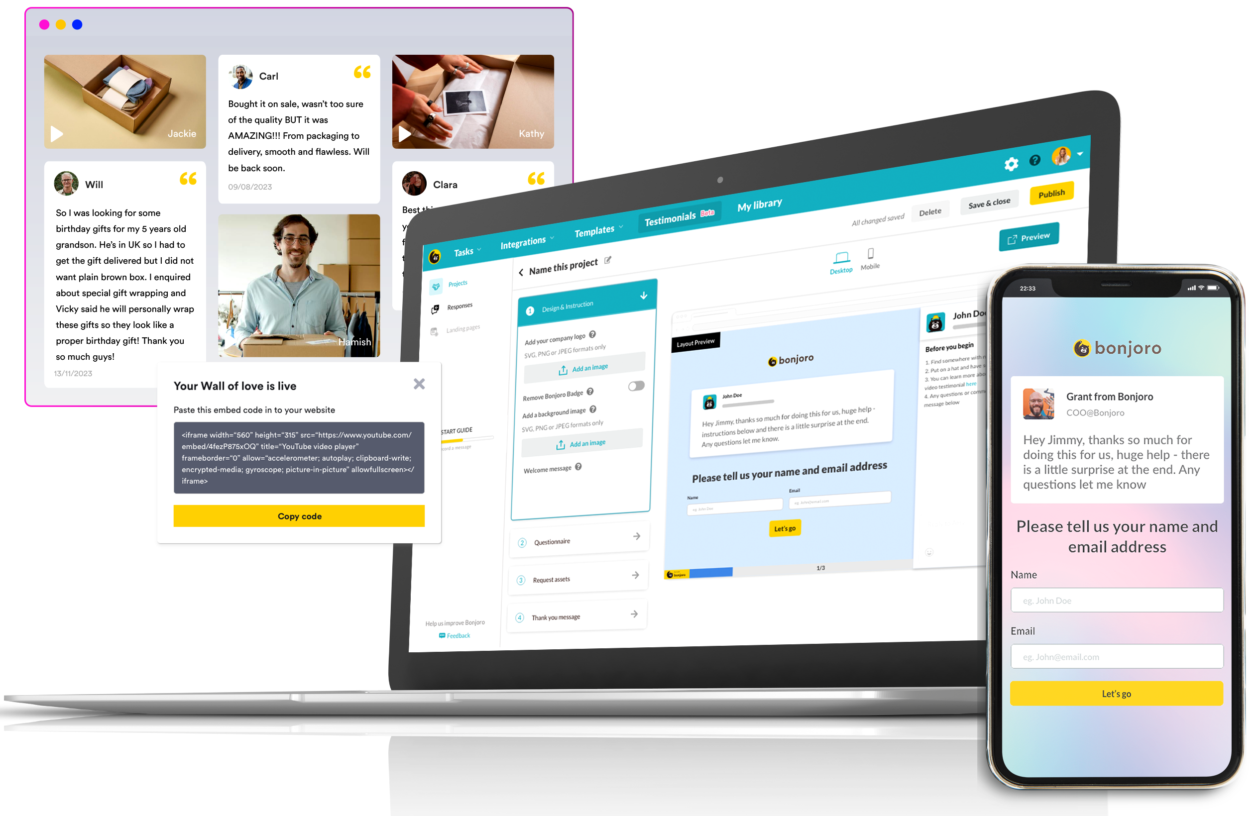
Bonjoro Testimonial was developed to turn linear and flat typical customer journeys into more intuitive full circle by allowing collection, management and publishing (sharing) of testimonials easier than ever. This needs to be both B2B and B2C as we are creating a tool our own users can use to send to their own customers for both collection of testimonials and publishing of the collected. This case study explores my design processes to build a major second product for Bonjoro.
My role
As the Head of design, I was a part of the product team and responsible for the experience, strategy and design of all across Bonjoro. I was to lead the UX and produce UI elements. I worked alongside CTO, Tech lead, CMO, CEO(the product owner) and the Product manager.
The challenge
Unlike most of my past projects, this was building something entirely new and must fit the platform which was built entirely around ‘Video messaging’. Navigation must update, websites and structures of onboarding must also be considered. There was no data on usage, issues or users to interview but only our goals. Our goal, however, was simple and strong - make collecting, managing and publishing video testimonials as easy as possible.
The problems to solve
Personally, as a designer, I remember countless times where I had to steal profile photos of a CEO or CMO who has given the permission to use their quotes/interviews for marketing purposes. Often I was given nothing but the quote itself, no clean logo images, profile photos or links to assets. Designing the testimonial section was the easiest part but collecting good photos, big enough logo files and getting their official titles took up most of my time. So whenever the marketing team come to me asking for a testimonial section I would first ask if we have all the ‘assets’. The answer was always yes but everything I needed was never there. I believed this is not just a problem for me but for everyone with a website. Managing collected assets also was a problem. Once an image file has been hosted on AWS, it gets often deleted from the local download folder and gets forgotten. So later on when we needed to reference client’s logo again, I had to go through file collection process all over again -slack, emails, googling their website etc.. Publishing, adding or removing new assets were also quite frequently on my to-do list. While it is easy enough to delete or add a new content in, it’s a different story if this testimonial section was spread across different pages across the entire website. It was very time consuming to search for all the references than to replace/delete. To validate, we interviewed several other SaaS or eCommerce businesses to see if they have ever faced problems such as these. The answer was plain yes - we were right on the money for the pain point. Starting from deep understanding that I am not the only one with such problems, I knew we were to have three different parts which were pretty much named already - Collect, Manage and Publish.
The goals
- Allow collection of both video and text testimonials from customers
- Make managing assets easy - tags, delete, sort etc.
- Publishing to be easily accessible even to people with no coding experience
- Provide good looking publishing templates so it's actually practical
- Promote usage of Bonjoro's other main product - Video messaging
The process
Brainstorming
First of all, we needed to determine the main functionalities we will support with our first version of Testimonials. Without a clean list of all the functionalities we intend to cover and also a list of what we will release in the future, it would be impossible to build a good foundation that does not need change every time we update a new feature.
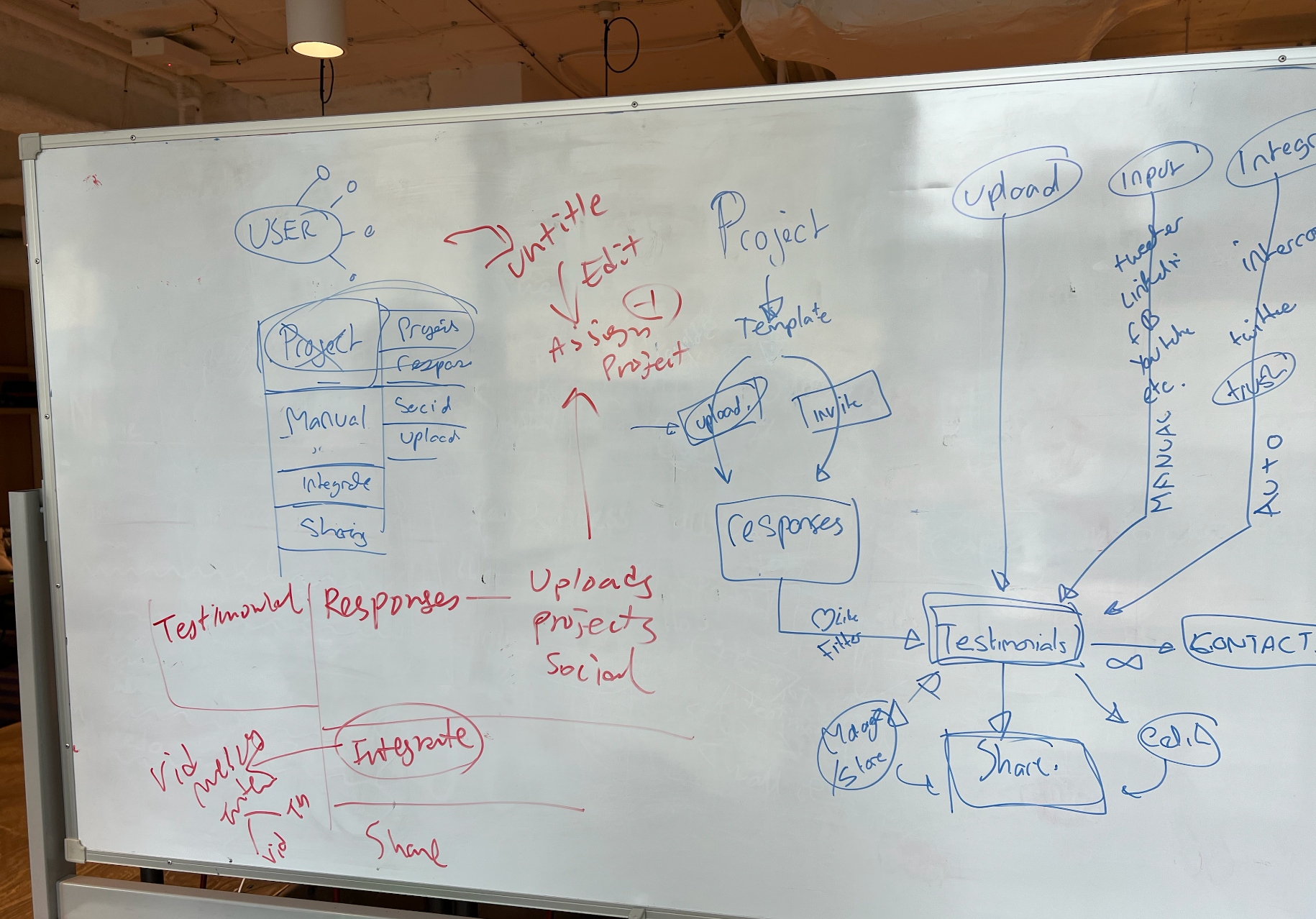
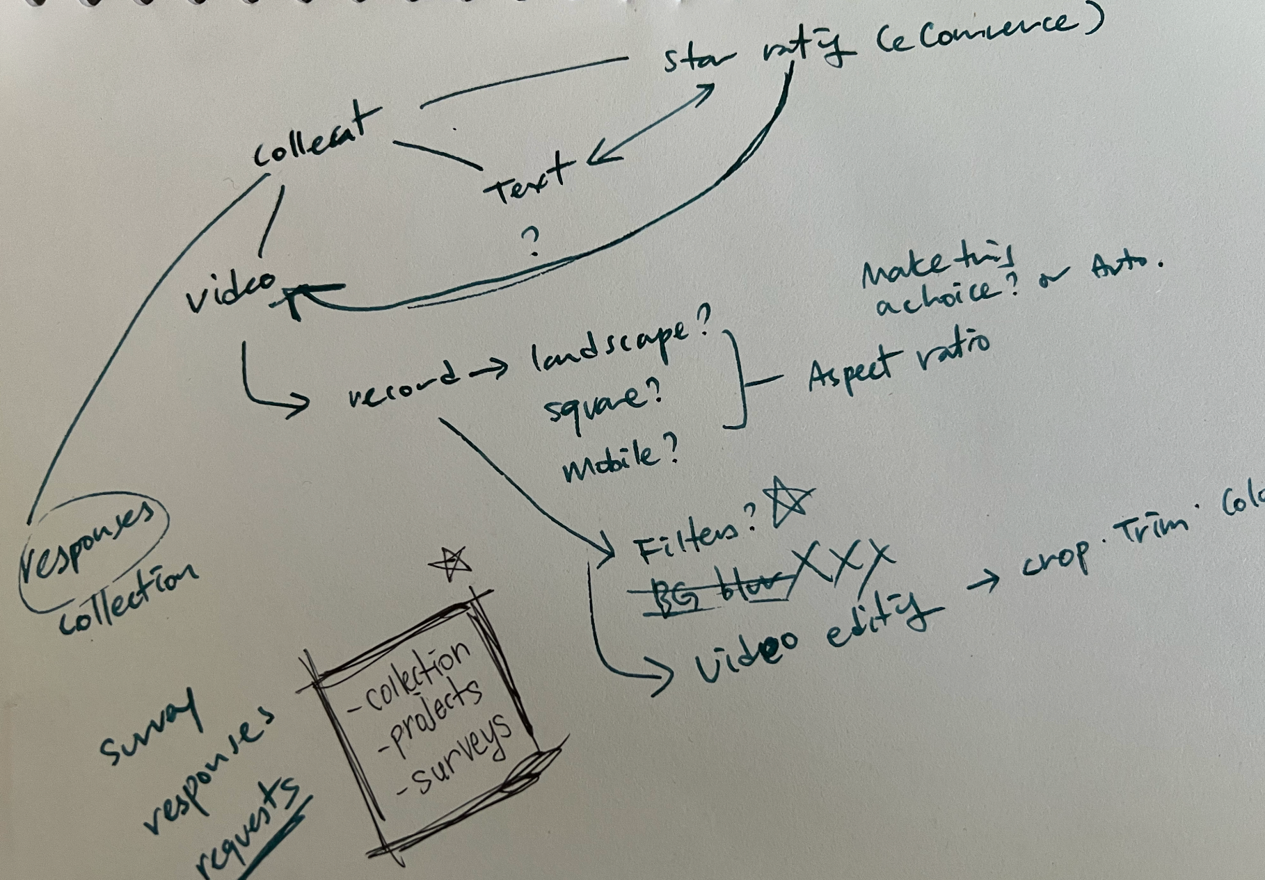
Brainstorming session with CEO, CTO, Head of CS and COO narrowed down to creating three services - ‘Project’ to create and send review requests, ‘Responses’ to view all collected and finally ‘Publish’ to turn collected assets into a ‘Wall of love’. We also decided to limit collected assets to videos and text for now, with a plan to support any social media assets such as Twitter, Facebook, LinkedIn, YouTube and Instagram later. Although these are placeholder names, we even decided names for each tabs and for the service itself. (We actually called it Reviews instead of Testimonials before this session.) This meant I was ready to start doing mockups.
Basic mockup and wireframing
From three main features, I did a quick sketch to jot down ideas and create simple layouts. I listed out all the functionalities to include in each piece so I won’t forget to consider those when doing basic mockup design. I shared these sketches and notes to our team for feedback. After double checking that I have not left out anything important and taking feedback on flow, I moved onto mock and prototyping.
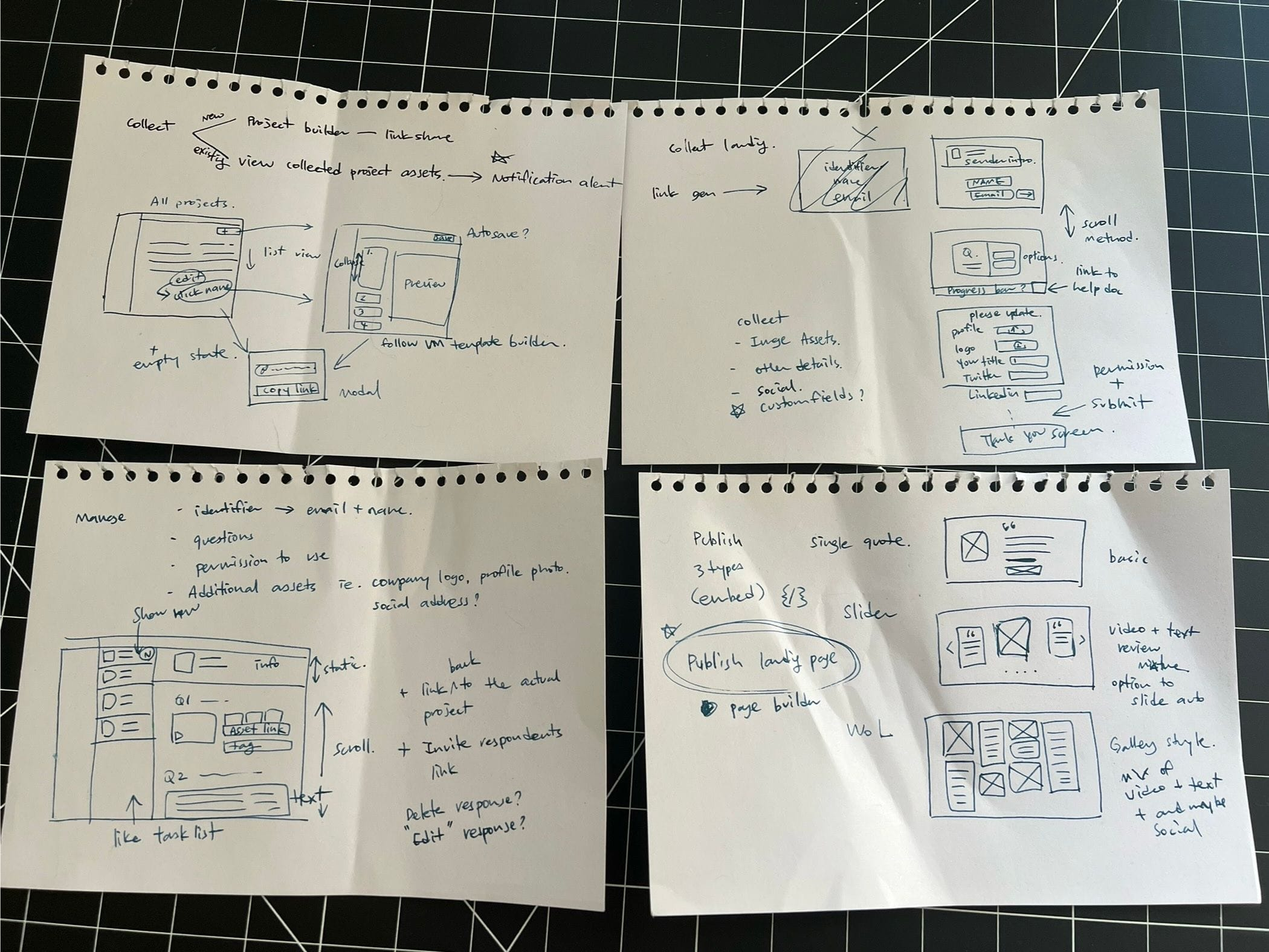
Collect (projects and builder)
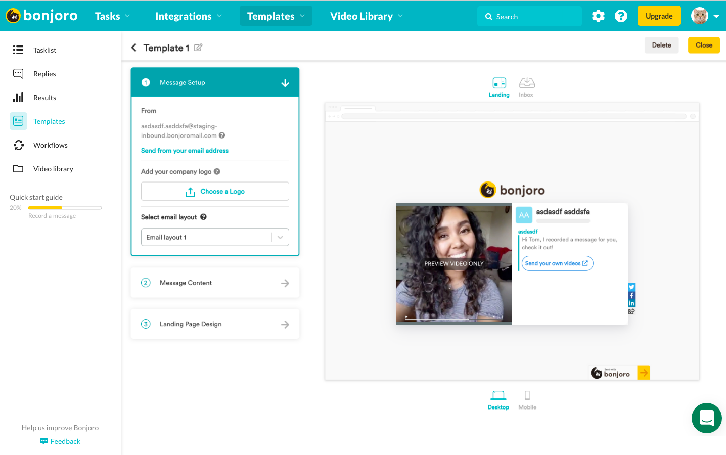
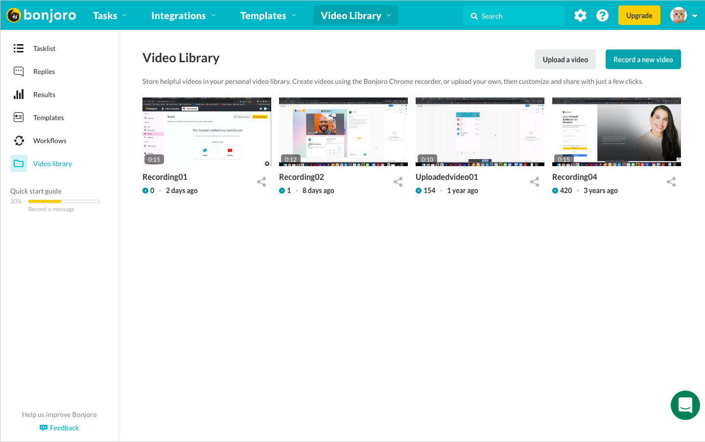
There were several components and layouts I could use from Bonjoro’s existing pages. Since I already had most of these components ready at hand, it was easier to do high fidelity mockup rather than forcefully creating low fidelity.
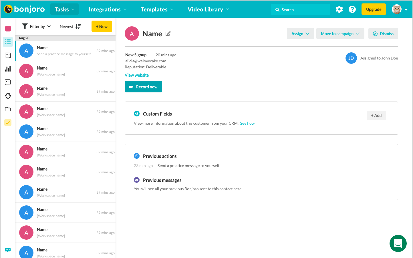
Bonjoro Video messaging - Tasklist page
Bonjoro Video messaging - Templates page
Bonjoro Video messaging - Video library page
Below are my first iterations of Projects page and Project builder design
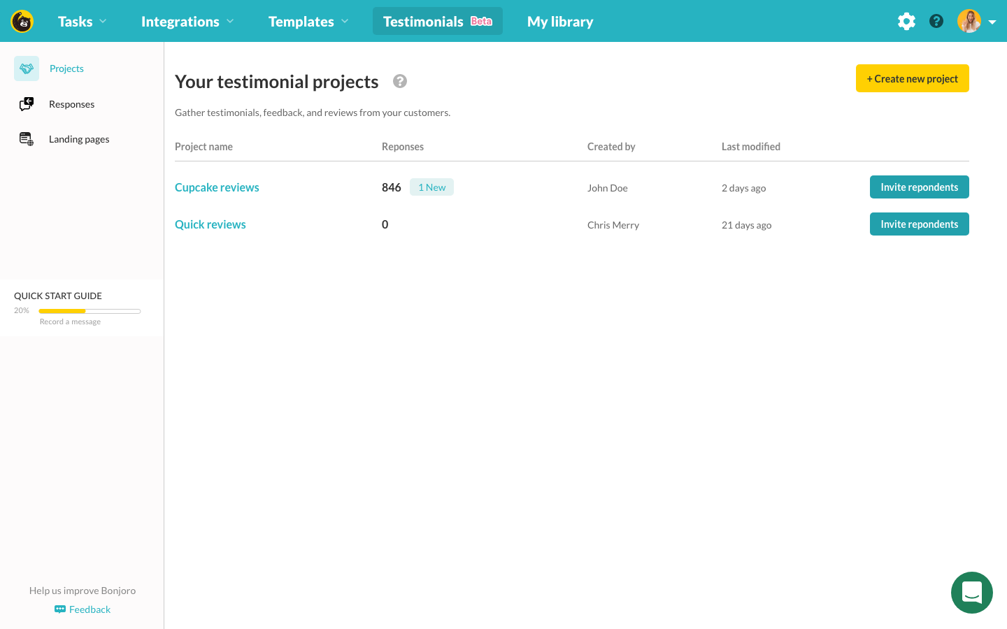
Projects page mockup

Project builder mockup - user identification
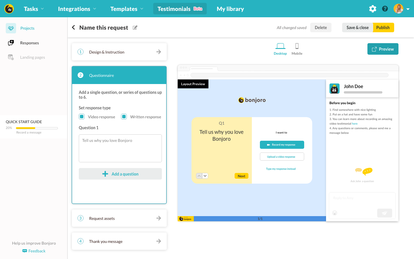
Projects page mockup - questionnaires
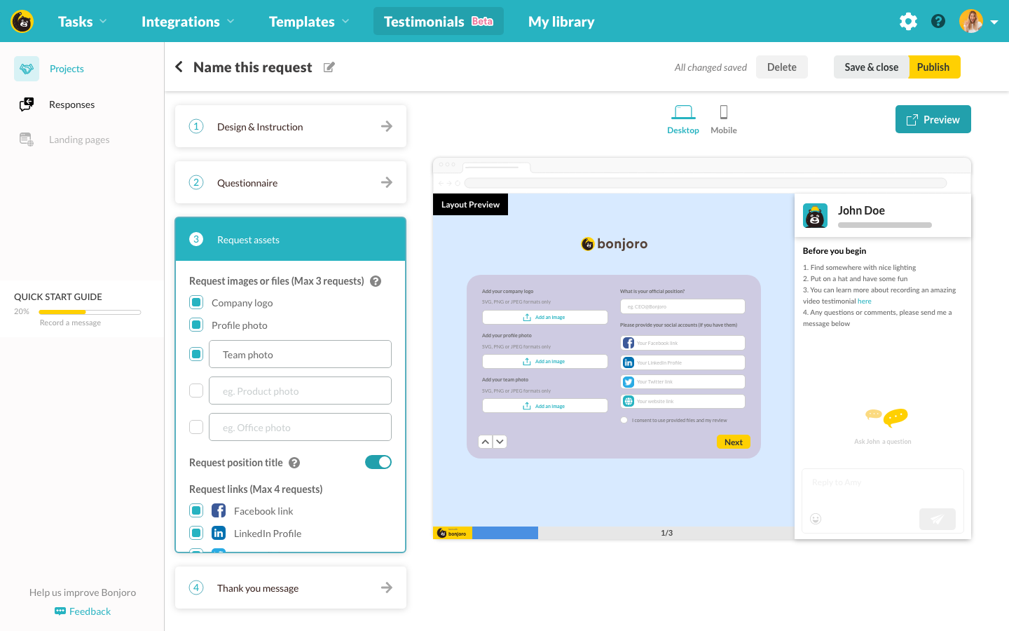
Project builder mockup - additional assets
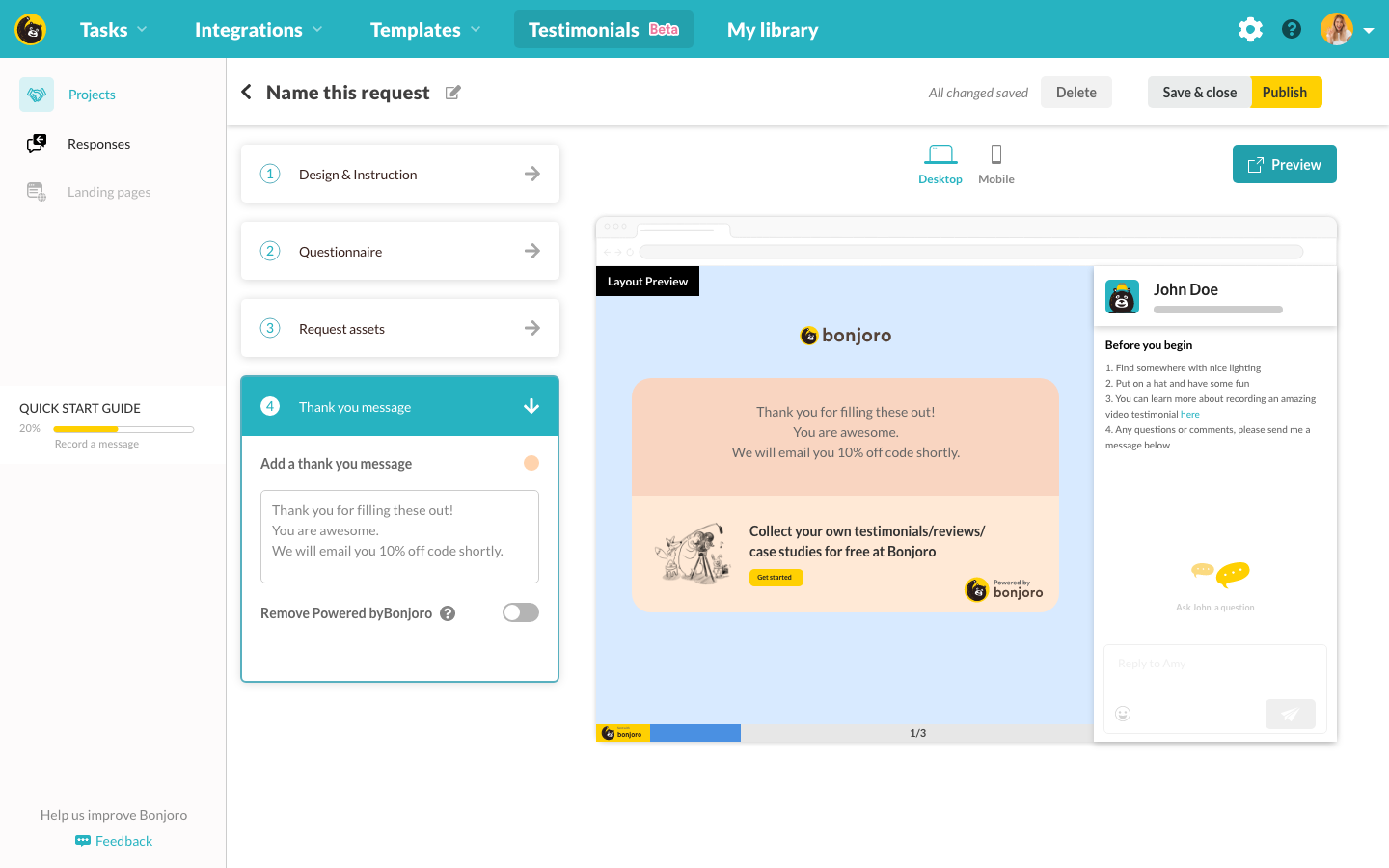
Projects page mockup - thank you message
Manage (library)
Using layouts from Bonjoro Tasklist and Video library, I created two views for collected assets. Apart from being able to see all of collected responses in one view, I wanted to provide a way to filter out the view by projects in case users have more than one projects running. This way users can stay on top of who responded to which project and see respondent’s information at a glance.
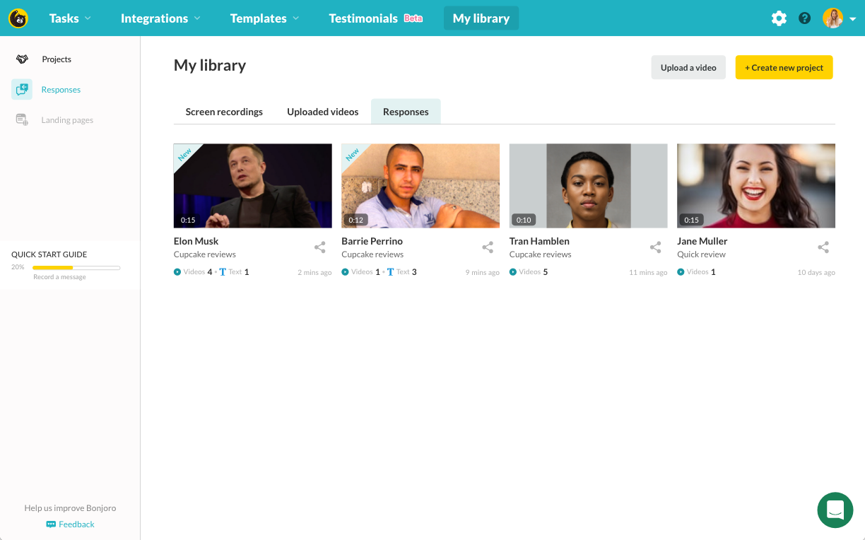
Projects page mockup - all responses
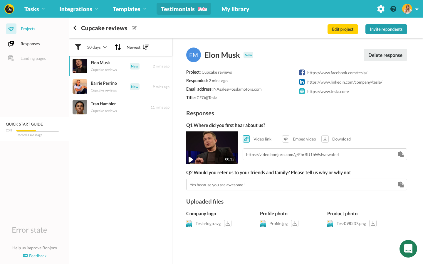
Project builder mockup - by project
Publish (embeds)
Initially, we planned three different types of embeds ie. Single quote embed, Slider and Wall of Love. According to my research, these three types of testimonials were most frequently used layouts. To validate this research, we asked some of power users on our platform how many of these sections were in use or would like to be able to use on their websites/eCommerce pages. While 84% of users interviewed have answered they have a slider and single quote sections on their website already, 52% of the users answered that they would love to use Wall of Love but they lack resources to implement this properly. This was a good sign for us to tackle Wall of Love as our first embed as we believed the real value is at being able to provide something new rather than simply replacing the existing. (But this didn’t mean I don’t have to design the others!)
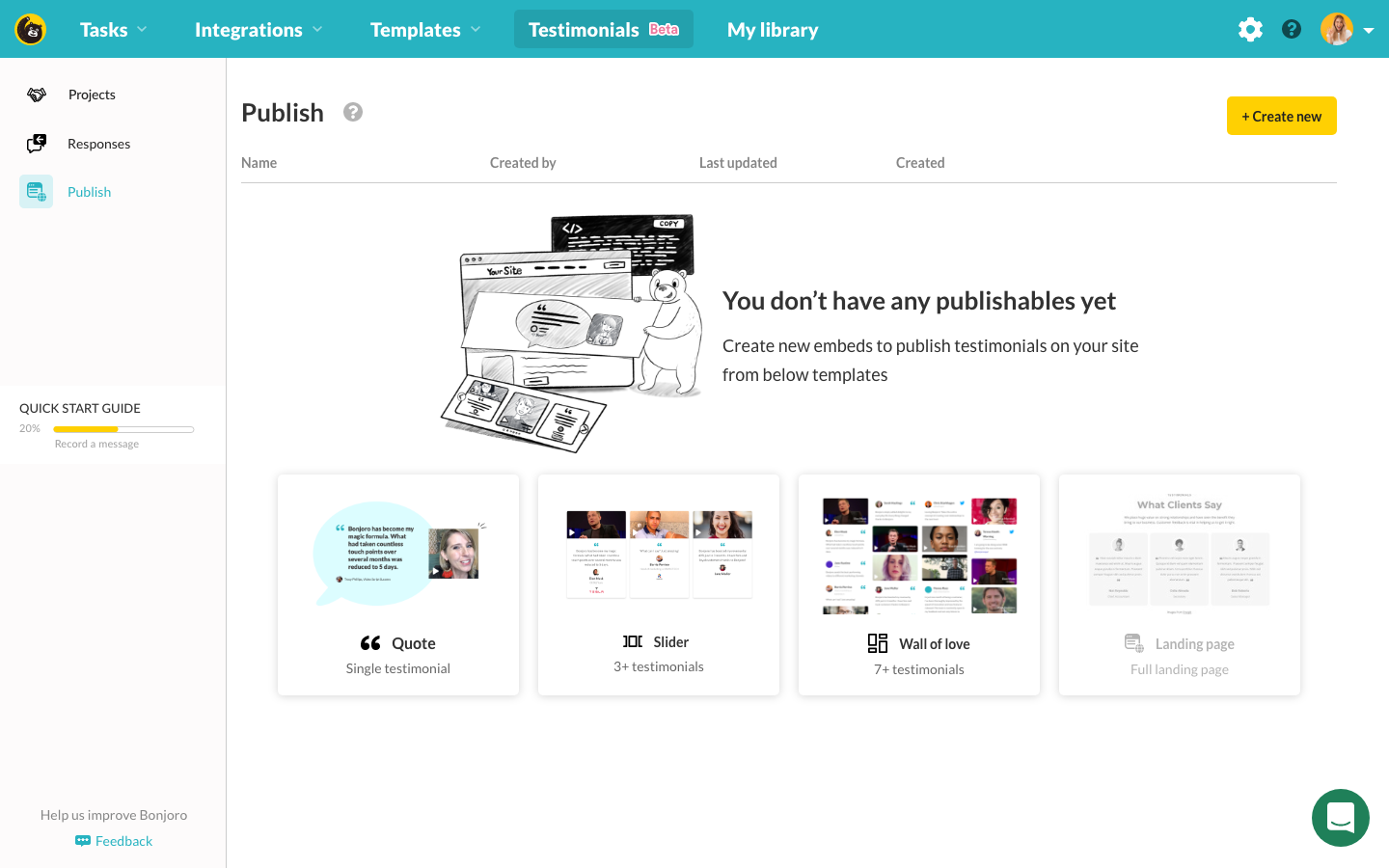
Publish mockup - empty state
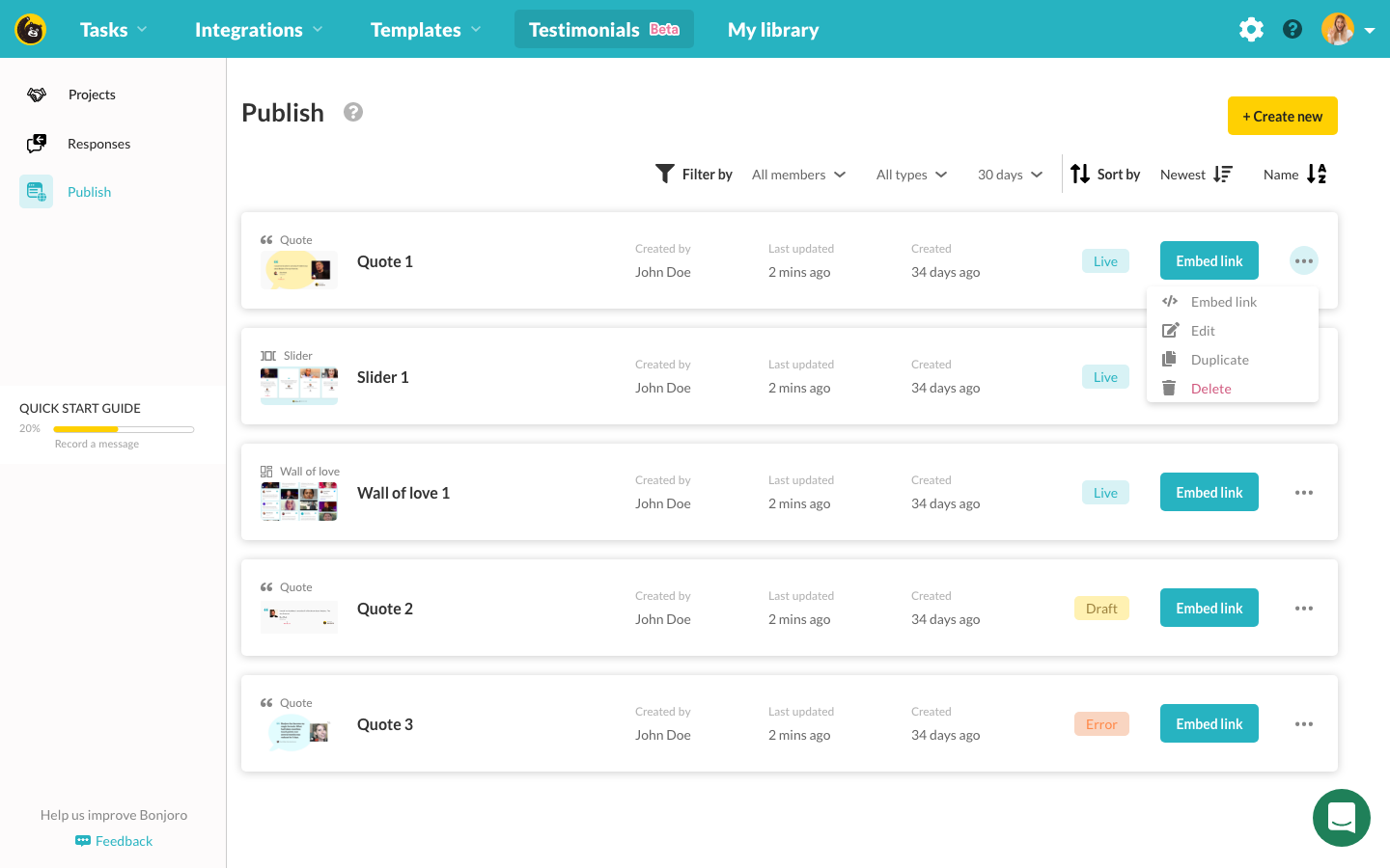
Publish mockup - filled
Starting with empty state of Publish to prompt users to get started, I designed filled state with basic sorting and filtering options. Then I went ahead and created three different templates for each publishable to correctly understand what are the common fields across all publishables and what are the differences. Understanding the differences across the types of publishable was very important as later when this gets reviewed by the team and we face negotiation for time, I can quickly suggest what to build first to enable quick release but at the same time, create a stepping stone for the next iteration to come quickly.
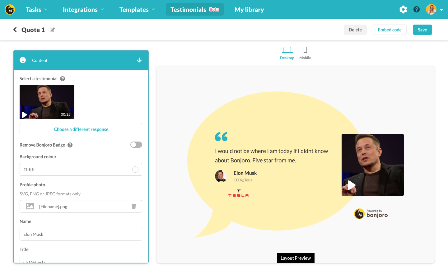
Publish builder mockup - single quote
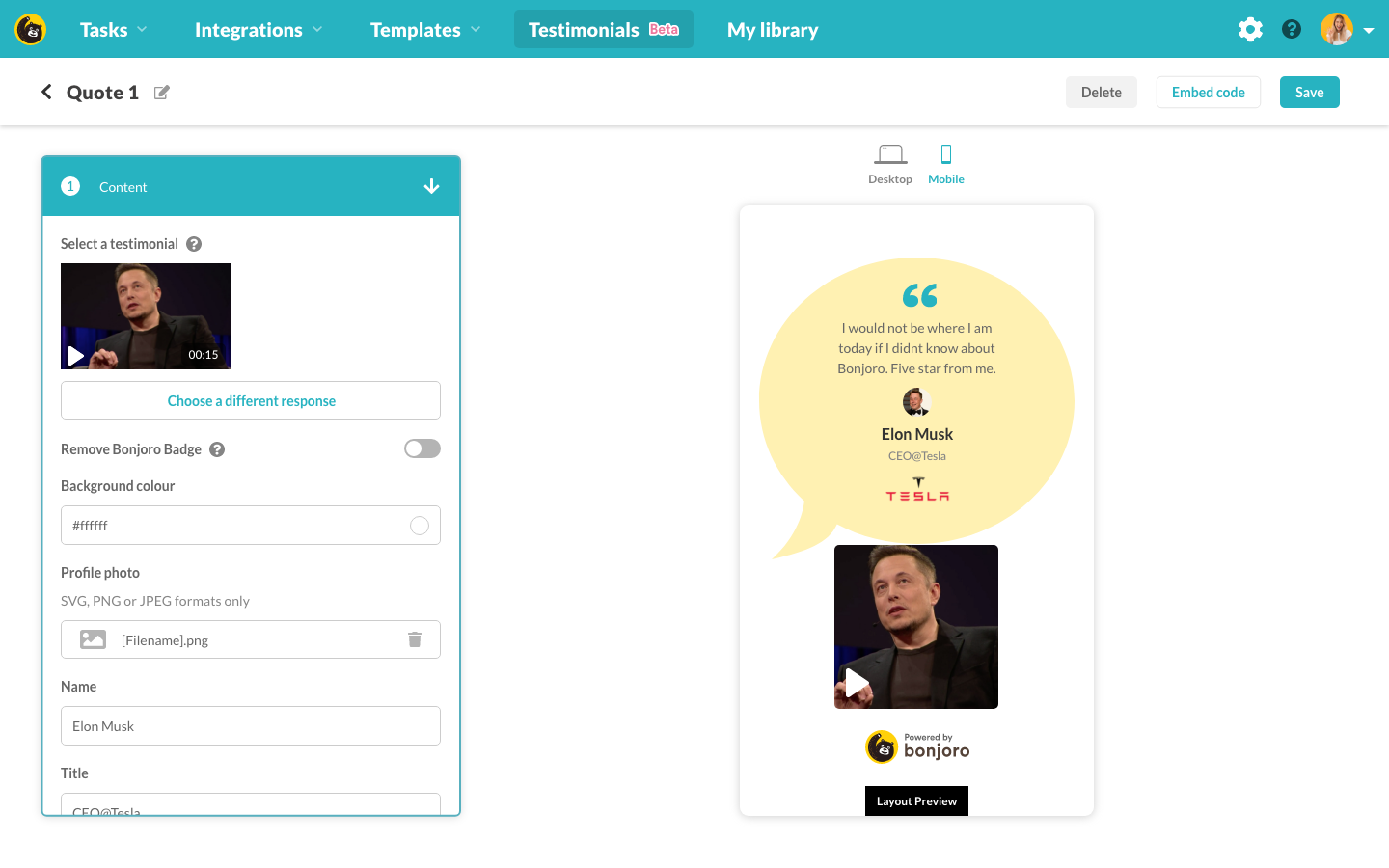
Publish builder mockup - single quote mobile view
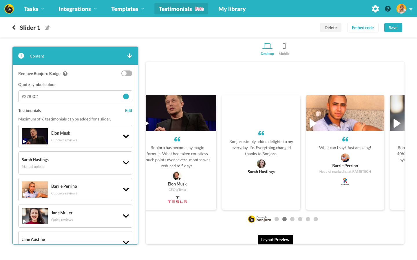
Publish builder mockup - slider
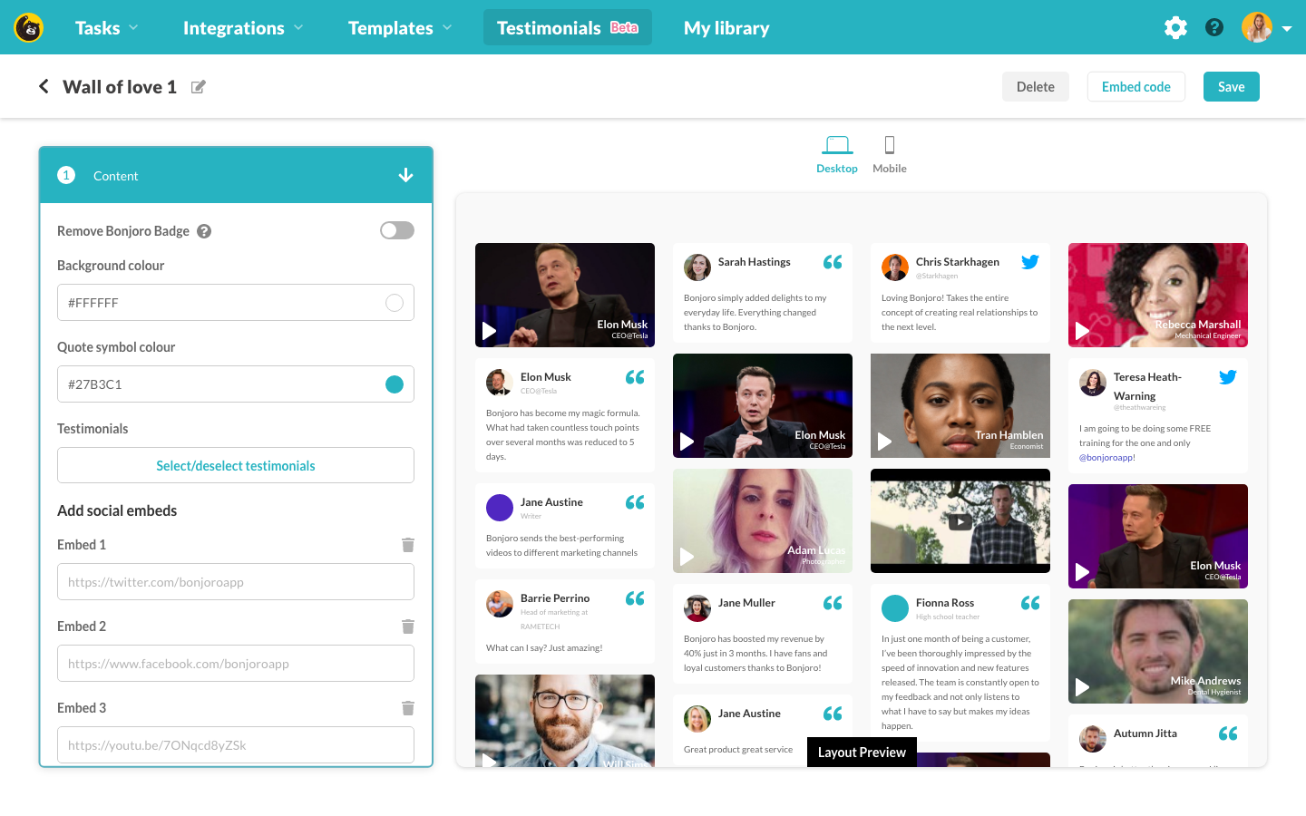
Publish builder mockup - wall of love
Internal review and negotiation
With the most of design completed, I ran through a series of internal assessments with our product team. Although I have already gone through many technical checks with our dev team during prototyping process, I wanted to make sure this product was easy enough to understand and shows no potential road blocks for devs. This allowed us a good opportunity to negotiate on the scope of the build. We were all in agreement that we want to create a full ‘Embed builder’ but with the time limit given for this project, we were not sure if we can build it in time. So instead of creating half-done Embed builder, we decided to remove Embed builder from this iteration but instead introduce ‘tag’ system for creating Wall of Love embeds. Tagging feature was always on our roadmap so I did not see any issues of us introducing this early. And it was now much simpler to create a Wall of Love. Instead of going to the builder, users were now able to simply select a tag that they have used to pre-sort their received responses then hit ‘create’ button. Not only this has shorten our development time in half, but made things a bit simpler for our users so I was very happy with this negotiation.
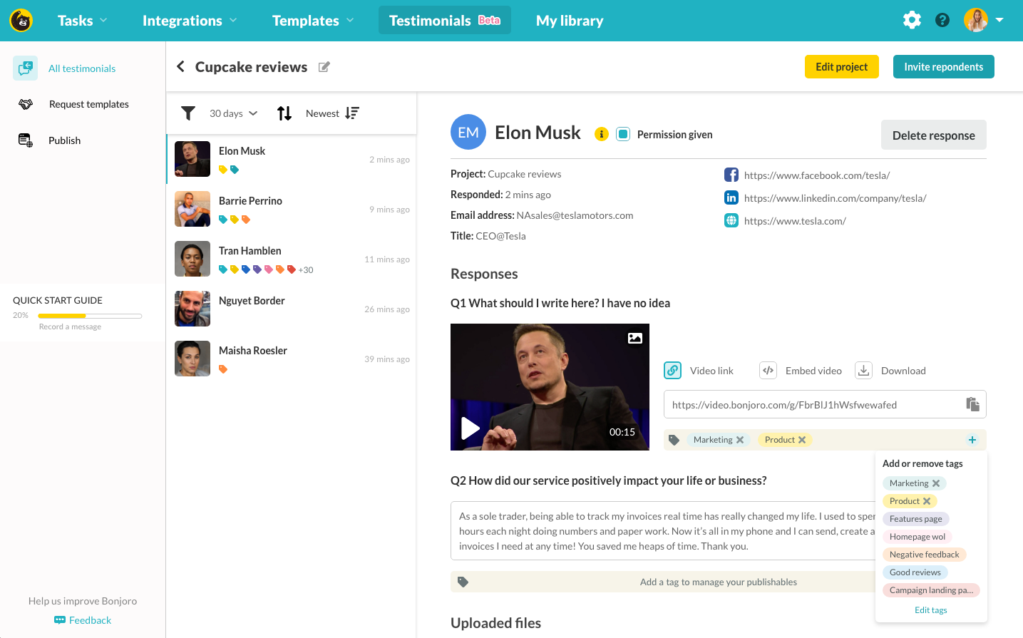
Publish mockup - tag bar and management
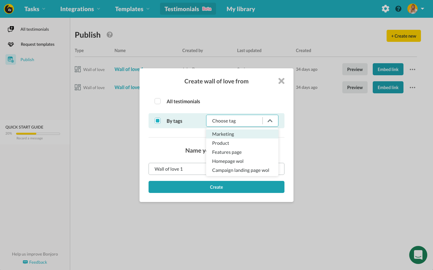
Publish mockup - create by tag
User testing
With all pieces worked out and engineering team busy with building components, I reached out to our power users both online and offline to run end to end user testing. Some were Bonjoro’s business partners and some were random users who responded to our user testing calls. I sent online testers an interactive prototype XD link and sent users a short quests to carry out within the prototype while recording their screens. With offline tests, I simply opened up the same interactive prototype but watched users in real time. I was watching for their facial expressions and moments of hesitation. While offline tests were much easier to engage emotionally, online testers provided important tracking around their mouse movements and as this would be closer to our real customer experience once Testimonials goes live, it was invaluable test data. Two main areas of confusion were our terminologies and the method of how to actually use the embed codes. Terminology was our mistake as we changed names of well everything, multiple times. After this feedback, we had a quick internal discussion for final names for everything, then I replaced all the terms on both prototype (that our devs will be building from) and also on my design handover notes to avoid confusion once and for all. As to how embed codes work, we put together a detailed help doc for major CMS platforms such as Wordpress, Elementor, Webflow, Wix and Squarespace.
Outcome
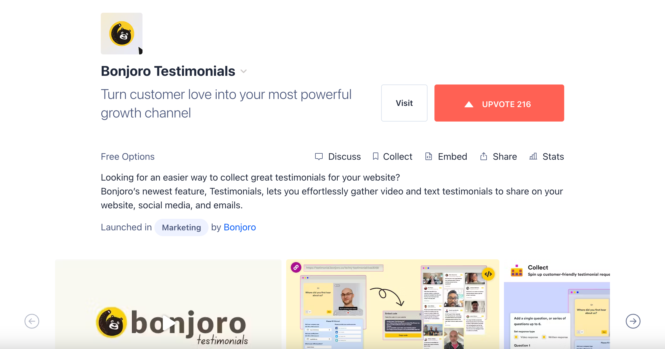
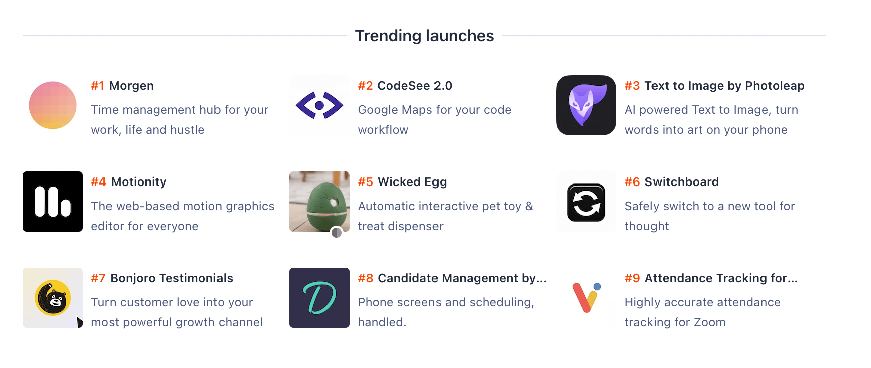
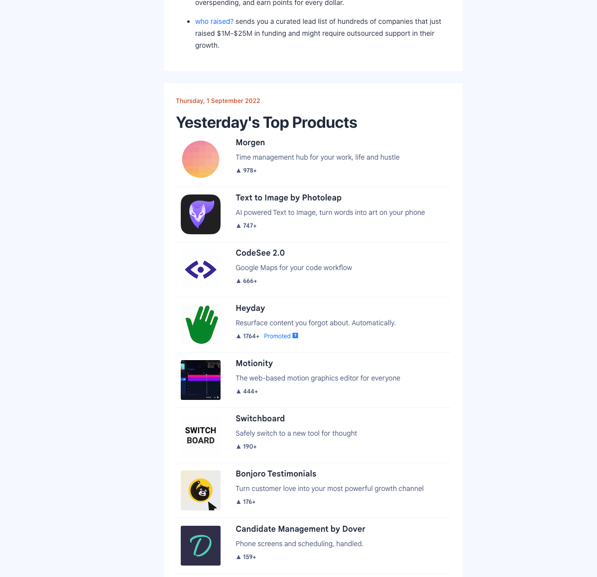
We went live on ‘beta’ early 2022 with 500 users pool, then after three rounds of feedback from real users, we went fully live on August 2022. We were featured on Product Hunt top 10 trending launches within a day. Many users volunteered to send us testimonials for our Testimonials product and this Wall of Love now sits on our live product page and below :)
