Bonjoro App Redesign 2023
Programs used

Overview
Project date/duration - 4 months, Jun 2023-Oct 2023
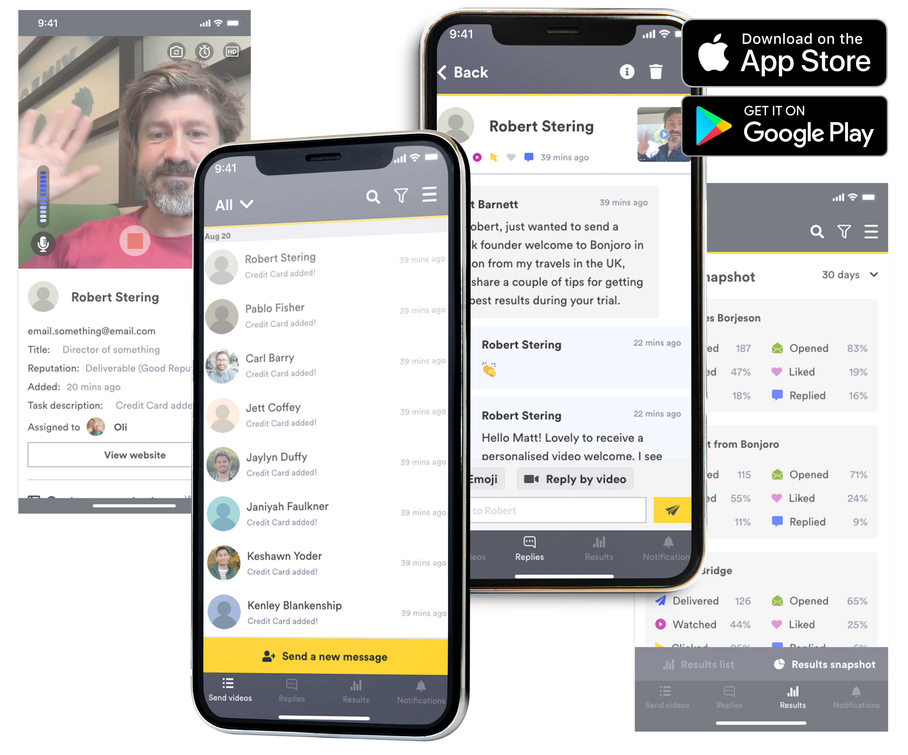
Bonjoro is a customer loyalty building platform using videos. Bonjoro’s two main products - Bonjoro Video messaging (since 2017) and Bonjoro Testimonials (since 2022) both use video to effectively create delightful and personalised experiences for every customers, then harvest that customer loyalty through testimonials to complete user journey. Bonjoro app is a companion app that allows users to send personal video messages from their mobile devices. This app is available on both Apple Appstore and Google Play store. This case study explores my process in redesigning Bonjoro companion app.
My role
As the Head of design, I was a part of the product team and responsible for the experience, strategy and design of all across Bonjoro. I was to lead the UX and produce UI elements. I worked alongside CTO, Tech lead, CMO, CEO(the product owner) and the Product manager.
The challenge
Bonjoro App was first designed and published in 2019. Since then, other than a few bug fixes and small improvements, the app has never been updated with new features or new designs. There are features such as template set up and integrations that are left out of the app, but this is intended as the app never intended to become a replacement for the platform. This app is meant to be a companion app that helps users to be able to record quickly and connect with their customers from anywhere after they have finished all their set up on the platform. But there are few necessary features still missing from this app. Firstly, the full platform has 3 main menus for Video messaging - Send videos, Replies and Results. Send videos is where you send personal video messages to new customers. Results is a collection of all sent video messages and the reactions such as likes or replies. Replies is a collection of all sent video messages that received a written or video replies back. Although replies tab may feel like a filtered page of results, many of our Video messaging users use this tab quite regularly and have told us that they prefer to keep a separate Replies tab to get back to customers who have taken time and effort to respond back. This is a crucial part of Bonjoro service where users communicate and build good strong relationships with their own customers after sending a personal video message. However, Replies tab does not currently exist on Bonjoro’s companion app, and therefore, users must scroll around to find replied messages amongst all other personal messages they have sent. Bonjoro companion app also lacks push notifications feature for replies. It does send general notifications such as new tasks being available but does not send immediate push notifications when customers respond back. This, once again, is a serious UX problem for overall Bonjoro experience. Better push notifications and naturally its control page was absolutely necessary. Some users were churning because of the app’s limitations so we had to address these issues as soon as possible. Moreover, because the web platform recently went through a complete reskin, the app now looked completely outdated and functionally behind.
The goals
- Update Bonjoro companion app with latest branding
- Clean up Ui and UX overall
- Add Replies tab
- Add notification controls
- Add Results stats page Improve empty states/match with platform
- Design with Testimonials becoming available on the app in the future
The process
Tab/navigation
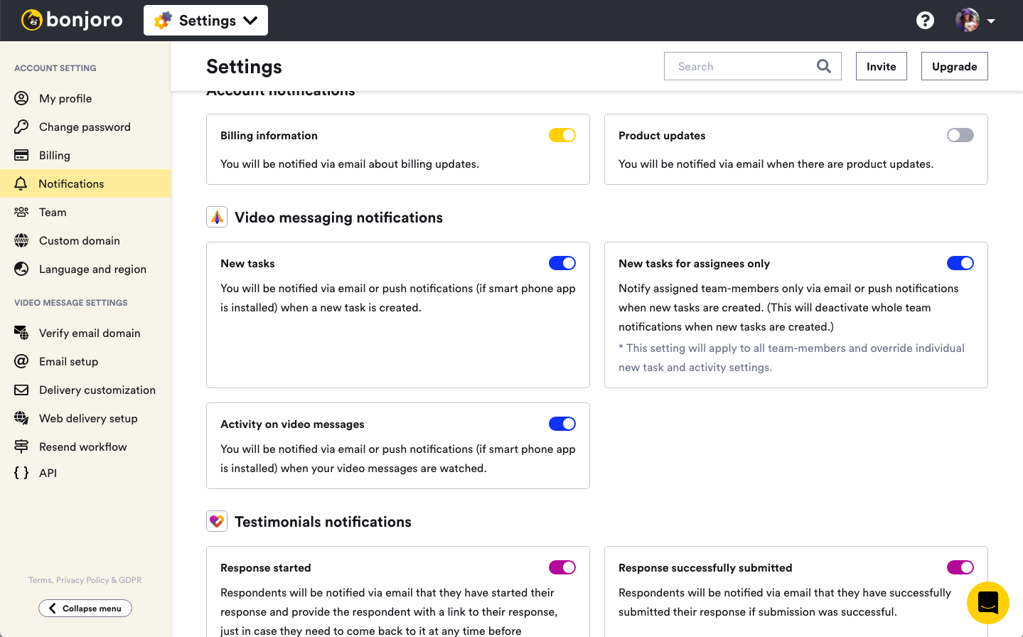
Notifications page on Bonjoro platform
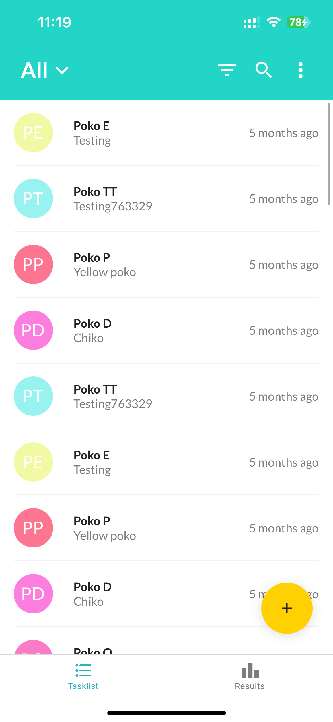
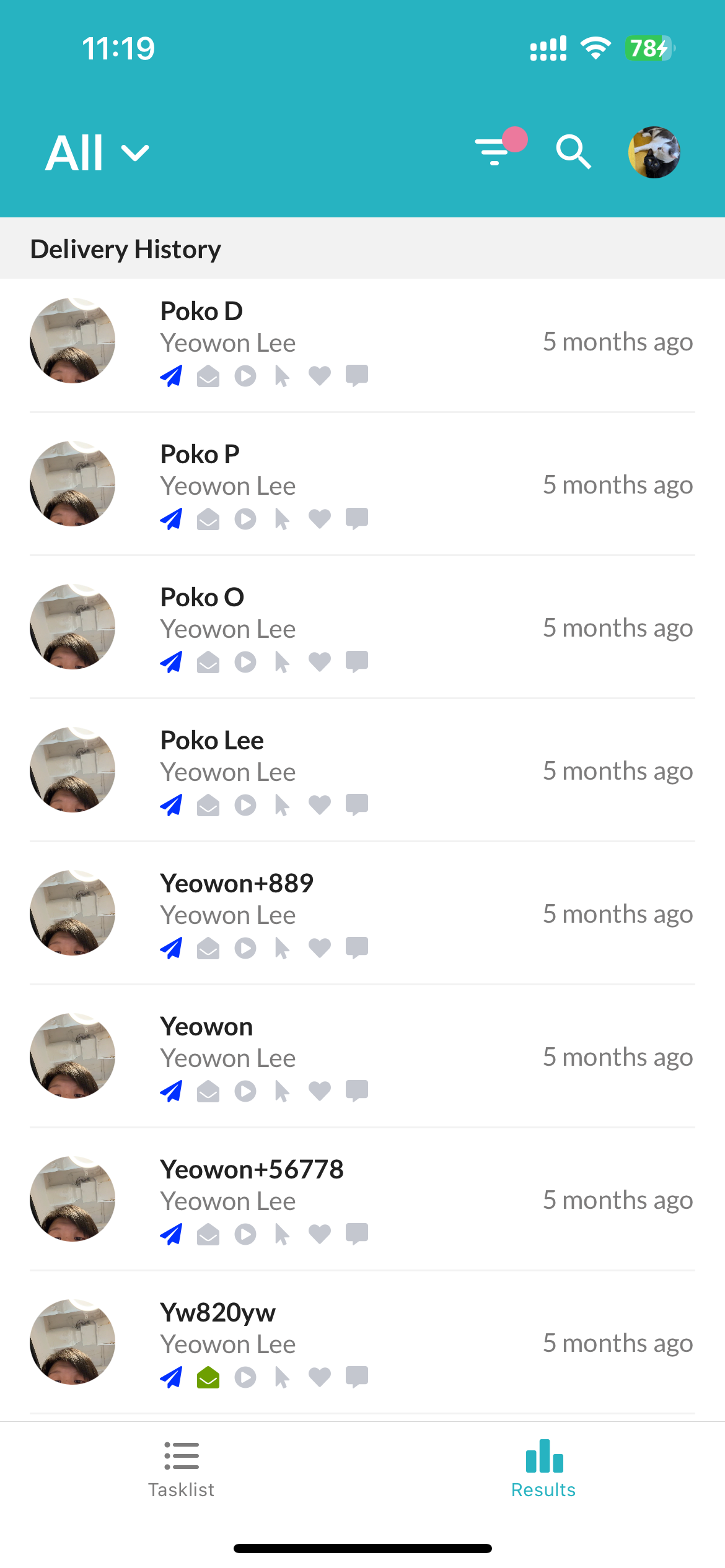
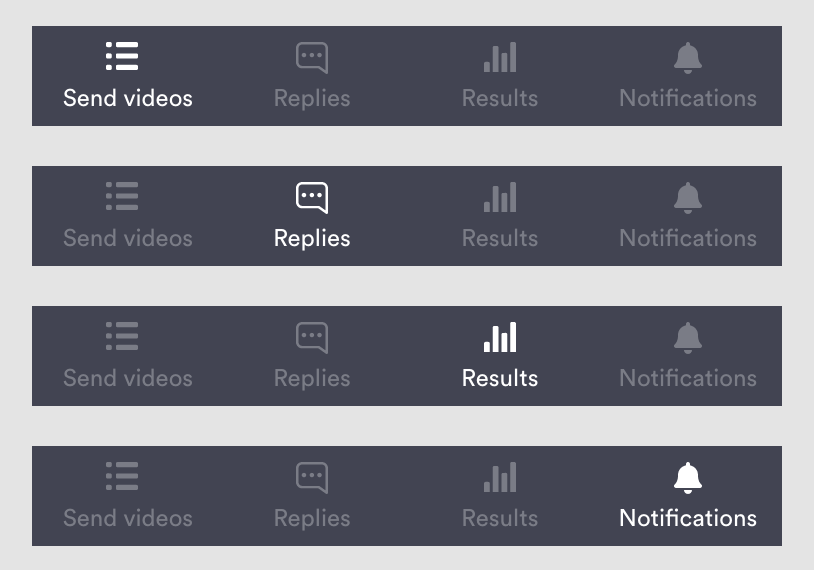
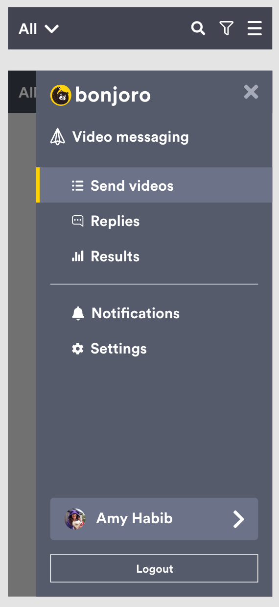
So I have redesigned mobile app tab as below, reusing same icons and main top navigation colour.


Recording and sending
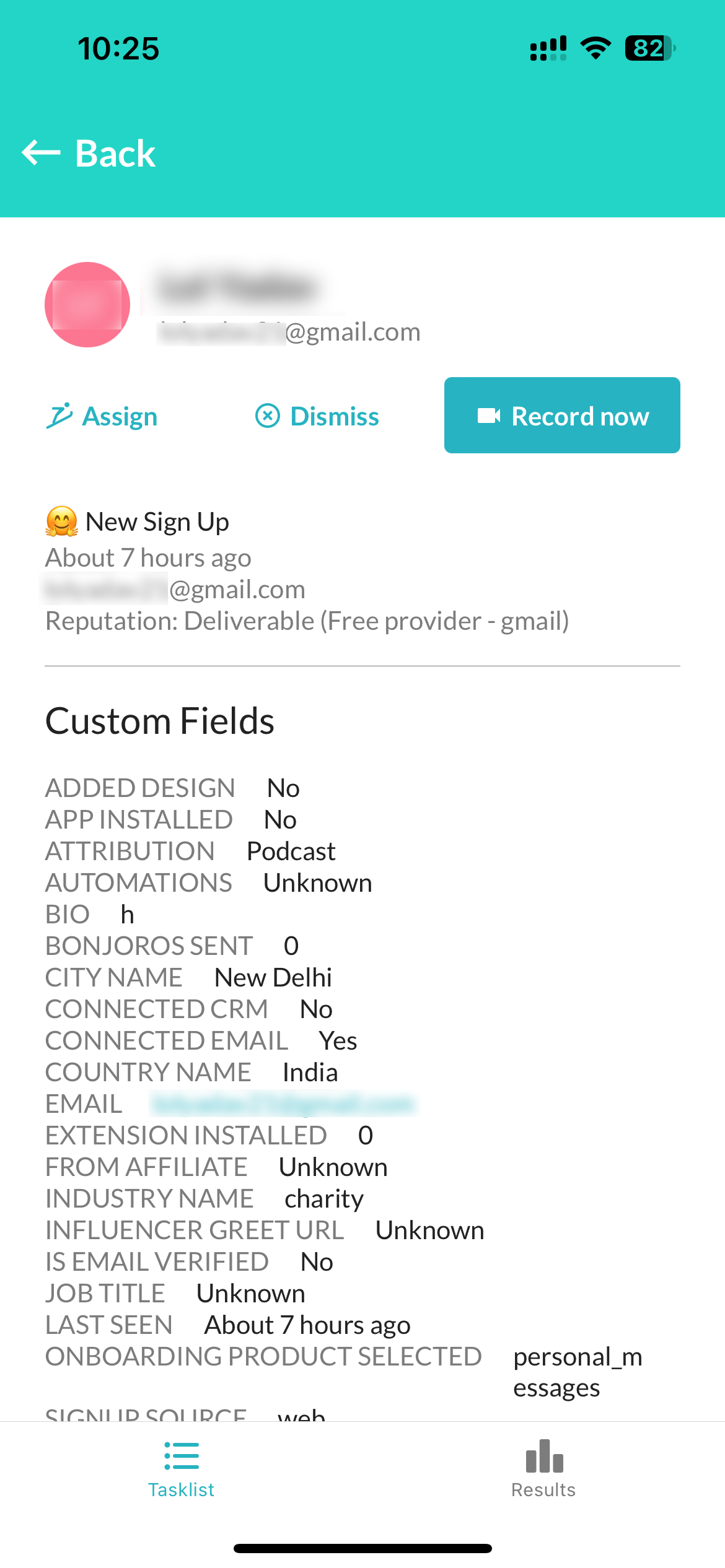
Contact info screen
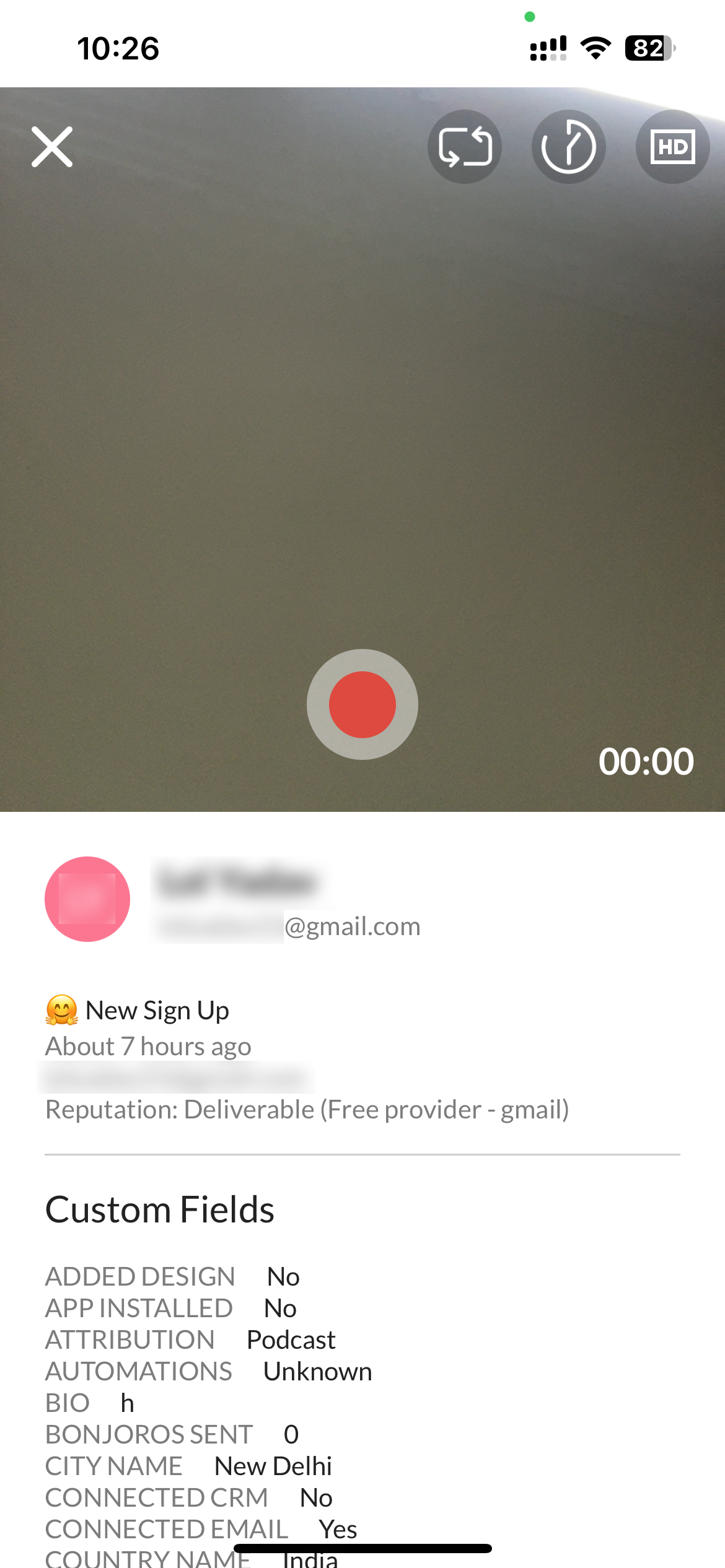
Recording screen
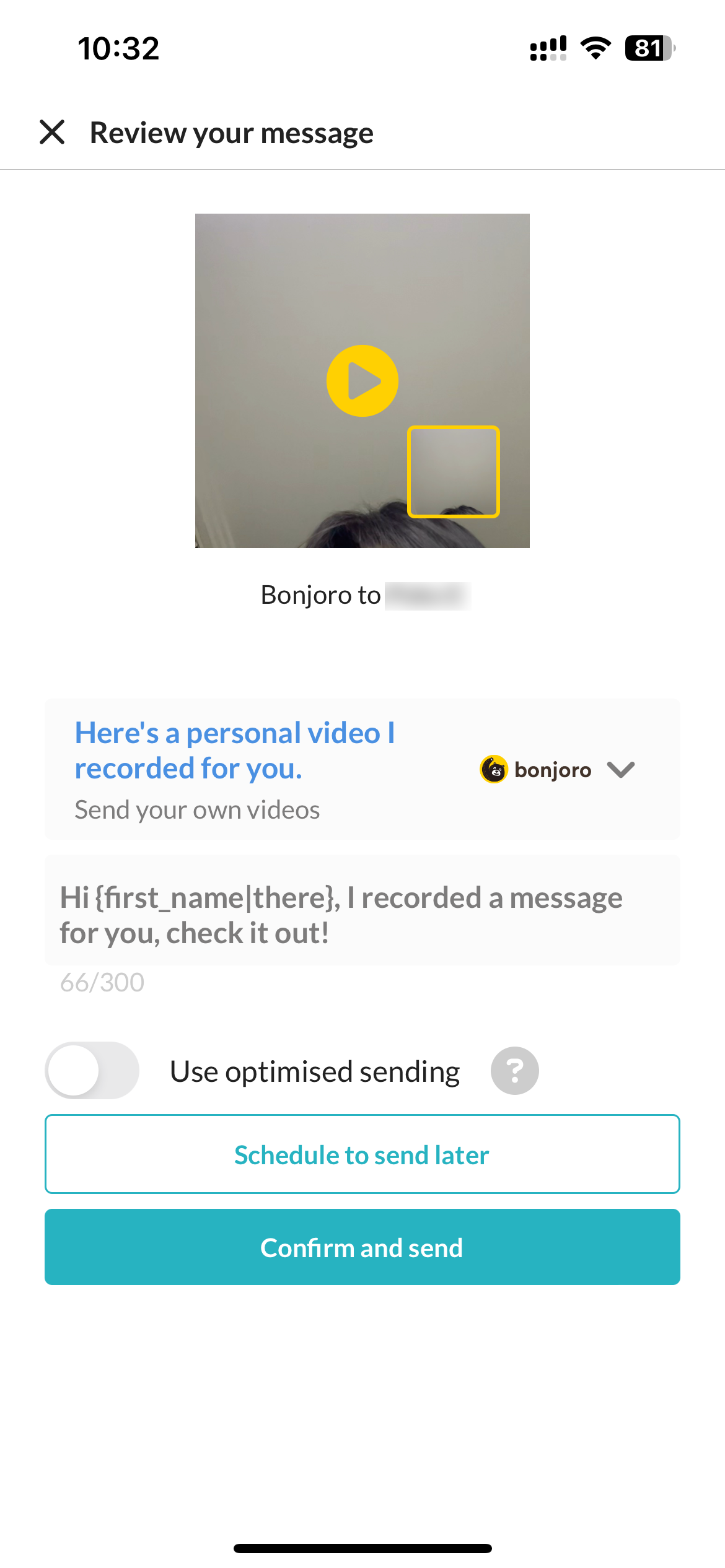
After recording review screen
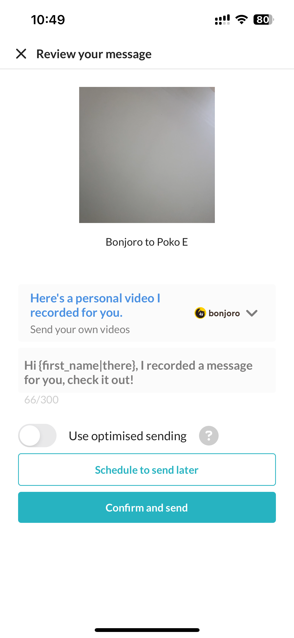
Previewing video (plays in the small square)
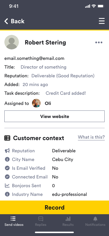
New contact info screen
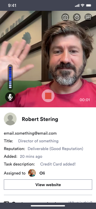
New recording screen
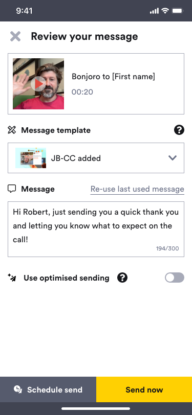
New after recording review screen
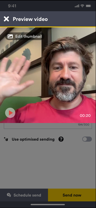
New video preview
Replies tab
One of the main goal of this project was to create a replies tab. There was not much UI work to do since this tab could look like new results tab. But the replies chat system looked very old and outdated so I redesigned this part. Following the trend with most messaging apps, I moved all conversations and videos into chat bubbles, aligned right for ‘My’ messages and aligned left for received message from my contact. The text field was redesigned as well, with more noticeable button design for ‘Reply by video’ feature. Previously this was just an icon that sat in front of the text field which was not very noticeable unless users already knew what it was.

Old Results tab
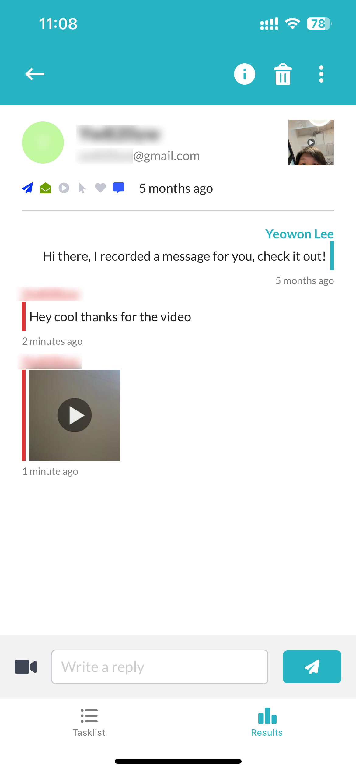
Old Replies chat
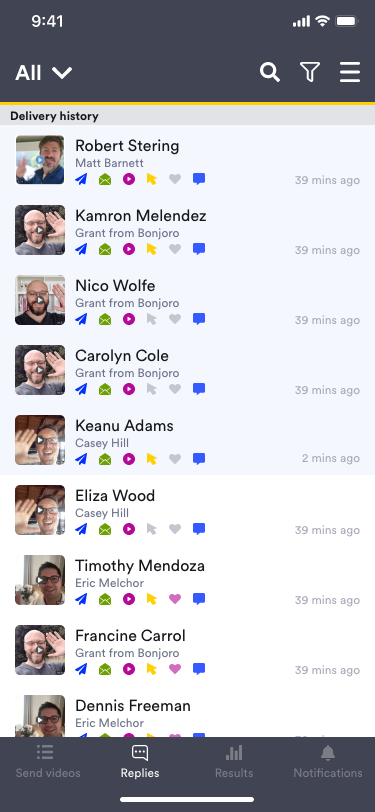
New Replies tab
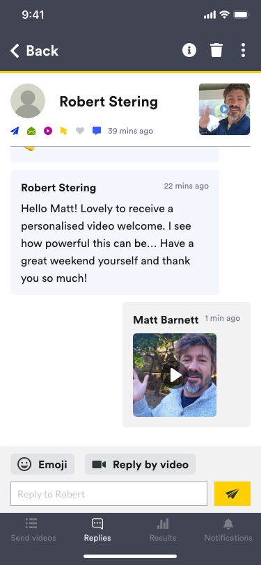
New Replies chat
Results snapshot
Results snapshot is a statistical data available on the platform. This gives users insight to all video messages they have sent and also for their team members. This information was never available on the app, so I decided to include this in this new version. First, I created tabs on top of tabs to switch between the Results list and Results snapshot. Then reorganised table information that fits better for mobile screens.
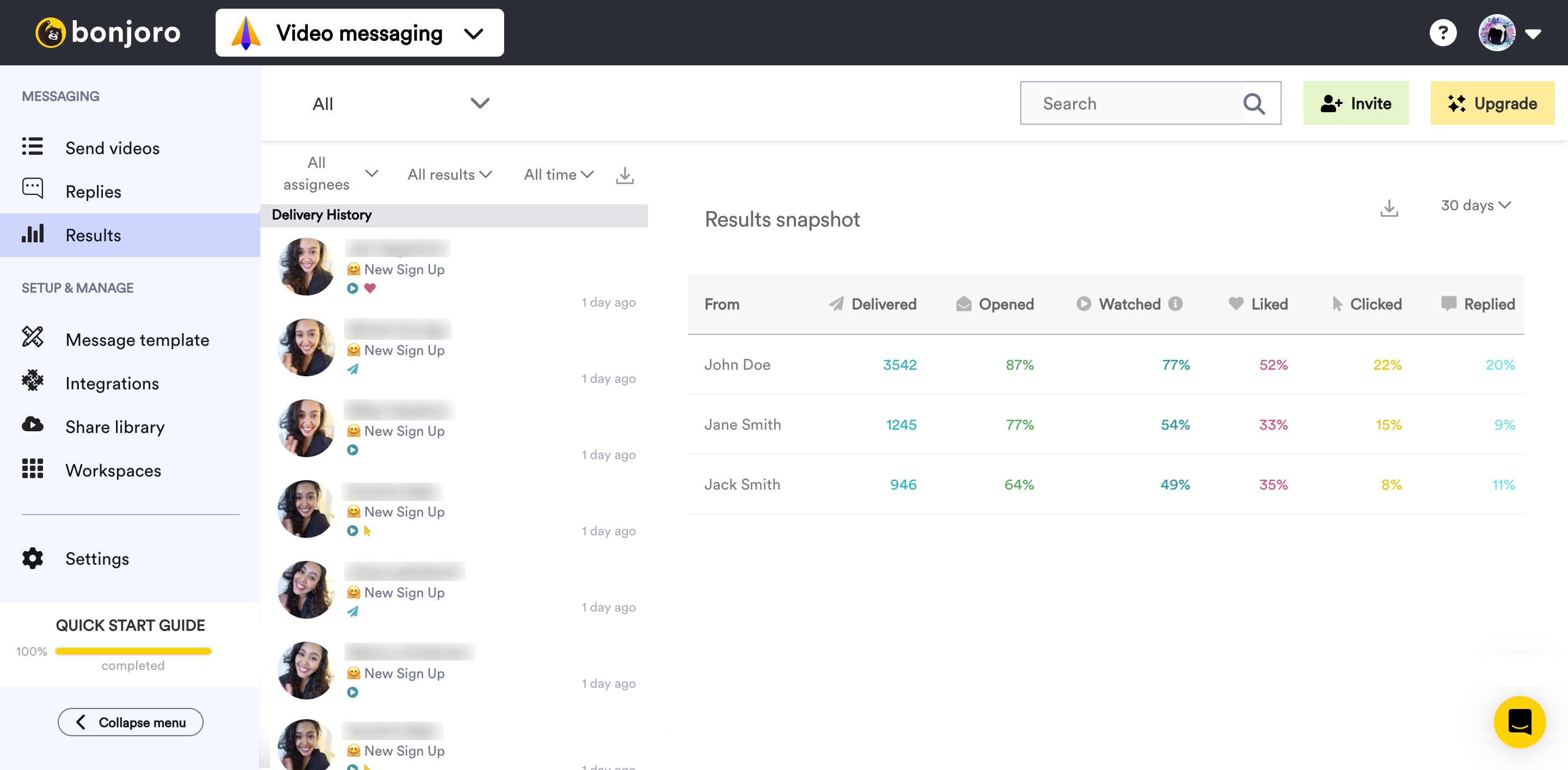
Results snapshot from platform
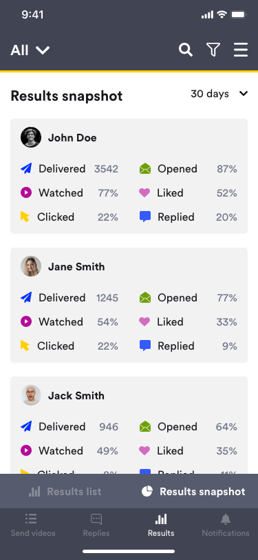
Results snapshot
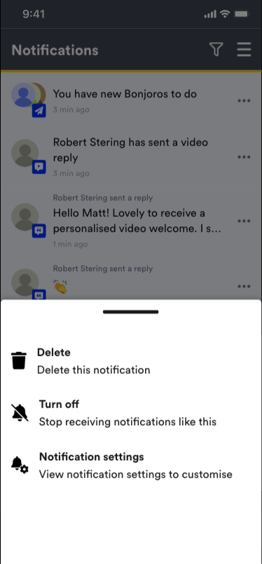
Notification controls and settings page
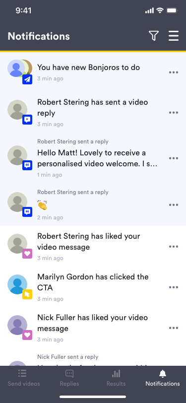
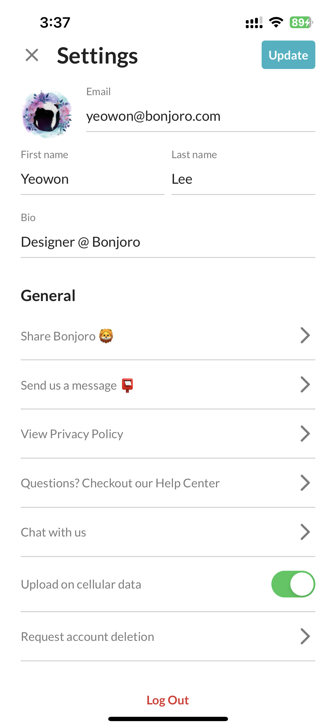
Old settings page
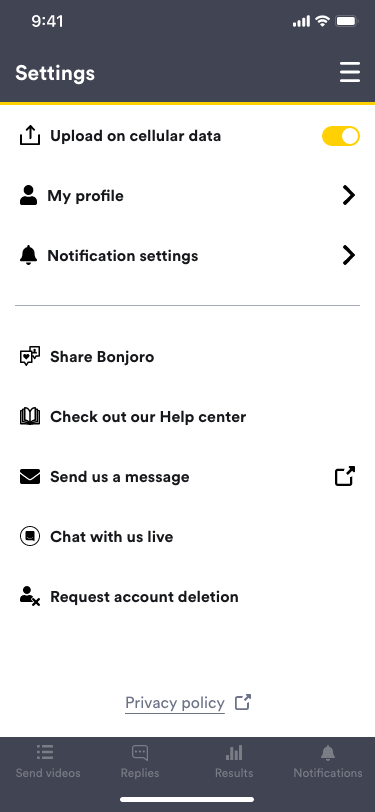
New settings page
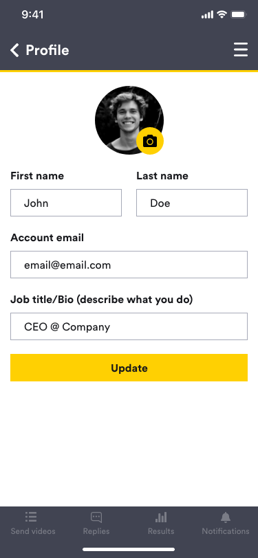
New profile
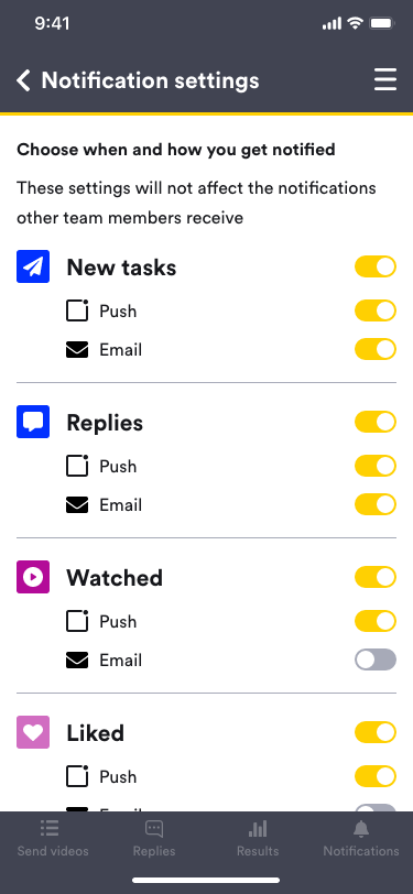
Notification controls
Outcome
This project is yet to be included on build roadmap as different projects and bug fixes took priority, however, through extensive internal testing and user testing, overall feedback was very positive. Many users asked ETA on the build and some were very eager to find out if there will be any additional cost involved in using the app. All new functions and UI components were pre-checked with Tech lead to ensure all design could be translated to actual build. This will be updated further once the app goes live.